Curiosity can be a dangerous thing. After all, it killed the cat! But even armed with this knowledge, I still can’t prevent my mind from frequent forays into thoughts that begin with, “Hmm, I wonder if…”
Recently, I completed that question with the words “… anyone ever made a 24×24 square frame 35mm camera?” A quick search of Google (also a dangerous thing) revealed the ancient Zeiss Ikon Taxona and the somewhat less ancient Robot Royal 24. On the cheesier end sat a smattering of mid-60’s Rapid format compact cameras, and the Lomography LC-Wide.
The LC-Wide was the first option I investigated. It’s still in production, and thus easily obtained should I decide to add another goofy 35mm format camera to the collection. But a rather extreme disconnect between its price and its value, coupled with the fact it achieved the square format by simply masking the edges of a standard 3×2 frame (meaning you still get 36 frames on a 36-exposure roll) resulted in its immediate dismissal from any and all consideration.
The Zeiss Ikon Taxona was a bit too doddering to crank my enthusiasm dial. However, I found the Robot Royal 24 wickedly intriguing — and not just because it was designed from the ground up to cram 50+ images on a 36-shot roll of film, but because it had several unique features, including a nice assortment of interchangeable lenses; a rotary shutter; and a wind-up film advance — exactly like my beloved but dearly-departed Ricoh Auto-Half. I’m a real sucker for wind-up cameras.

The Rapid format cameras were also intriguing, but for an entirely different reason: they’re dirt cheap! I knew the Rapid system quickly came-and-went in the mid-1960s as a failed competitor to the popular Kodak 126 format, but had always assumed it (like the Kodak system) used some sort of proprietary film type that would prove hostile to a 35mm photographer. Turns out the Rapid system actually does use 35mm film — it just gets loaded (quite easily) into an entirely different type of cassette.
At this point, research completed, my curiosity was sated. Or rather I thought it was sated until, two days later, I walked into my local camera shop to buy some bulk film, and spotted not one but two Rocket Royal 24’s in a cabinet. Uh oh. 30 seconds later, I was fiddling with both.
One was totally non functioning, but the other had potential. The spring advance was working; the shutter was a bit sticky but was opening; the rangefinder patch was clear and clean; and the horribly complicated 3-piece take-up cassette, into which one must laboriously insert their film leader, seemed to be working in all its sadistic glory. Sure, the camera weighs slightly more than a Honda Civic and yes, it definitely needed a skilled jeweller to gingerly clean and lube its clockwork mechanics, but I could feel it tugging at my heart strings.

Fortunately, my brain also comes with attached strings, and I was able to tug those with enough force to counter the heart’s. “I’ll think about it,” I said, as I slid the Robot Royal 24 back across the counter, adding “Maybe I’ll see if I can find an old Rapid format camera first.”
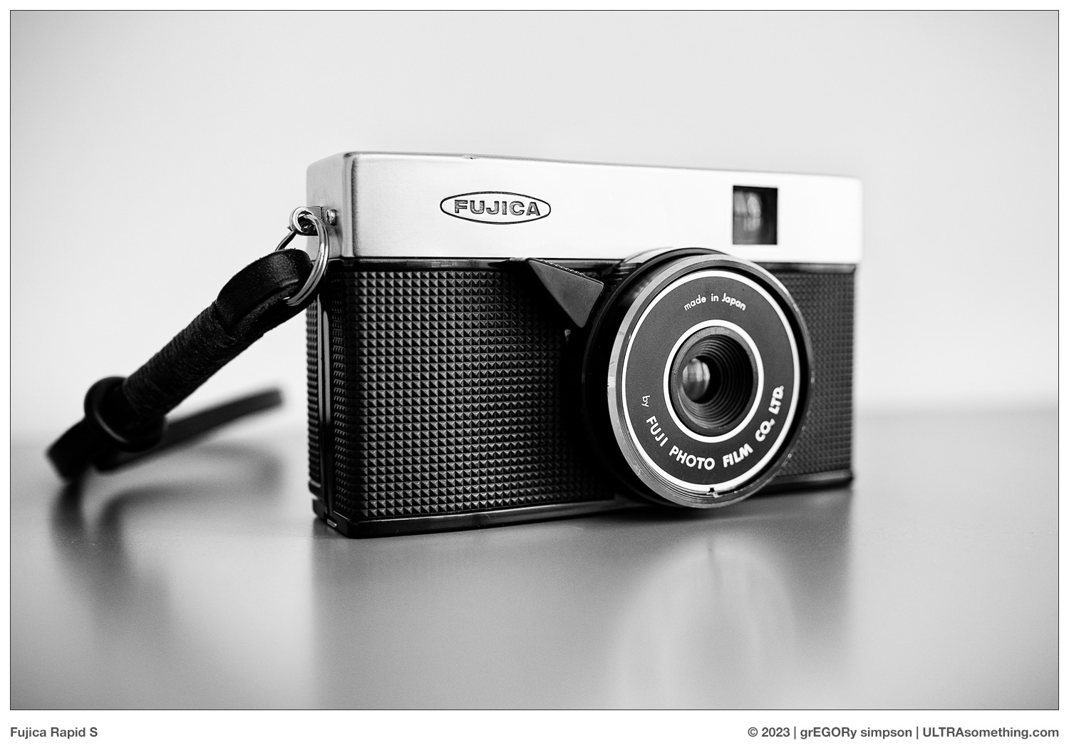
“We have one” replied the salesperson, pointing in the direction of a shelf loaded with ridiculously cheap consumer point-and-shoots from around the dawn of Beatlemania. And there, indeed, sat a Fujica Rapid S — wedged in amongst its full-frame riffraff. $50 Canadian, with new seals and a pair of Rapid cassettes already inside. “I’ll take it” said my heart and brain in unison.
Perhaps this would be a good time to discuss why I even wanted a square-frame 35mm camera. And if I knew the answer, I’d tell you. But I don’t, so what follows is merely conjecture.
33 years ago (as discussed in Origin Story), after spending the previous decade as a mere photography connoisseur, I bought my first camera. Since I had plans to focus mostly on studio photography, the camera I initially desired was a Hasselblad 500 series. I wanted one badly. But not only was the price of the camera well beyond my means, so was the price of medium format film and a medium format darkroom enlarger. So I surrendered to my budget and bought a 35mm Canon camera and a 35mm B&W darkroom enlarger instead.

Unfortunately, the call of the Hasselblad never quieted. To this day, I still want a 500 series Hasselblad, even though it makes absolutely no sense. I don’t know if it’s simply a siren call from my youth, or if it’s those big square negatives. I suspect both. As I matured my way out of any desire to do studio work, the object of my affection shifted to the collapsible 6×6 Mamiya 6 rangefinder camera — itself, an unconsummated lust, much like the Hasselblad.
Though neither dream camera has ever graced my shelves, I have dabbled a bit with square format over the years — a pinhole camera; a couple of TLRs; a Dianna — all medium format, and all shot before my workflow could adequately support it. Today, however, medium format fits effortlessly into my workflow, but only the Fuji GS645S Wide 60 is in my shooting ‘rotation.’ So the Hasselblad 500 series and Mamiya 6 cameras continue to taunt me — along with my desire to explore the square in greater depth. But now, just as then, those cameras are beyond my budget — which may be what prompted me to ask, “I wonder if anyone ever made a 24×24 square frame 35mm camera?” Because, if the answer was “yes,” that would allow me to explore the aspect ratio at minimum expense.

The other possible motivation is that I might be infatuated with any non-standard aspect ratio that can fit on a strip of 35mm film. Framing a square onto a strip of 35mm yields a 24mm x 24mm negative, which would make it a 2/3 frame camera — something absent from my shelves.
Prior to purchasing the Rapid S, my cameras supported ‘only’ the following oddball 35mm aspect ratios:
- 1/3 frame (8×24 LomoKino)
- 1/2 frame (several, like the Pen FT and Konica Recorder, either 24×17, 24×18, or even the 13×36 masked panoramics)
- 7/12 frame (Kodak Stereo camera, which could also be considered a 7/6 frame camera since it requires two 7/12 frames to make a single stereo image)
- 1 2/3 frame (Widelux F7)
- 1 4/5 frame (Hasselblad Xpan)
- 2 frame (Sprocket Rocket)
- 3 1/3 frame (Spinner 360)
So, looking at this list, how could I NOT want to add a 2/3 frame square format camera to my collection? The same compulsive impulse is probably what continues to drive my desire to own a Fuji BYU-N 16 Rensha Cardia golf camera, which manages to cram 16 exposures into a 2-frame width — half the images being 9×9 and the other half being 7×9, making it both a 3/32 and a 7/96 frame camera. Just writing that sentence fills me with desire…
Once I arrived back home with the new camera, I did some internet digging — eventually unearthing snapshots that someone took of the original Fujica Rapid S Japanese language manual. Happily, in spite of the fact I don’t read Japanese, numbers are still numbers. So I was quickly able to figure out that the lens is fixed at f/11 and that the two available shutter speeds are 1/30s and 1/125s. Minimum focus distance is 1.5 meters (5 feet for my American readers). This is rather typical for a 60 year-old, fixed-focus, consumer point-and-shoot camera. However, since the shutter release is a rather inelegant lever on the lens (as opposed to a button on the body), it’s nigh impossible to take a photo at the 1/30s setting without inducing a bit of camera shake. Fortunately, the lens is soft enough that it helps mask any such movement.

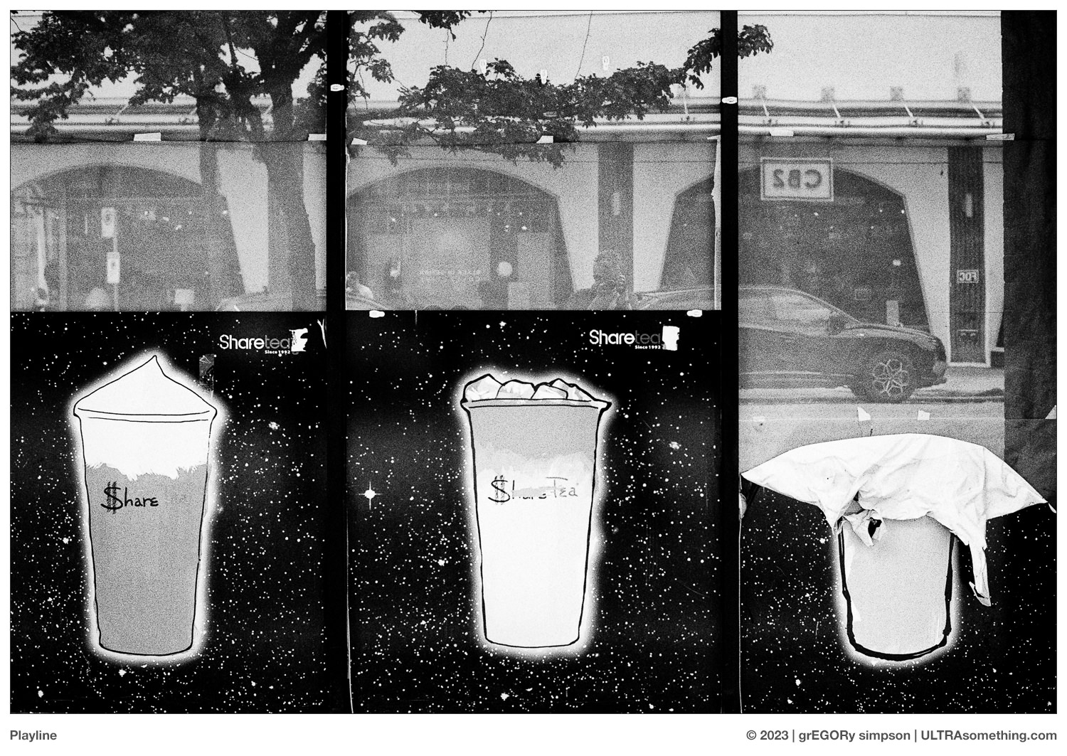
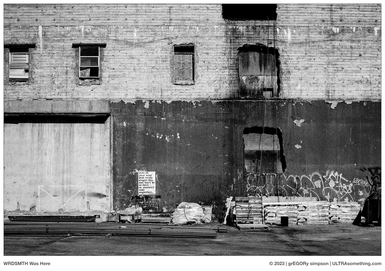
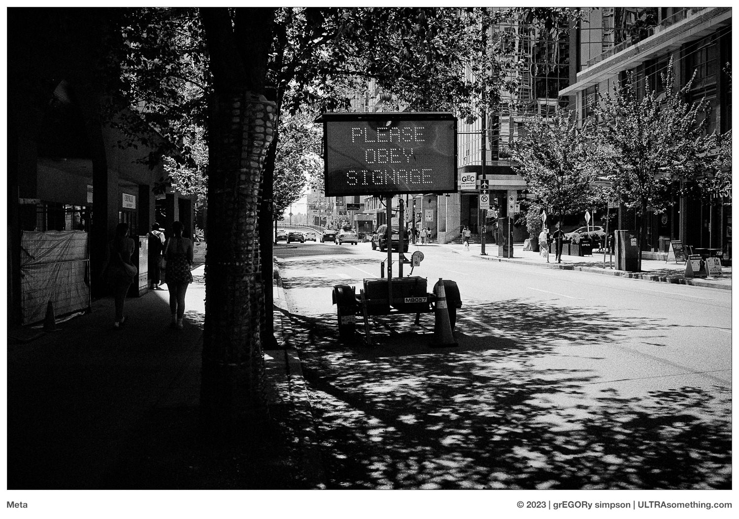
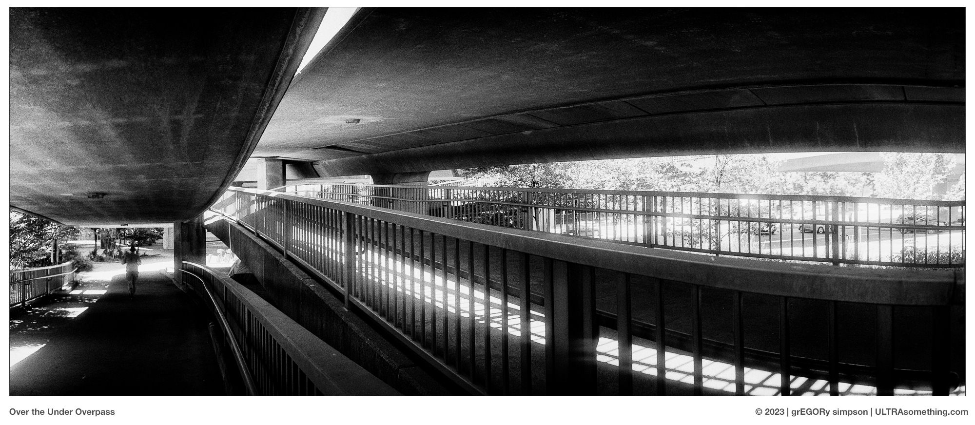
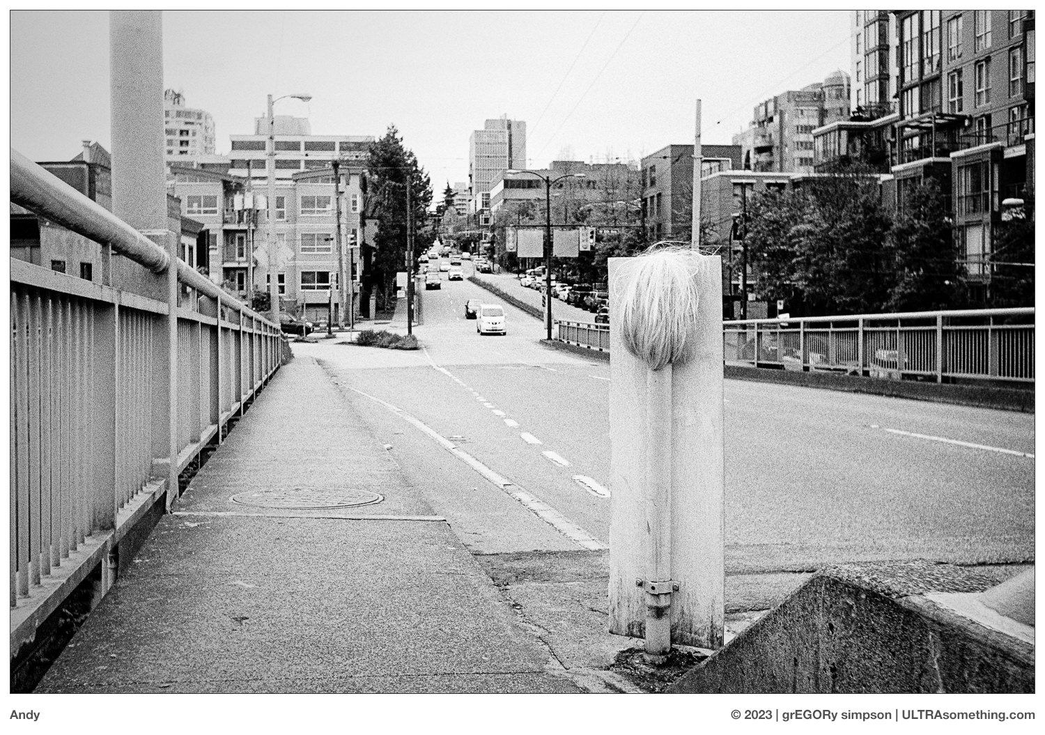
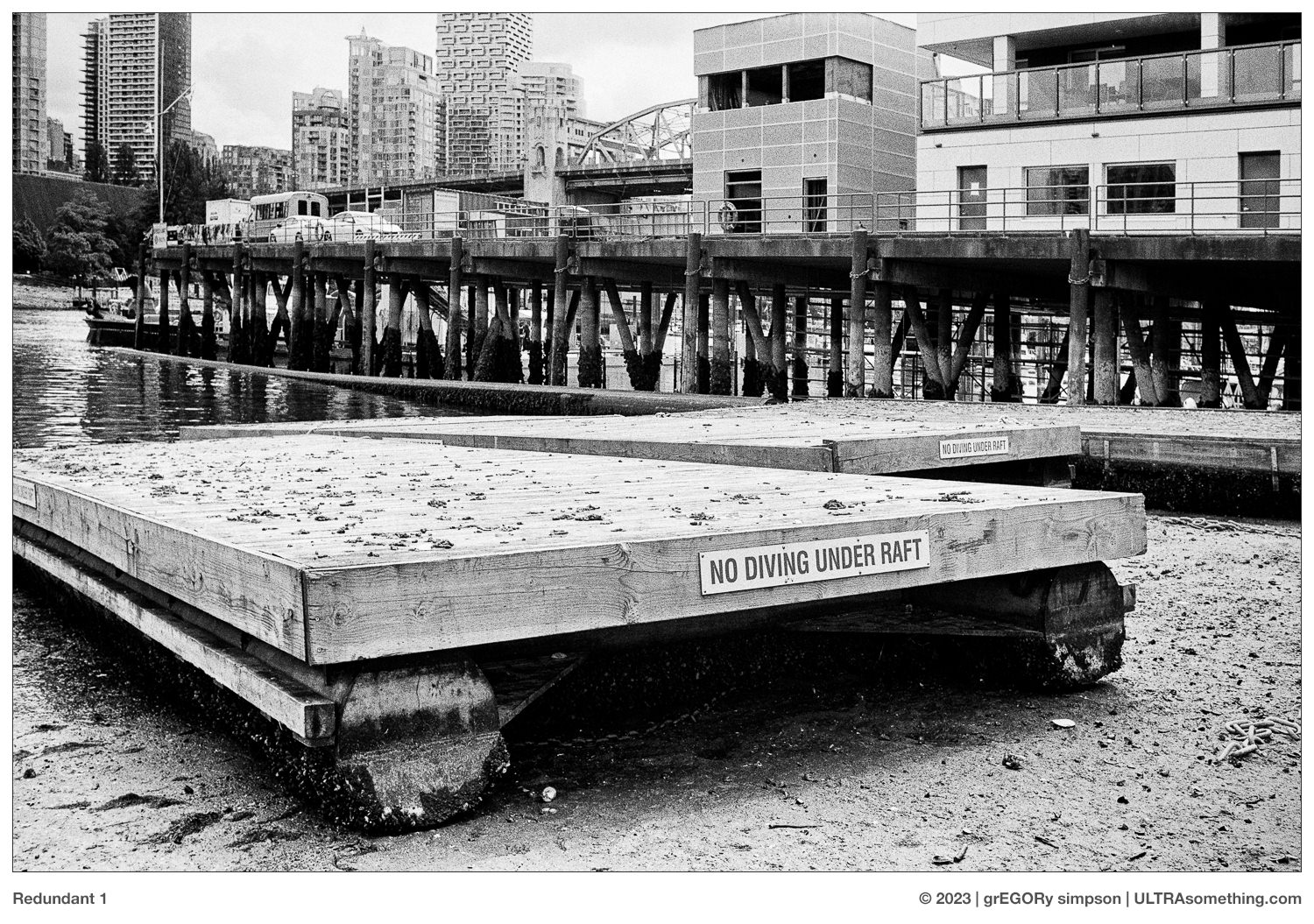
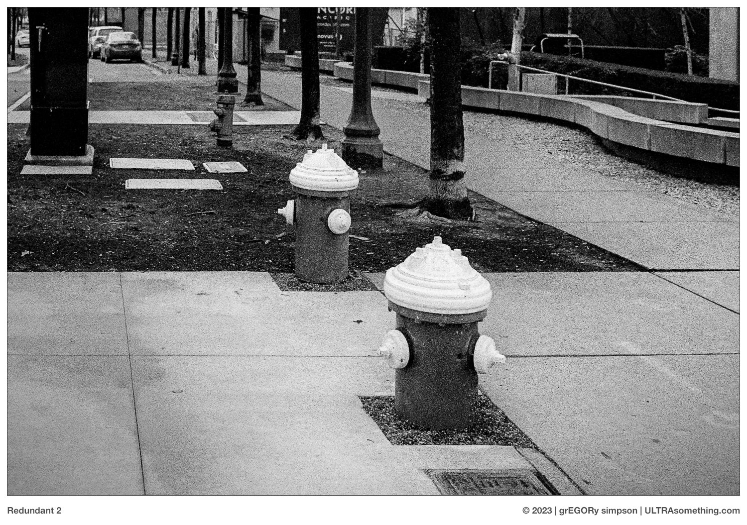
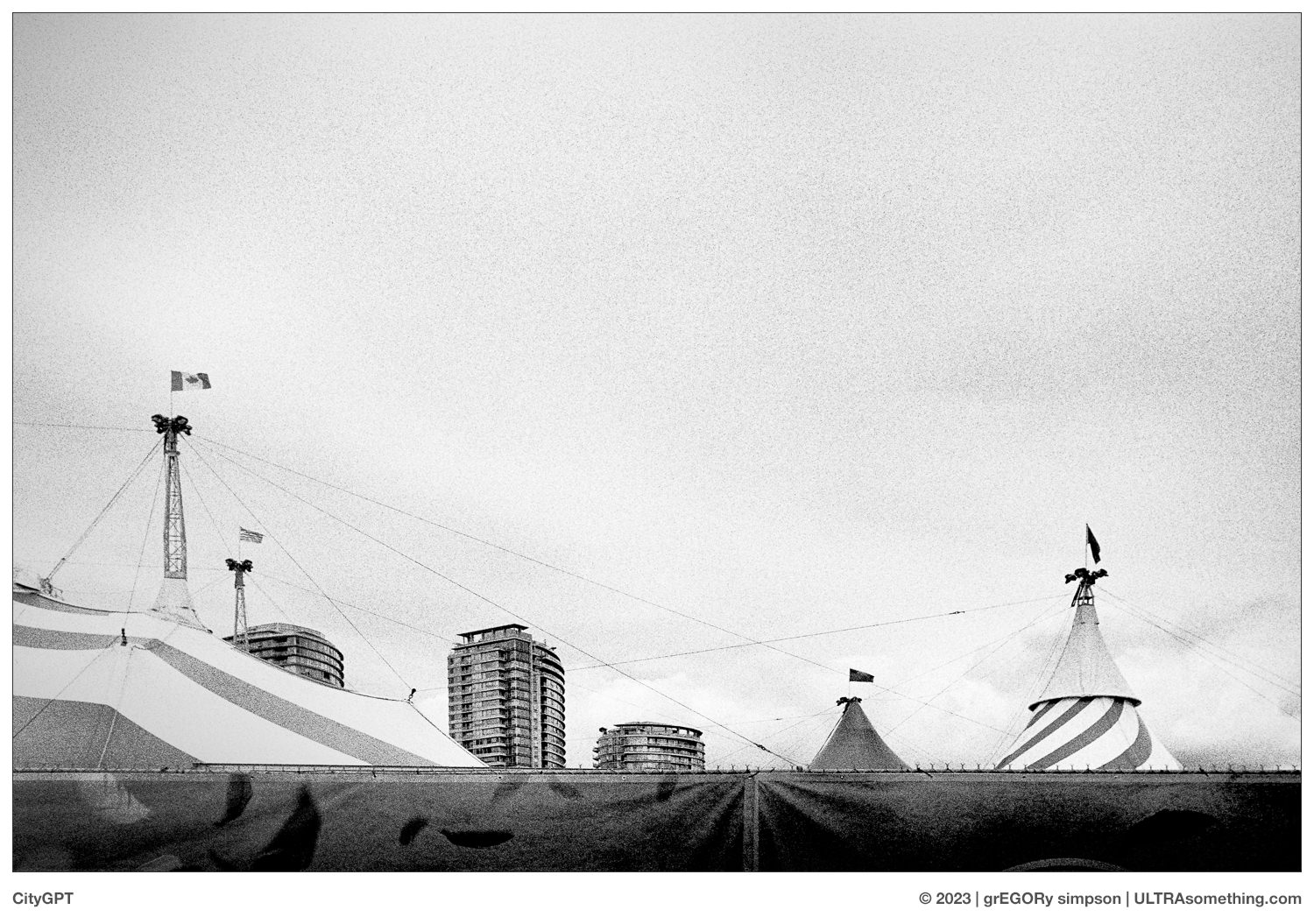
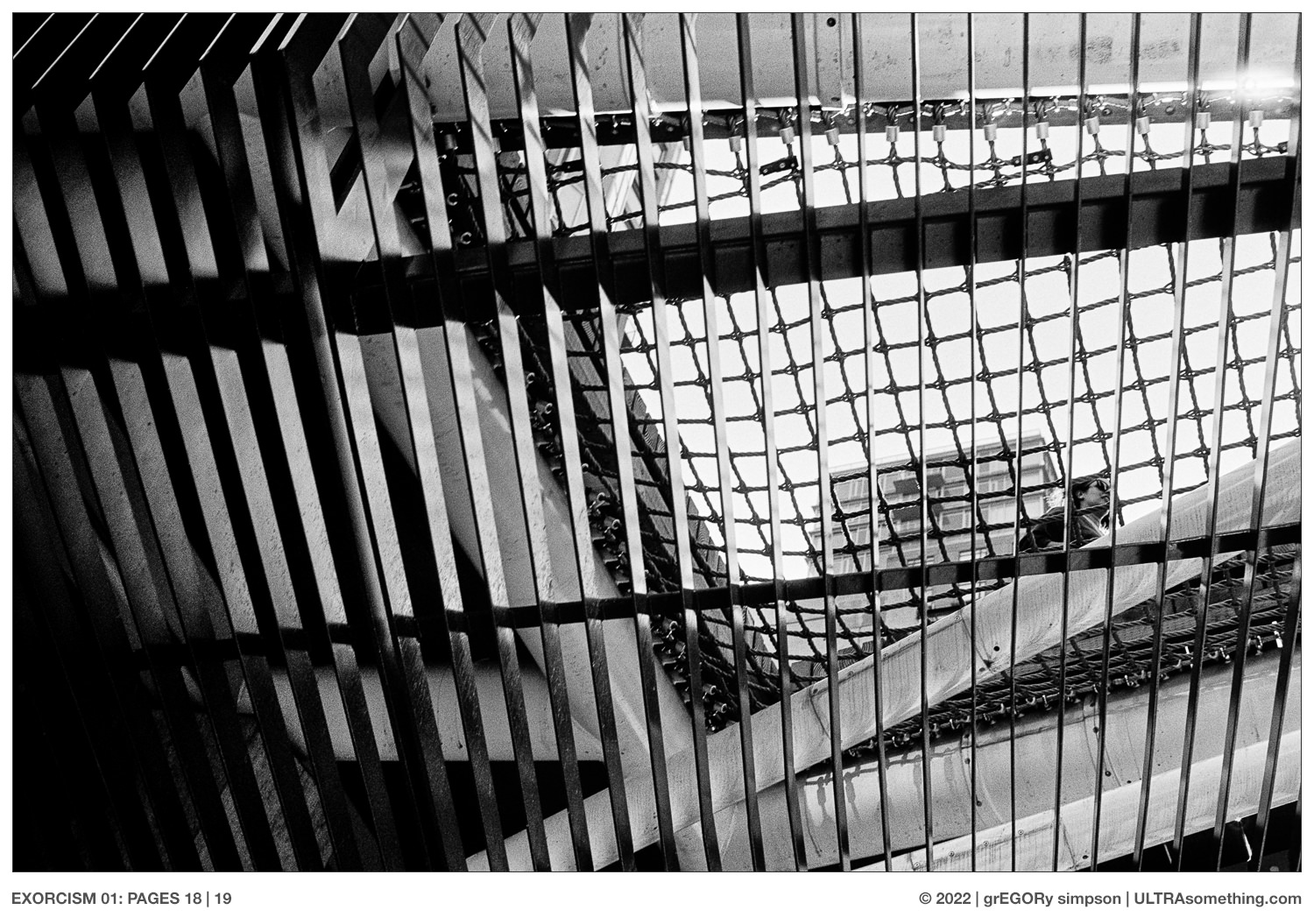
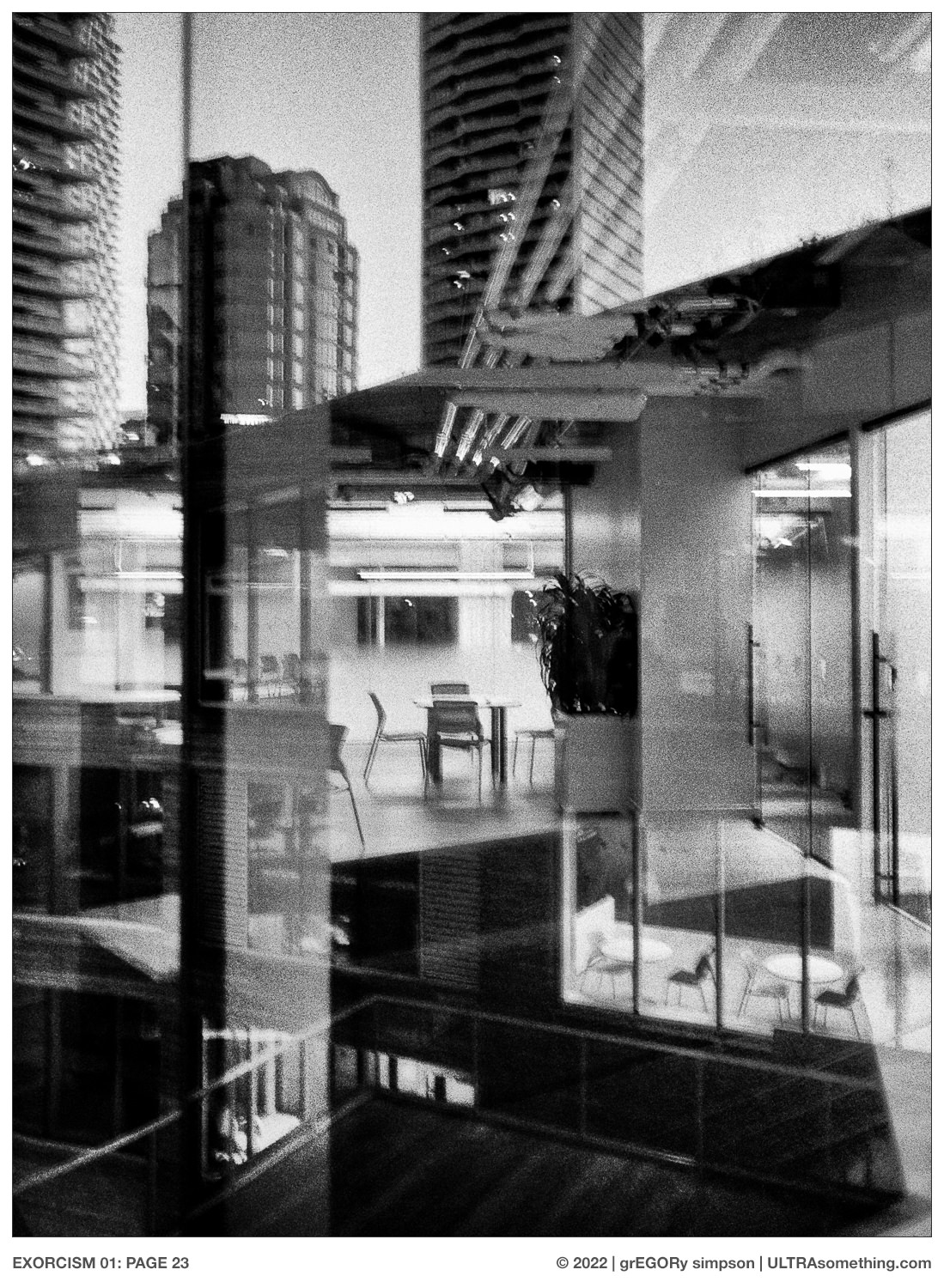
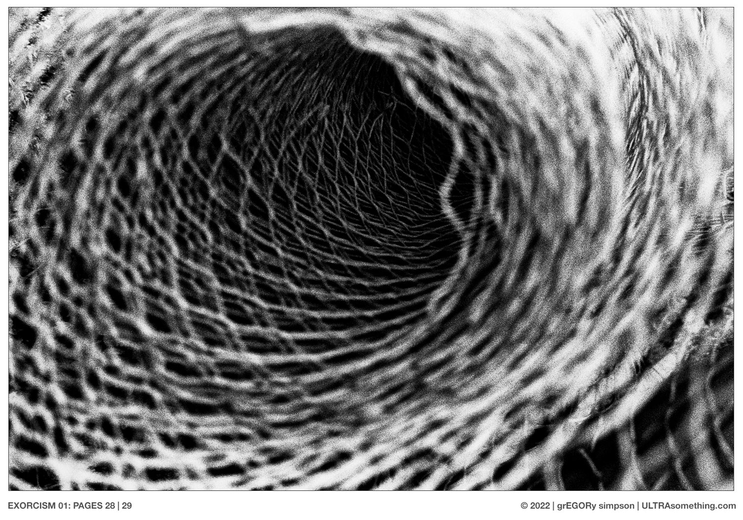
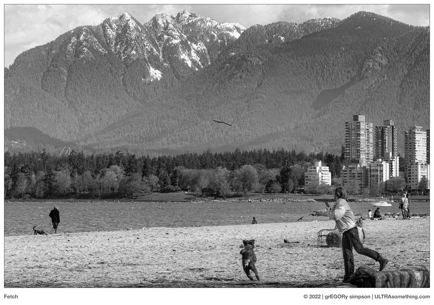
Every camera has its specialty. Because of this, I like to let the camera tell me what to shoot. It became immediately evident that the Rapid S, like the Ford MVP or my old Olympus PEN EE-2 (RIP) is an anti-fidelity camera — its softness working well for a hint of pictorialsm, while its lens distortion generates the more off-kilter feeling of early 20th century German expressionism. In reality, the camera yields a 24 x 26 negative — awkwardly sitting halfway between a Mamiya 6’s 1:1 aspect ratio; and the Mamiya 7’s 6:7 aspect ratio. For this article, I simply cropped each 12:13 negative into a square, losing only a tiny bit of visual mush on either side of the frame.

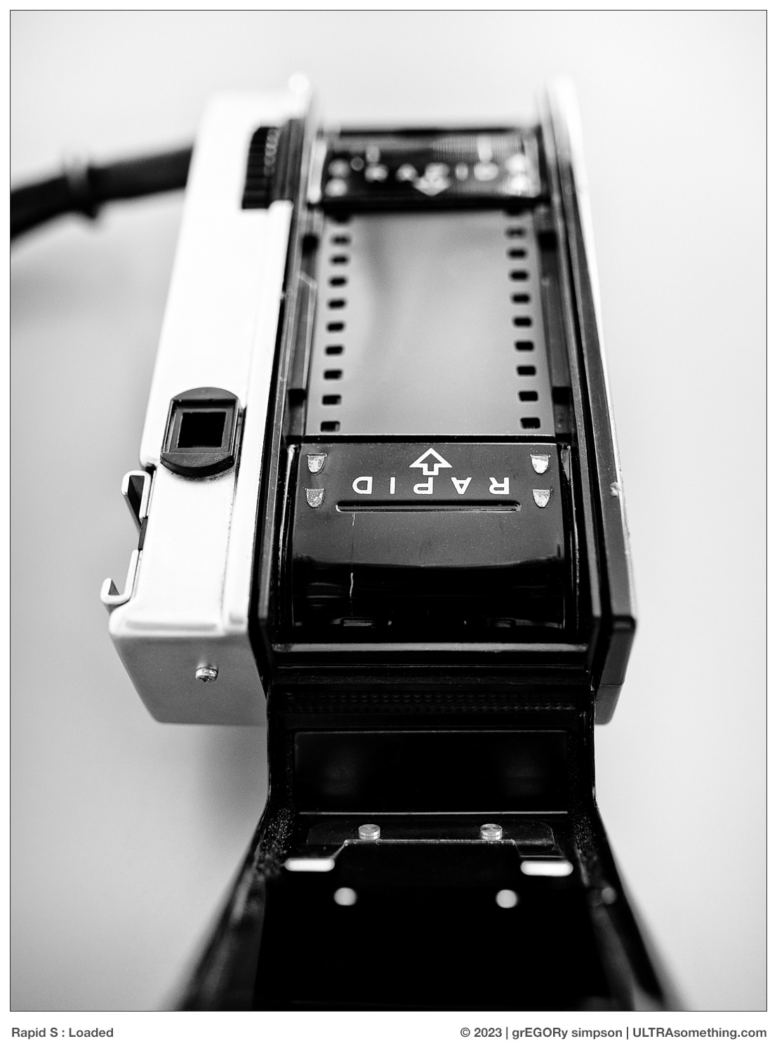
Loading the camera and its Rapid format cassette is extremely simple, though it does require either a darkroom or a changing bag. Snip a little concave shape into the film leader then, in a dark bag, yank a 60 cm (2 ft) strip out of your bulk loader (or commercial 35 mm film cartridge, if you’re not a nerd), and cut it. Stuff the concave end of your film strip into the teardrop shaped Rapid cassette. There is no spool inside — the cassette merely coils the film as you feed it in. Leave a few centimetres sticking out of the cassette, then pull it out of the changing bag.
Fashion the exposed end with the same little concave cut and drop the full cassette into the right side of the camera. Drop the empty take-up cassette into the left side of the camera, and insert the recently cut leader into it — making sure the sprockets engage the holes on the film. Close the back; advance the film; and marvel at what may be the most austere camera you’ve ever seen. 16 shots later, drop the take-up spool in your changing bag, pull out the film strip (the leader will never disappear into the cassette), roll it onto your reel and develop as you normally would.

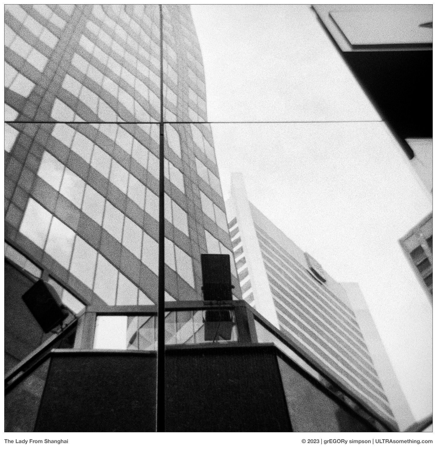
As you would rightly conclude, this article is sprinkled with shots taken from those first few strips from the Fujica Rapid S. Though my penchant for non-standard formats is somewhat at odds with my need to routinely publish new ULTRAsomething magazines (which I designed to support either 3×2 or 5×7 photos), no such limitations exist for the website, which may be why I still bother publishing it after 15 years.
The Fujica Rapid S is a camera that will definitely enter the ever-growing collection of cameras in my shooting rotation. But, happy as I am with this little camera, there’s one thing it didn’t do: quiet my lust for both a Mamiya 6 (with all three lenses) and a Hasselblad… “Hmm, I wonder if there are any decent but affordable Hasselblad 500 series cameras for sale on eBay?”
© 2023 grEGORy simpson
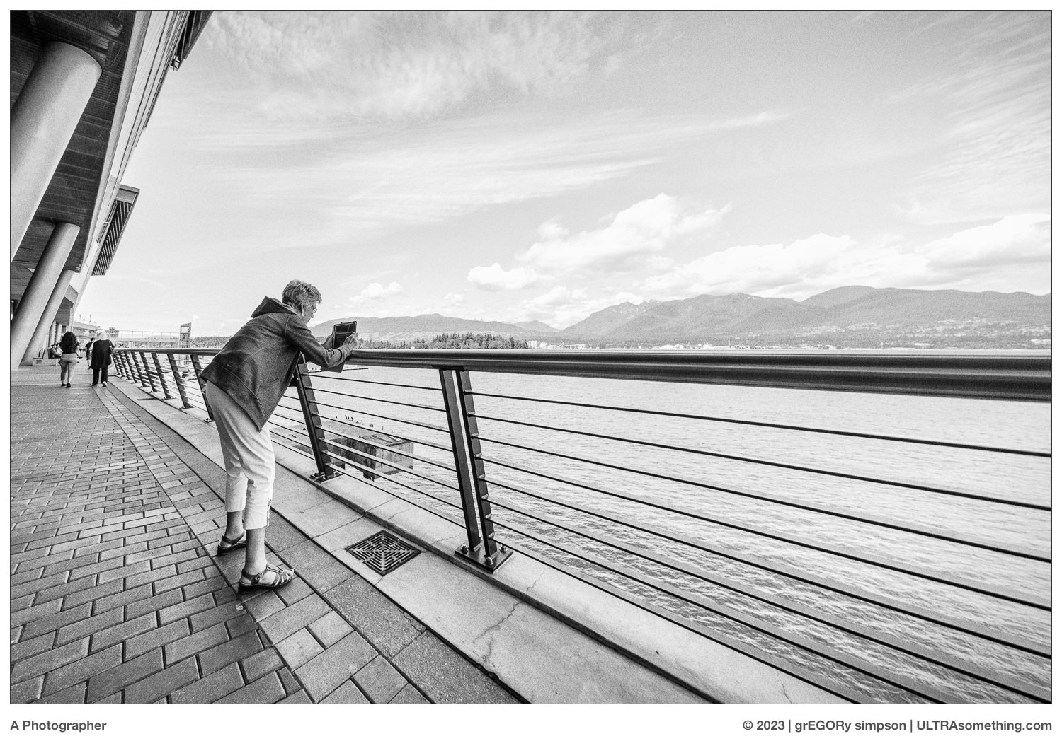
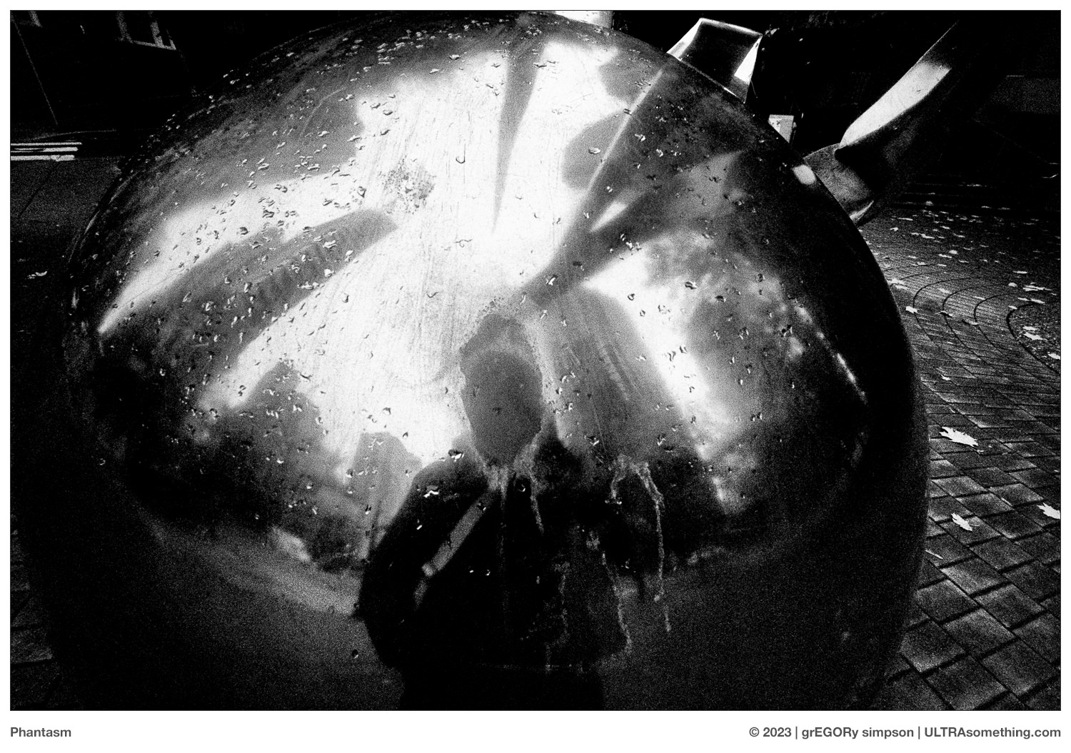
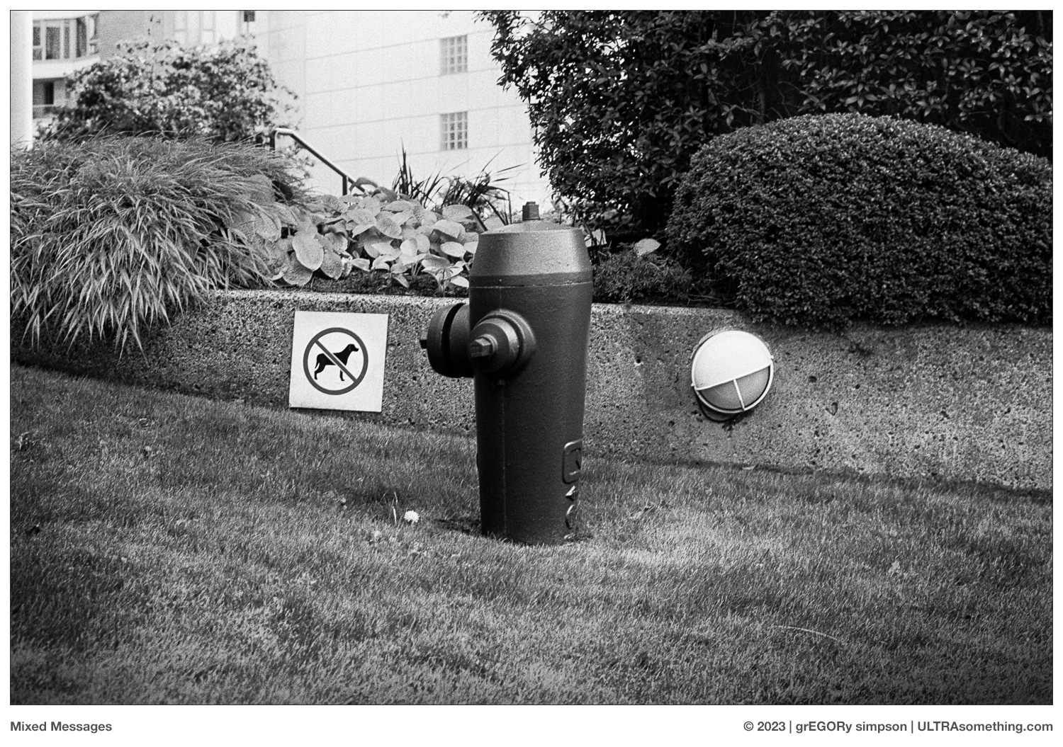
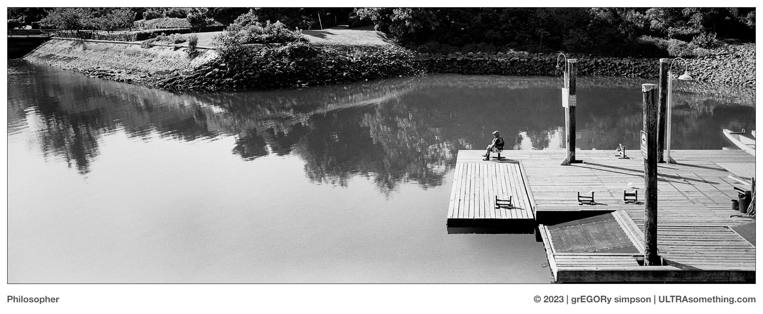
ABOUT THE PHOTOS:
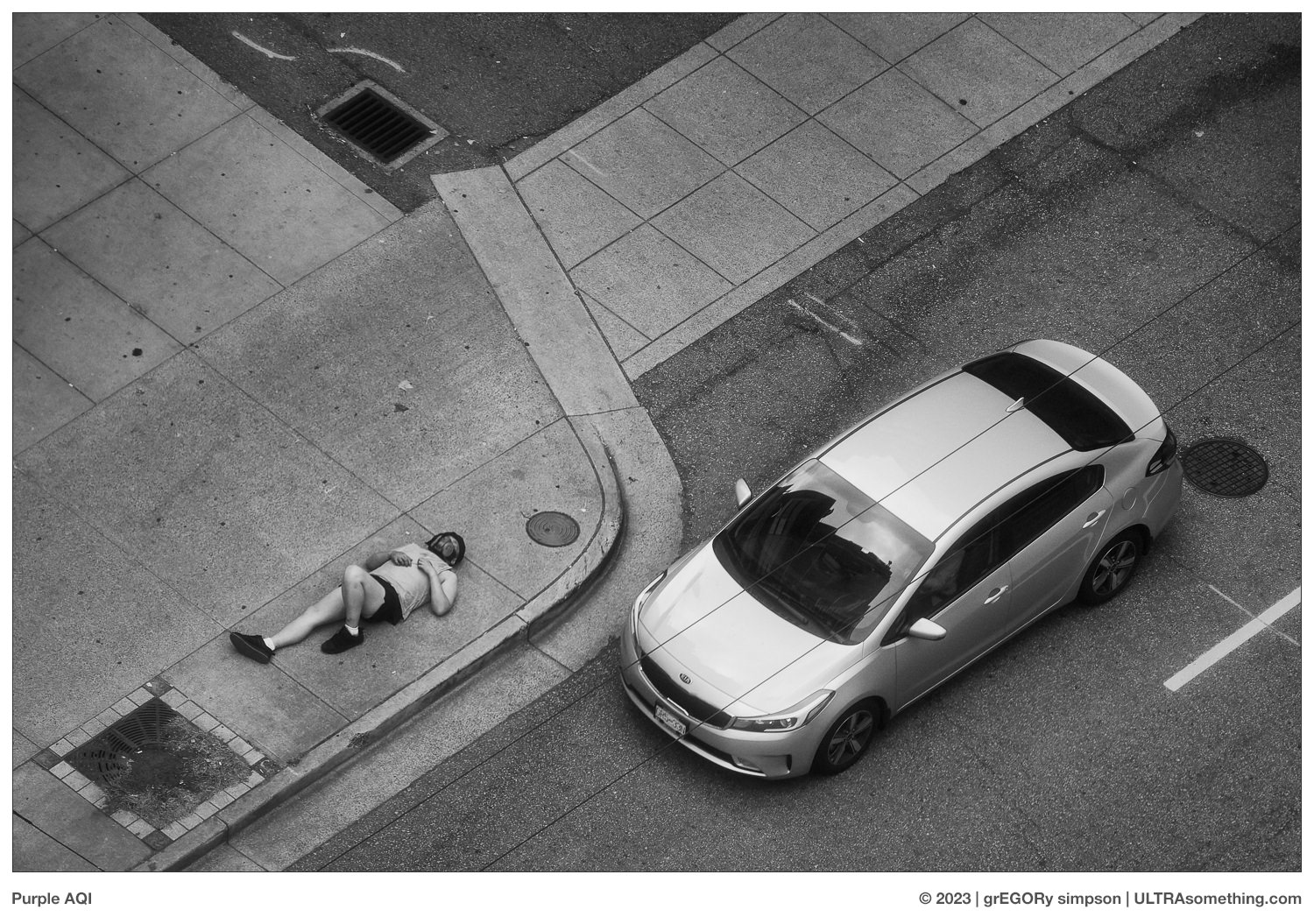
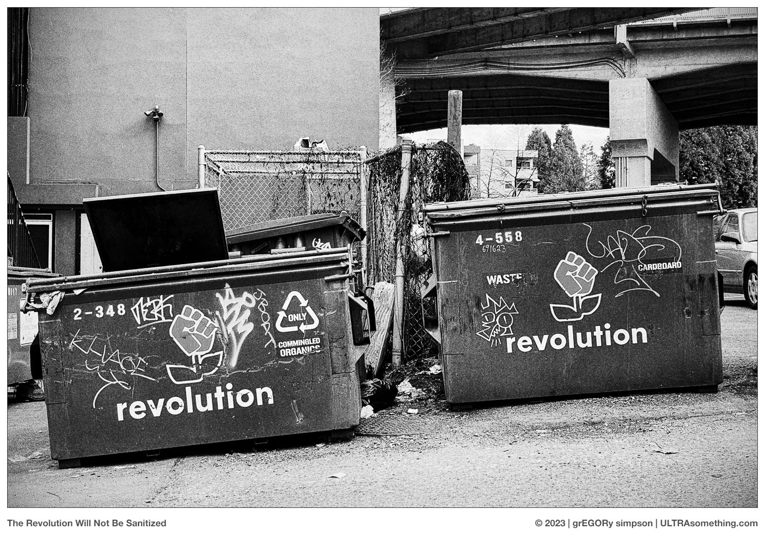
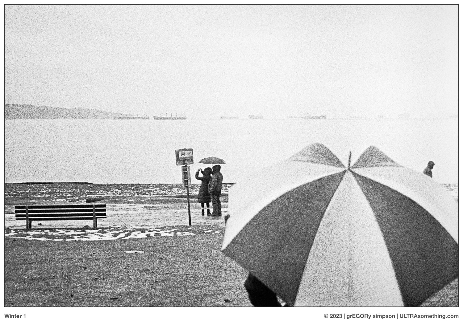
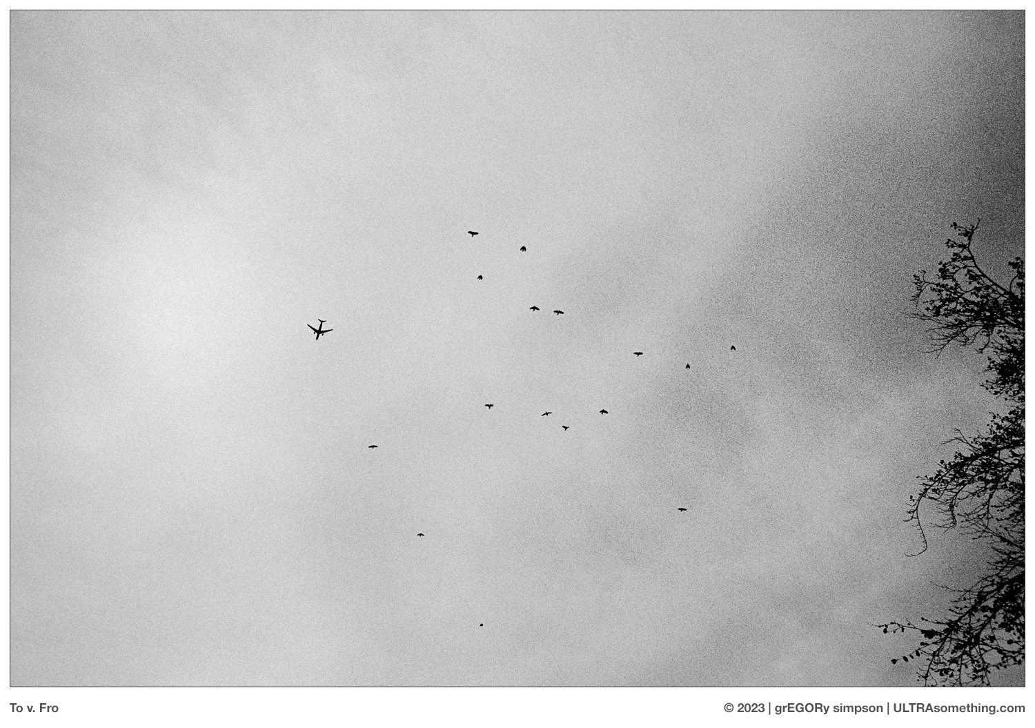
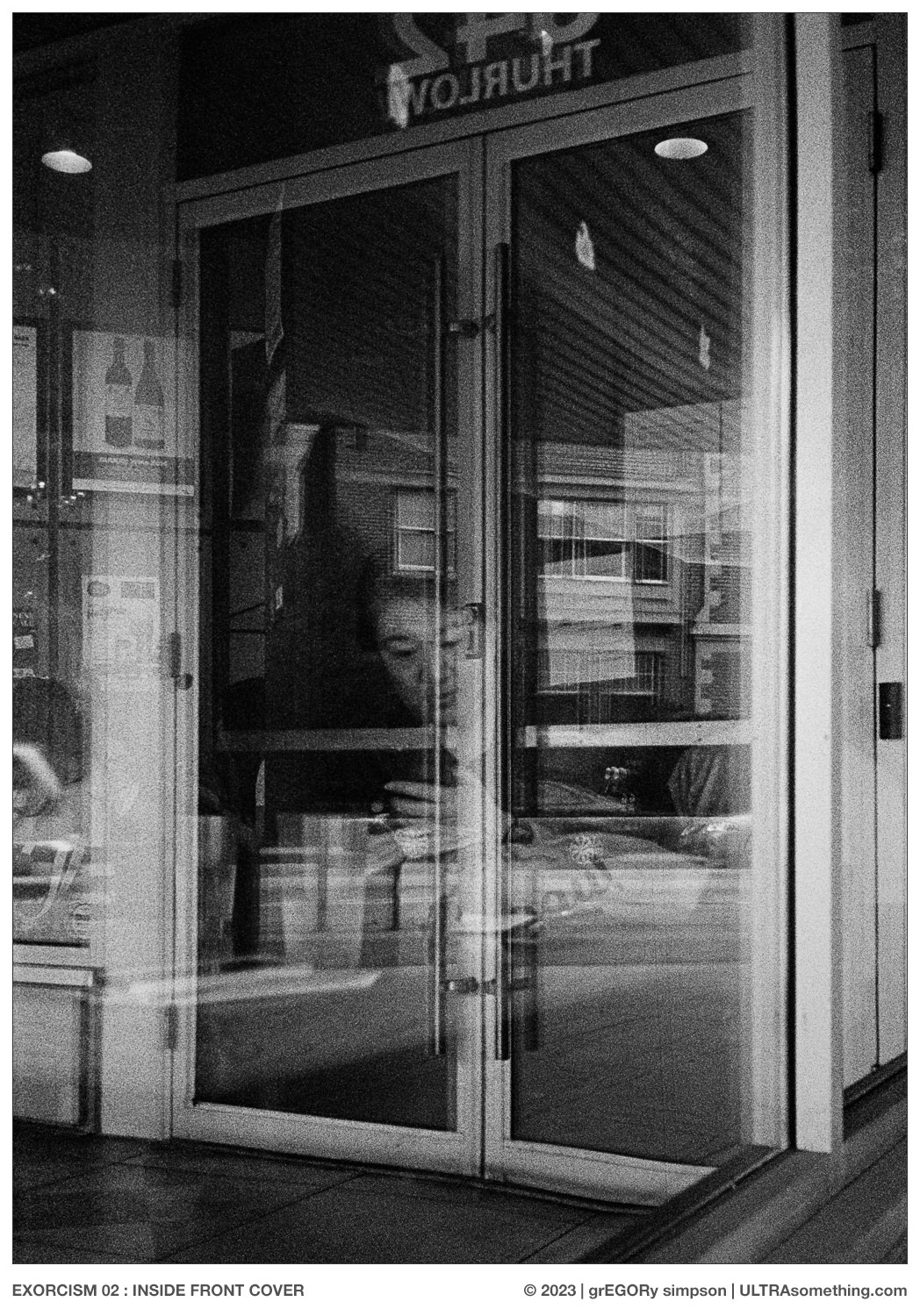
While walking around shooting that first roll in the Rapid S, I found myself singing a bastardized version of The Waitresses Square Pegs, which was written for the 1982 American TV sitcom of the same name. “Bastardized” because, rather than singing “square pegs”, I was singing “square negs, square negs, square, square negs.” In my defence, I’ll note that I never once claimed to be an intellectual. So naturally, when it came time to develop the first two rolls, I did so to the Waitresses “Wasn’t Tomorrow Wonderful” album, which — come to think of it — isn’t all that natural, since “Square Pegs” isn’t even on that album. The third roll was inexplicably developed to Tori Amos’ “Little Earthquakes,” which became explicable when I remembered the cover was mostly blank, save for a small photo of Tori stuffed into a little square box. The mind’s ability to free-associate is a curious thing.
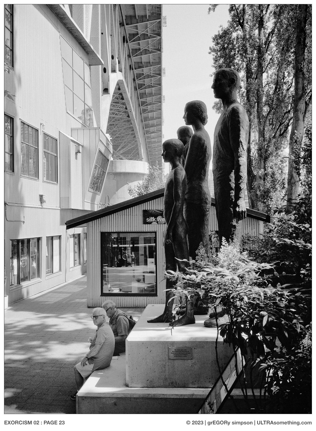
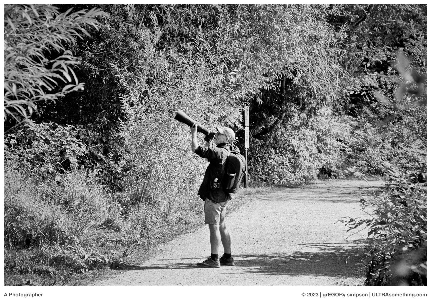
However, I had no such epiphany around my decision to name each photo after a movie. It’s simply that a few of them reminded me of films, so I went with it. There were several other photos I could have included with this article, but they didn’t immediately conjure up any recollections of motion pictures, so they didn’t make the cut. All photos, no matter their birth music or their movie title suitability, were shot on FP4+ and developed in Rodinal 1:50.
REMINDER: If you’ve managed to extract a modicum of enjoyment from the plethora of material contained on this site, please consider making a DONATION to its continuing evolution. As you’ve likely realized, ULTRAsomething is neither an aggregator site nor is it AI-generated. Serious time and effort go into developing the original content contained within these virtual walls — even the silly stuff.
Those who enjoy a tactile engagement with photographs are encouraged to visit the ULTRAsomething STORE, where actual objects, including ULTRAsomething Magazine, are available for purchase.