• Home
  • Blog
  • Gallery
  • Music
  • STORE
  • About
  • Contact
Posted by Egor 
· August 1, 2014 

Psycho Semantics

Bloggers are know-it-alls. I know this because I am a blogger, and thus know it all. Fortunately, most of us limit our didactic soliloquies to a single subject — thus freeing ourselves from the burden of having to explain everything to everyone.

For the ULTRAsomething blog, I’ve chosen to expatiate on photography. Regrettably, I long ago opted to avoid the lucrative sub-genre of “better photography through trendy gear acquisition,” and instead chose to spray my verbiage in the general direction of “better photography through existentialism, nihilism, philosophy and psychology.”

Naturally, being a know-it-all, I was fully conscious of this avenue’s inevitable unpopularity — but I also knew that introspection is far more likely to improve one’s photography than replacing last month’s gear with this month’s.

The upside of such unfashionable pontification is that I basically have the niche all to myself. This means I can invent whatever theories I want, and thanks to the worldwide reach of the internet, they soon become uncontested fact.

Usually I present my hypotheses within tidy little essays that both formulate and justify whatever crap is currently rattling around in my head. But my latest bout of psychological pondering has me stumped. Even though I make it all up as I go, I still want my theories to possess a modicum of plausibility. But, try as I might, I can find no cogent answer to the following question:

“Why, when I see the following stack of objects atop my desk, am I filled with excitement, anticipation and hope…

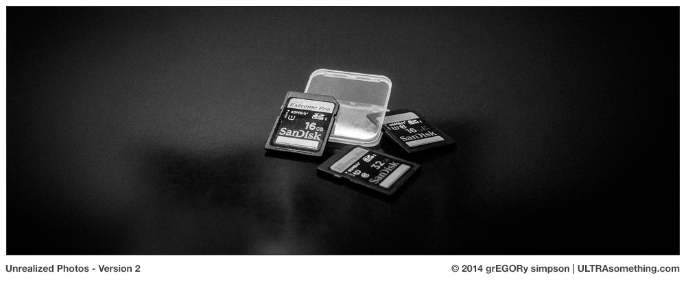
… while the similarly-themed stack of objects, shown below, stimulates absolutely zero emotional impact?”

Both photos depict a means to the same end. Both are empty vessels, ready to be loaded into a camera and filled with photographs that have yet to be shot. Shouldn’t they have an identical effect on my psyche?

With the film stash shown here, I’ll be able to shoot roughly 2000 photographs (depending on which cameras I use). The trio of SD cards should hold twice that many photographs (again, depending on which cameras I use). But wait — not only do I own more SD cards than what’s shown here (enough for at least 10,000 raw-format photos), but SD cards can be used time-and-time again, yielding a nearly infinite number of “potential images.”

Based on these statistics, shouldn’t the SD cards stir my photographic passions more than the film? If a big stack of film ignites my expectations for all those yet-unrealized photos, why does a stack of SD cards fill me with no more hope than when I look at a pair of my shoes? I don’t gaze upon my shoes and imagine all the places they’ll take me. And frankly, it would be a little odd if I did. So why do I do this with film?

Some might think it’s because I prefer film to digital. But that’s not the case. I prefer both. Each has its merits and its demerits. Each is indispensable in ways the other is not. I would be no more capable of choosing which to eliminate from my life than would a mother choosing between her children.

I’ve considered tactility as a potential factor. That is, film produces a tactile, physical result — an actual image on a strip of acetate or polyester. The SD card stores data — the opposite of tactility. But in reality, all my film gets digitized and fed into the same Lightroom catalog, where its data becomes indistinguishable from data recorded on an SD card. So that can’t be it.

Perhaps it’s more a matter of longevity? After all, film is “permanent,” while data is fleeting. Once you’ve erased an SD card, your photos are at the mercy of your media backup strategy. But negatives have their own Achilles heel — fire and theft. And unlike digital files, negatives can’t be cloned ad infinitum. Destroy a negative and poof — it’s gone forever. Destroy a digital file and I’ve still got three backups scattered around the world. Since all my film gets digitized, it also gets subjected to the same backup strategy as anything shot with a digital camera. So the only difference is that film gives me one additional “backup” copy — the negative. But having one additional backup is hardly a reason for such a visceral emotional difference.

A decade ago, I thought film was more “future proof” than digital. But do I still? I was always quite aware that anything shot on film could one day be re-scanned and re-processed — using technological improvements in both equipment and software to yield a better print. Yet for some curious reason, I thought this wouldn’t be true with digital. I believed that “all the data in a digital file is already being fed into the computer, so it can never look any better than it looks today.” But this is simply not true. I have digital files taken a decade ago that looked so horrible, I assumed they were destined for obscurity. But when re-interpreted with modern raw converters and re-processed with modern software, photos made from old raw files can also look better now than when I took them. So I no longer believe in the “future proof” theory. Film or digital — squeeze ’em both hard enough and you’ll always get a little extra juice.

Next, I considered the possibility that film provides more variety. Although both the film and digital worlds feature a nearly inexhaustible assortment of cameras and lenses, there seems to be very little variety in digital sensors. Look at any one slice of time, and you’ll see that most of the cameras produced within that slice have nearly identical sensors. Marketing departments might try to convince you otherwise, but the digital camera market basically acts as a single, homogenous entity. So if I go down to the local camera shop and purchase six current-generation cameras, I’ll basically be getting the same sensor tech in six different bodies. But if I purchase six different types of film, I’ll get six very different “looks.”

So is that the answer? Is it that film offers more variety? I think not, and here’s the reason: while digital cameras may all be similar to one another at any one time, they continue to change throughout time. Sure, there might be precious little variety if I purchase a bunch of new digital cameras at the same time — but if I purchase different digital cameras at different times and from different eras, I’ll get plenty of variety. Just look at the visible differences produced between, say, a CMOS sensor and a CCD. They’re world’s apart. But they’re both digital. And though they’re the exception, there are a few oddball sensors out there that will also give you a different “look” — Leica’s Monochrom; Sigma’s Foveon; Sony’s upcoming curved sensor; Fuji’s X-Trans (though that one’s more similar to the ubiquitous Bayer pattern sensor than it is different). So the variety is there with digital — you just need to own enough cameras to see it.

Ahh! Maybe that’s it? By shooting film, I can achieve a wide variety of looks within a single camera body. But to achieve a similar diversity with digital requires ownership of multiple bodies. This was likely the same bong from which Ricoh toked back in 2009, when they released their GXR camera. For those who don’t remember, the Ricoh GXR was a camera that featured interchangeable sensors. I thought it was the greatest idea in the world, and I still own and love this camera. Unfortunately for Ricoh, not a lot of other people agreed. Consequently, I can no longer buy new sensors for my GXR, making it the digital equivalent of Kodak’s equally irrelevant APS film format.

So is that it? Is frugality the answer? It’s certainly cheaper to buy multiple types of film than multiple types of digital cameras. And if I owned only one film camera, then I might have just solved this case. But I don’t. I actually own far more film cameras than digital cameras. So the notion that film lets me achieve multiple looks with one camera, while digital requires multiple cameras completely disintegrates between the theory stage and reality.

So what is it? Why do I perform an excited little dance whenever a fresh batch of new film hits ULTRAsomething headquarters? Yet a new SD card thrills me slightly less than a new tube of toothpaste?

I haven’t a clue. But I’m determined to figure it out. It is, after all, why they call it PSYCHO-logy.


©2014 grEGORy simpson

ABOUT THESE PHOTOS:

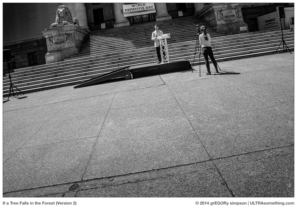
The photos contained within this article shine no additional light on the conundrum. Rather, they disprove yet another possible theory — that my approach to photography might somehow be different depending on whether I shoot film or digital. But it turns out this isn’t the case — I respond to the same subjects and the same stimuli, whether I’m depositing that image onto film or onto an SD Card. Case in point: the two “If a Tree Falls in the Forest” photos. Both illustrate the same situation — an embarrassingly small turnout to what, obviously, was expected to be a much more significant event. The first photo (which, paradoxically, is “version 2” of the “If a Tree Falls in the Forest” theme) was shot on a Ricoh GR digital camera using its 21mm (equivalent) lens adapter attachment. The second photo (which is “version 1” of the “If a Tree Falls in the Forest” theme) was shot with a Hasselblad Xpan using its 45mm lens, and developed in Caffenol-C-M. (See Note 1)

“A Failure to Communicate 3” is a continuation of a theme that began in my previous article, The Blacksmith’s Lot. That article contains two different photos illustrating a communications breakdown — both of which were shot on film. But the photo contained within this article was shot on a digital Ricoh GR, this time with its unmodified 28mm (equivalent) lens. Just as with the “tree falls” series, it illustrates that film and digital seem to have no bearing on the sort of photos I take, eliminating this as another potential answer to the question posed within the article.

Note 1: For those wondering why this photo was taken with an Xpan, yet isn’t panoramic, the answer is simple: The Xpan lets you choose between panoramic (65 x 24) format or standard (36 x 24) format. What’s particularly cool about this is that you can make these changes mid-roll. I learned rather early on that I can always squeeze one extra frame out of a panoramic roll of shots if, at some point in the roll, I switch the camera over and take one standard frame image. It’s the sort of thing you do to maximize your film dollar, and is also the sort of thing that’s completely unnecessary when shooting on SD cards — thus making yet another effective argument that my emotional delight at having plenty of unexposed film in stock is, perhaps, a bit psychotic.

If you find these photos enjoyable or the articles beneficial, please consider making a DONATION to this site’s continuing evolution. As you’ve likely realized, ULTRAsomething is not an aggregator site — serious time and effort go into developing the original content contained within these virtual walls.

Categories : Musings
Posted by Egor 
· July 7, 2014 

The Blacksmith’s Lot

“Wow! Was that your father’s camera?” asks the young be-suited man, nodding his head toward the Voigtlander Vito III dangling like an anchor from my neck.

I pretend he isn’t the fourth person to ask me this question today, and politely reply that “no, it was not” and “yes, there is a market for used film cameras.” A predictable course of banter follows, and I answer accordingly: “Sure, you can still buy film;” and “I don’t know where the nearest lab is — I just develop it myself;” and “no, it’s very easy and quite inexpensive.”

It’s not just the Vito III — most any time I venture into a crowd with one of my (way too many) film cameras, someone inevitably asks if it once belonged to my dad. Curiously, the only camera I own that actually did come from my dad is a Canon AE-1 — yet no one’s ever asked if that was my Dad’s camera. I’ve even been asked if my digital Leica M9 was my Dad’s camera. Stranger still, given the plethora of great female photographers throughout history, no one’s ever once asked if a particular camera belonged to my mother, even though carrying my Minolta Freedom Vista would afford me the ability to answer “yes.”

Other than my Rolleicord, the Vito III solicits more “father’s camera” inquiries than any other camera I own. It is, after all, a folding camera — definitely a relic of an earlier age — though it’s an age more associated with my grandfather’s era than my father’s.

Second in popularity to the “father’s camera” inquiry is the ever-curious, “does that thing still work?” I’ve never quite understood this question. I mean, how moronic would I have to be to walk around town with a non-functioning, ponderous chunk of metal and glass slung around my neck? Do these people think it’s a form of masochistic jewelry? Do they assume I’m being hazed for entrance into some fraternity of middle-aged men? I’m less likely to enter into conversation with these folks — offering a simple “yes, it works,” before hurrying along.

I suspect most ULTRAsomething readers will be interested more in how the Vito III operates than to whom it once belonged. But just how does one go about reviewing a camera that’s over 60 years old? Today’s gear expectations are not the same as our ancestor’s. Auto-focus, auto-exposure and scene modes are now the norm. So, too, is WiFi connectivity, built-in HDR and auto-stitched panoramas.

But really, are our needs all that different today than they were in 1950? Don’t the bulk of the features contained within modern cameras exist simply so today’s photographers need to know less in order to take a photo, and work less in order to share and display it? Isn’t the ultimate goal the same — a photograph?

From this perspective, it becomes rather easy to review old cameras — one needs merely evaluate them on how well they perform one simple task: photography. This means such attributes as build, handling and image quality are the yardsticks by which to measure the camera. So how does the Vito III measure up?

A Spot of History

The Vito III was made in the early 1950’s, and is one of the last cameras from the folder era. Truth be told, the folding camera market was basically dead by 1950, and this is why the Vito III is now such a rare camera: low demand meant low supply. Dueling historians argue over whether Voigtlander produced 12,000 or 16,000 of these cameras. But whichever historian you believe, the fact remains there are very few of these cameras out in the wild.

It’s important to remember that the Vito III’s low demand was due entirely to fashion and not to quality. In fact, many believe the Vito III may well be the best 35mm folding camera ever produced. It’s a bold claim that I can’t personally verify, since I’ve shot with very few 35mm folding cameras. But what I can say is that the Vito III is an absolute mechanical wonder, which is as pleasurable to use as its photos are to view.

Obviously the Vito III contains none of the advanced features expected in modern cameras. It was born in the day when cameras required their operators to have a smidgeon of knowledge. First, one needs to have some way of evaluating ambient light conditions — either by using an external light meter or by “seat of the pants” guestimation (my personal favorite). Second, it’s beneficial to have a rudimentary understanding of how aperture and shutter speed affect an image. And finally, it helps to know how to focus the darn thing.

That’s it. If you know these few, simple basics, then you can operate any old film camera without relying on owner’s manuals, menus, and multiple modes of operation. Learn one, learn ’em all. That’s one of the many benefits of old film cameras, and the Vito III is no different — though it is both a spectacularly good and somewhat quirky example, as we’re about to see.

The Good

The good is that the Vito III is a folding camera. You could carry it in your jacket pocket, assuming that pocket is stitched with titanium thread. This is one heavy (and well-made) camera — but it folds up compactly and slips effortlessly into a bag.

Its 50mm Ultron lens opens all the way to f/2 — a rarity for fixed lens cameras (of any era). The lens quality is superb, and I have no qualms shooting it wide open. Sure, it’s a bit “dreamy” at f/2, but this is an attribute I actually appreciate. Stop it down, and this lens could be the flag bearer in the sharpness parade.

Thanks to both the camera’s weight and its Synchro-Compur leaf shutter, handheld shots remain crisper at slower shutter speeds than do shots taken with lighter cameras that feature focal plane shutters. Basically, weight + leaf shutter = the 1950 equivalent of “image stabilization.”

Unlike many fixed lens cameras of its era — most of which required the user to estimate the subject’s distance — the Vito III has a built-in, coupled rangefinder. That rangefinder also happens to be quite accurate and, surprisingly, has a focussing patch that’s still bright and contrasty enough to actually see.

The Quirkily Good

Speaking of focusing, the Vito III uses a totally wacky focus methodology. Rather than turning a focus ring on the lens to focus it, the camera is focussed by turning a knob on the top of the camera. This allows you to firmly grasp the camera with both hands — your right hand doing double duty on the shutter release, and your left hand twiddling the focus knob. It took a few days before this got instilled into my muscle memory, but once it took hold, I really started to enjoy the ergonomics of focussing this way.

Since the focus knob is where most cameras place the film rewind knob, the Vito III engineers crafted a rather clever dual-functioning knob, where flicking a button releases a handle that transforms the focus knob’s functionality into the expected rewind knob. It’s quite ingenious, and one of those things that makes old film cameras so fun to fiddle with.

Not content to limit their ingenuity to knobs, the Vito III also sports a cool little pop-up stand on its baseplate, which allows the camera to sit perfectly level on a tabletop whenever the lens bellows is extended. Again, it’s the sort of nicety that’s so utterly associated with an earlier era, that I just can’t help playing with it.

The Quirkily Quirky

Strangely, the Vito III’s viewfinder has absolutely no frame lines of any kind. Zip. Zero. Nada. This means the exact cropping of every photo you take is going to be somewhat of a surprise. And if your subject is at the lens’ minimum focus distance, there’s a darn good chance the surprise won’t be a good one — parallax errors forcing anything seen in the center of the viewfinder to ultimately appear at the top (or even off the top) of your photograph. I suppose this is something I’ll get used to eventually, but it’s going to take a few more rolls before I have a handle on what will and will not be in my photographs.

Continuing in the frame vein, I should probably mention that frames on a Vito III negative are more tightly packed than on any of my other cameras — meaning the space between photos is absurdly small. The upside of this is I always get one more shot per roll than I would get with any other camera. The downside is that one needs the hands of a surgeon to cut up negatives without cutting into an actual frame.

The next issue isn’t necessarily “quirky” nor is it unique to the Vito III: but the shutter does need to be manually cocked. My Rolleicord, which is a medium format camera, also works this way. But in the 35mm world, it’s much more common to have the shutter automatically cocked by the film advance. On the Vito III, advancing the film and cocking the shutter are two separate and distinct operations — both of which must be completed prior to taking a photograph. Having grown accustom to this two-step dance with my Rolleicord, I found it wasn’t really much of a problem with the Vito III. In the several rolls of film that I’ve now spooled through the camera, I think I forgot to cock the shutter only twice.

One issue I haven’t adequately resolved is the curious fact that the Vito III was built without strap lugs. If you want to dangle the Vito III from your shoulder, you’ll need to use the camera’s original ever-ready case to do so. As I have a psychological aversion to ever-ready cases, this has presented a bit of a problem for me.

I did my best to adapt to the ever-ready case. I used it for the first roll or two that I ran through the camera. And if it was the sort of ever-ready case that allowed you to detach the front half from the back half, I’d probably still be using it. But it’s not — it’s the sort that has the front flap firmly and permanently affixed to the body-case, thus insuring it’s always dangling like a turkey waddle below the camera body.

I next tried carrying the camera in a small, easily accessed bag — but it simply takes too long to extract the camera and open the lens. It’s already a camera that demands slow and deliberate shooting, and since I tend to photograph rather ephemeral subjects, it took a total of 6 shots for me to reject this solution.

So lately, I’ve opted for the roguishly swashbuckling technique of carrying the camera in-hand, with the lens extended and ready for business. Without any type of strap to secure the camera, I adopted a gripping technique in which I curl my fingertips into the opening where the bellows extends. Besides the fact that I need to be careful not to jam a finger into the bellows, there’s an additional complication: an extension lever, which couples the shutter release button with the actual shutter release on the lens, runs right under my fingertips — meaning I need to alter my grip before I can actually take a photo. Considering this might well be the most delightfully engineered camera I’ve ever used, the absence of any strap securing methodology strikes me as totally insane. But in the Vito III’s time, no one used a camera without an ever-ready case, so I guess there was some sort of perverse logic to this decision.

Conclusion

Have you ever been to one of those ‘old-timey’ tourist traps? The kind where actors dress in period costume and perform bygone tasks like butter churning and blacksmithing? I used to feel somewhat sorry for those folks — possessing a skill that nobody actually wanted. But at some point during the middle of this review, it occurred to me that I have become one of them! Film photographers are quickly facing the same fate the befell farriers — practitioners of a craft with a greatly diminished demand. But sadly, unlike the aforementioned butter churners and blacksmiths, film photographers haven’t yet (to my knowledge) become a staple in historical reenactment attractions. But if they ever do, then the Vito III would make a mighty fine prop: durable, dependable and decidedly old-fashioned in appearance.

In its day, the Vito III was considered the pinnacle of 35mm folders. It was a professional’s camera — designed to appeal to that era’s luddites, who preferred the familiar old-skool folding camera format to those fancy new Leica III’s.

In our day, the Vito III is still considered the pinnacle of 35mm folders — though it’s likely not a camera one would choose for daily use. Nor is it necessarily going to be the one film camera you choose to own should you decide to own one. But it is, in its own way, a work of art. And in the hands of a skilled photographer, works of art should emerge effortlessly from this camera.

When I bought the Vito III, I wasn’t sure how much use it would get. But now that I’ve had it for several months, I’m finding myself turning to it more-and-more frequently — often throwing it into a bag just because it slips so easily into a sliver of space. “Modern” guy that I am, I usually prefer shooting with my Leica III’s, but there’s a seductive quality to the Voigtlander Vito III that entices. It’s a camera that’s easy for camera lovers to love.

And by the way, should anyone need an old-timey photographer to set up shop in their old-timey tourist village, I’m pretty sure I’ve got an old-timey Domke photo vest around here somewhere. It’ll make a swell costume.


©2014 grEGORy simpson

ABOUT THESE PHOTOS:

This article contains two types of photos: those taken with the Voigtlander Vito III and those taken of the Voigtlander Vito III. It’s fairly obvious which camera took the former, while the latter were both shot with an Olympus OM-D E-M1 with a 60mm Macro lens. The Vito III photos shown here were shot on two different film stocks. Specifically, “A Failure to Communicate 1,” “Target Marketing,” “Demi-Monde,” “Type B: Two Types” and “Portland: First Light” were all shot on Fomapan 200, exposed at ISO 160, and developed in Rodinal 1:50. “Obstacle” and “A Failure to Communicate 2” were shot on Fomapan 100, exposed at ISO 100, and developed in Rodinal 1:50.

Regarding the product photos: “Voigtlander Vito III” shows the camera open and ready for action. “Top-Deck Focus” shows the location of the Vito III’s focus mechanism, as discussed in the article. Incidentally, you would be safe to assume that a backdrop consisting of Vladimír Birgus’ book, “Czech Photographic Avant-Garde” does, indeed, constitute a tacit recommendation.

If you find these photos enjoyable or the articles beneficial, please consider making a DONATION to this site’s continuing evolution. As you’ve likely realized, ULTRAsomething is not an aggregator site — serious time and effort go into developing the original content contained within these virtual walls.

Categories : Photo Gear
Tags : Black and White Photography, Film Photography, Folding 35mm Camera, Voigtlander Vito III
Posted by Egor 
· July 1, 2014 

Caffenolog 2: A Shot in the Dark

Word on the street is that ULTRAsomething is a photography blog. But in the six years I’ve dutifully supplied it with text and photographs, I never once considered myself a blogger. Perhaps that’s because, as a blog, ULTRAsomething does everything wrong. New posts don’t appear daily. And when they do appear, they’re neither simple nor succinct. They weave multiple subjects into crafted narratives and gleefully embrace diversion — seemingly addressing one topic, while subtly being about something else entirely. As blogs go, ULTRAsomething may well be one of the worst examples on the net.

Because nobody wants to create the “worst example” of anything, I spent the past six years trying to convince people that ULTRAsomething was not a blog, and that I was not a blogger. For a time, I described this site as a column and myself as a columnist. Yet everyone still called me a blogger. So I began alluding to ULTRAsomething as a publication and myself as an essayist. “Great blog,” wrote my readers. A couple of years ago, I tried something more “clever,” and referred to the posts as ARTicles — the capitalization scheme designed to mirror the site’s name, as well as provide a playfully ironic bit of word play. But in the wide world of the web, ULTRAsomething remained a blog.

So when I redesigned the site last month, I gave up trying to refer to this collection of columns, essays and ARTicles as anything other than a “blog.” If that’s what people want to call it, that’s what it must be. So to commemorate the occasion, I did something unprecedented on the ULTRAsomething site: I wrote an actual blog entry. Note that I define “blog” in a somewhat rigid, old-fashioned way (if anything web-related can be considered “old-fashioned”). The word “blog” is short for “web log,” which I interpret most literally to mean “an activities log kept on the web, rather than in a hand-written notebook.”

The idea was to keep a detailed record of my findings and observations as I fine-tuned my caffenol film developing methodologies. Caffenol, as discussed in the first post, is a DIY film developer mixed from instant coffee, washing soda and Vitamin C. Given its experimental, grass-roots formulation, very little data exists. So, in order to give a little something back to the community, I decided to document each and every caffenol experiment — discussing exactly what I did, how I did it, and what film I did it to. In other words, a “web log.”

Curiously, after finally succumbing to the pressure to call ULTRAsomething a “blog,” and after writing its first true term-complient posting ever, the Caffenolog 1 entry became my least read article of the year. Funny how that works…

Experiment 2: Neopan Acros 100

Caffenolog 1 ended with my utter amazement that this syrupy swill actually worked. Not only that, it worked quite well. The only issue I had was that I’m not particularly fond of the way Kentmere 100’s grain looks when pushed to ISO 200. So for this experiment, I’ve done everything exactly the same as before, only I’ve used Fuji Neopan Acros 100 film, which I also pushed to ISO 200. Please refer to the Caffenolog 1 post for the ingredients, recipe and techniques that I used here.

I again made up a 500ml batch of Caffenol-C-M, even though I only need 300ml to develop a single roll of film. If anyone routinely whips up caffenol batches of less than 500ml, please leave a comment and let the caffenol community know your results. I would have done it myself, but downscaling the recipe would necessitate measuring ingredients in tenths of a gram, and my scale is granular only to whole grams. Perhaps, given my inherent frugality, this will be the focus of a future experiment.

Aside from the film itself, the only other thing that changed from my previous experiment was the water temperature. My water supply clocked in at 23.5°C — a half-degree cooler than before. So I made a slight adjustment and increased development time from 10:50 to 11:17.

Just as with the Kentmere 100, the Acros 100 emerged from the tank much darker than film developed in anything I’ve used previously. Note that when I talk about the “darkness” of the negative, I’m not referring to a dark (overexposed or overdeveloped) image — I’m talking about the entire negative, sprocket region and all. Most B&W negatives are fairly clear in the regions surrounding the actual image, but with Caffenol, those areas are extraordinarily dark. Currently, I’m assuming this is due to staining from the coffee and not an overall fogging — though a future experiment involving the addition of Potassium Bromide will either confirm or disprove this suspicion. I did note that the Acros 100 negative was slighty less dark than the Kentmere 100 negative — perhaps on the order of a half-stop. I wonder if this has to do with the fact that Kentmere 100 sits on an acetate base, while Acros 100 uses a polyester base? It’s another data point to investigate moving forward.

To insure the least number of variables possible, I shot this set of negatives using the same camera that I used in the first experiment — a Hasselblad XPan. Similarly, all negatives were “scanned” with the same Olympus 60mm macro lens mounted on the same Olympus OM-D E-M1 digital camera.

Although it’s difficult to tell from the downsized, web-compressed photos shown in this post, there were some significant differences between the two sets of negatives. As I had hoped, the Acros 100 had a much tighter and more pleasing grain structure, along with a very rich and malleable set of mid-tones. The shadows were, however, rather unsatisfying — blocking up quickly and exhibiting very little detail.

It was at this point that I realized I made a fundamental error in judgement. I had never before shot with Acros 100 and was thus completely unfamiliar with how it “normally” looks, much less how well it responds to 1-stop pushes. So this second caffenol experiment really doesn’t tell me anything useful. Maybe the shadows normally block up when Acros 100 is pushed? I don’t know. And for this reason, I don’t know whether caffenol is the cause or not. As nice as I think the highlights and mid-tones look here, maybe they actually look better (or worse) in a standard developer? Again, without having any prior experience with Acros 100, there’s no way for me to know whether caffenol is a good developer choice or a poor one.

So my direction for the next caffenol experiment is obvious — use a film with which I’m intimately familiar: Tri-X perhaps. That way I have a base of knowledge upon which to draw some conclusions…


©2014 grEGORy simpson

ABOUT THESE PHOTOS:

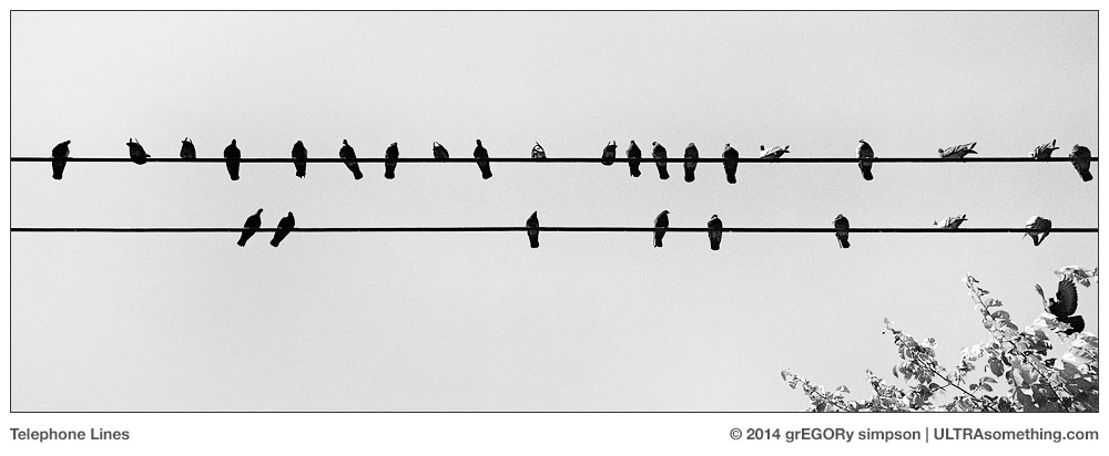
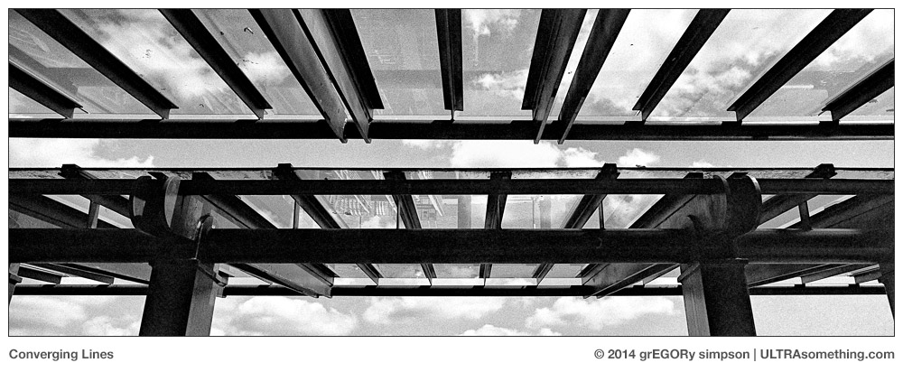
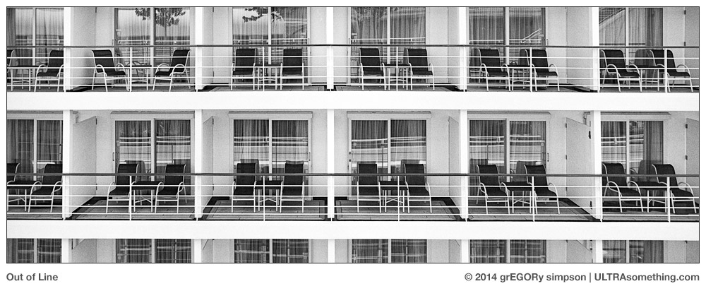
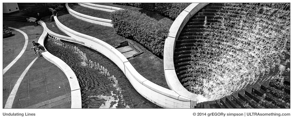
As with my first caffenol experiment, I had a very short amount of time available for exposing the test roll. So just as I did then, I looked for a “theme” to help me quickly push film through the camera. This roll’s theme was lines: all kinds of lines. Some lines were fairly literal, some were implied, and some were wordplay tricks (or “cheating,” if you prefer). But everything I shot was some kind of line. “Telephone Lines,” “Converging Lines,” “Guy-Lines,” “Out of Line,” “Undulating Lines” and “Ikea’s New Stads-Rotä Line” were all shot with a 45mm Hasselblad XPan lens mounted on a first-generation Hasselblad XPan, exposed on Fuji Neopan Acros 100, which I rated at ISO 200 and developed in Cafenol-C-M as described in this (and the previous) caffenol article. “Horizon Line” was shot with the same configuration, only a 90mm lens was used instead. And for anyone wondering about the Ikea shot, the answer is “no I don’t speak Swedish, but I did manage to name this furniture line with the help of Google Translate.” Actually, I had several other names in mind, but I really wanted an umlaut, so it took a bit of experimenting…

If you find these photos enjoyable or the articles beneficial, please consider making a DONATION to this site’s continuing evolution. As you’ve likely realized, ULTRAsomething is not an aggregator site — serious time and effort go into developing the original content contained within these virtual walls.

Categories : Photo Techniques
Tags : Black and White Photography, Caffenol ingredients and techniques, Caffenol-C-M, Film Developing, Hasselblad Xpan
Posted by Egor 
· June 12, 2014 

Cones of Silence

The idea of a website refresh struck me, quite literally, while walking down the sidewalk one pleasant afternoon. An oblivious smartphone user — their attention focused intently on their handheld device — slammed into me with such force that I nearly dropped my own device — a decidedly less-fashionable, early-1960s Olympus PEN-EE half-frame film camera.

Were it not for my deftly executed evasion effort, the collision would have been head-on, rather than the shoulder-to-shoulder impact that resulted.

“Umph,” I said involuntarily, as the air rushed from my lungs.

“Sorry,” grunted the iperson, never once lifting their eyes from the device. It was the sort of unapologetic apology that could only come from someone who repeats it several times a day.

Over the past few years, collisions with distracted smartphone users have risen to second place on my personal list of ‘bruises, contusions and their causes.’ Annoying? Certainly. But many years on earth have taught me the futility of my attempts to change the course of human behavior. So these days, instead of rebelling, I seek to adapt. And I realized that, amongst these millions of isolated and preoccupied souls, not a single one of them was being distracted by the ULTRAsomething site — because the ULTRAsomething site was fundamentally unreadable on a smartphone.

If social mores now dictate that people plow into one another on the street, then shouldn’t I get a piece of that action? Shouldn’t I, in some small way, contribute to the new spirit of heedlessness that’s sweeping the world? Wouldn’t it be great if, instead of muttering “sorry” after ramming into someone, people could say, “sorry, I was totally absorbed and enthralled by the latest ULTRAsomething post.” Now that’s worth a bruise or two.

Since the dawn of the world wide web, I’ve changed my site once every five years. It’s a rate far too infrequent to keep pace with the ever-shifting technological landscape. But it’s always such a laborious ordeal, that I tend to put it off as long as possible.

When I last modified the ULTRAsomething site, the iPhone was still an infant — its sleek, glass touchscreen merely a prophesy of a utopian future filled with internet-enabled, portable handheld devices. Obviously, as one can tell from my assortment of multi-colored contusions, that future is now.

So for the last three weeks, I’ve been re-coding the ULTRAsomething site from scratch. I completely ditched my old fixed-width website, and have adopted a responsive web design that automatically reconfigures itself depending upon the device used to view it. For many of you, these changes will manifest mostly as cosmetic (though I did also implement a multi-tiered navigational menu, which eliminates the use of drop-down lists for the phone & tablet crowd). The biggest changes will be seen by anyone who once tried to read this site on a smartphone. No longer must one pinch, tap and scroll awkwardly to read a few lines of text — instead, the site will reformat itself to be read and navigated quite easily.

I apologize to anyone who has visited the ULTRAsomething site this past week, and endured some weird or ugly formatting. While I did make the bulk of these changes offline before uploading the new site, I’ve continued to “tweak” the live, online version directly. It’s a technique known as “cowboy coding,” and truth be told, I’m not a fer’ real cowboy.

Aside from the fact that the site is now mobile-friendly, there are also a number of underlying changes that will allow me to expand ULTRAsomething in new and exciting ways in the coming months. There are, of course, still some bugs to squash, and I’ll eventually get around to fixing most of them sometime during the next five years.

Also, all you readers who once complained about the old site’s dark background will rejoice in the new, inverted layout. Meanwhile, all you readers who dislike sites with a light background can commence complaining.

So for anyone who can’t possibly wait until they get home to read the latest photo-related yarn on the ULTRAsomething site, now you don’t have to. You can read it on the bus, in the mall, or even while playing human pinball on the street. But please have the good sense to not read it while driving — ULTRAsomething may have adapted to modern imprudence, but we still need to draw a line somewhere.


©2014 grEGORy simpson

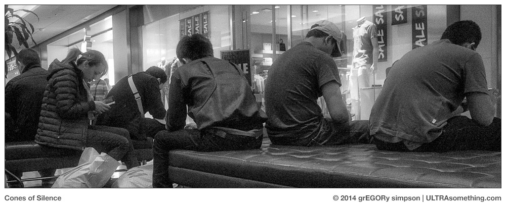
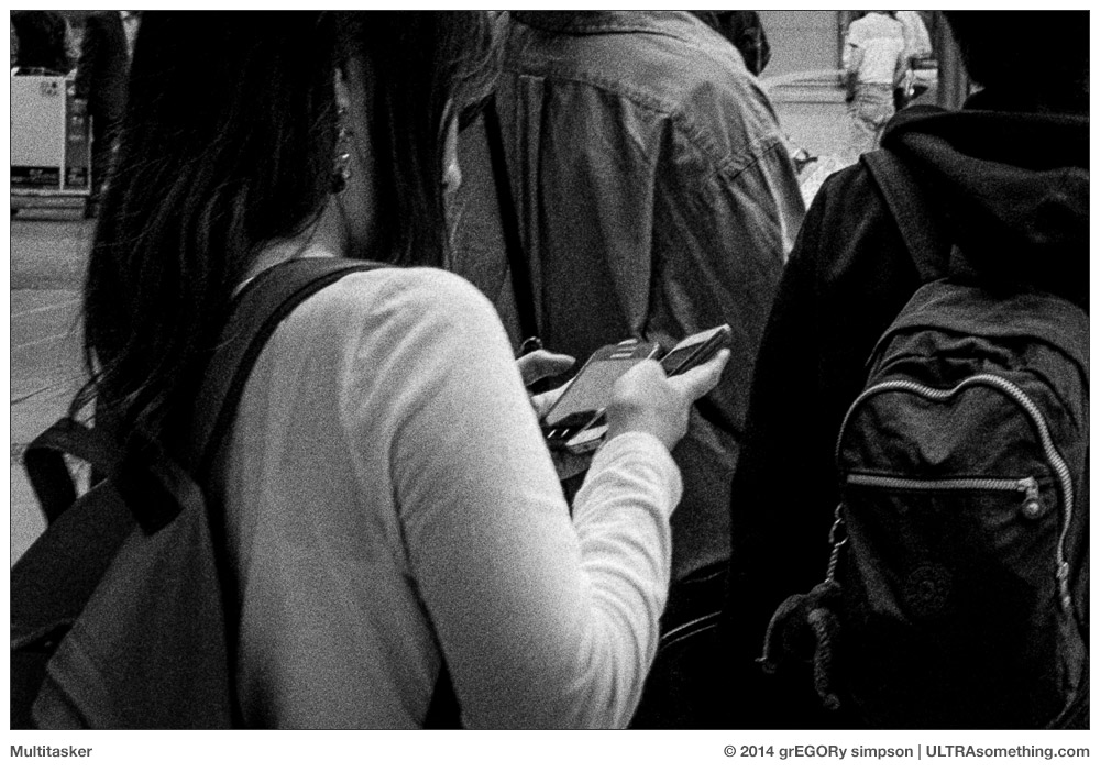
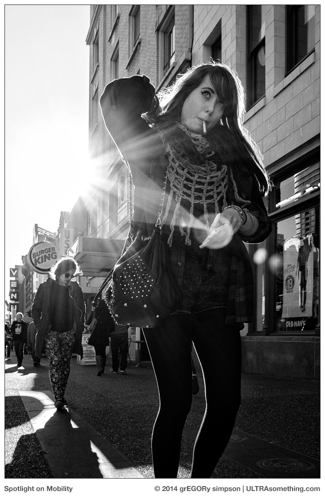
ABOUT THESE PHOTOS:All four photos were taken at various times in the last couple of months with my Ricoh GR digital camera. They were selected for publication for the most obvious of reasons. Note that the fortuitous lens flare in “Spotlight on Mobility” is actually the result of serendipity, and not subterfuge.

If you find these photos enjoyable or the articles beneficial, please consider making a DONATION to this site’s continuing evolution. As you’ve likely realized, ULTRAsomething is not an aggregator site — serious time and effort go into developing the original content contained within these virtual walls.
Categories : Musings, ULTRA news
Posted by Egor 
· June 1, 2014 

Caffenolog 1: Enter the Dragon

It’s been several years since the Caffenol craze took the online world by storm. And by “online world,” I mean “a tiny little corner dedicated to film photographers who develop their own black & white film.” And by “storm,” I mean “a collection of forums, blogs and Flickr pools that cumulatively number more than one.”

Caffenol is a home-brew alternative to commercial film developers. It was first formulated in 1995 by Dr. Scott Williams and the students in his Technical Photographic Chemistry class. Their goal was to devise a developing technique using only commonly available household ingredients. The original recipe used coffee, baking soda and potassium hydroxide, but over the next decade others would tweak and tune the ingredients to increase the developer’s effectiveness. Recently, the popularity of blogging and social media helped to further spread awareness of the technique — involving more people in the experiment, and even giving the substance its hip caffenol moniker.

In March 2010, Rheinhold G. launched a caffenol-focused blog to track his progress with various formulas and techniques, and to solicit opinions and alternate methodologies from his readers. For the next several years, this blog became one of the central repositories for caffenol knowledge.

Unlike commercial film developers, which are created by the calculations of pointy-headed lab geeks, Caffenol is an empirical developer derived from the experiments of pointy-headed film geeks. There are no corporately produced data sheets for Caffenol development — only blogs and forum postings. In November 2012, Bo Sibbern-Larsen gathered much of the information threaded throughout Rheinhold’s blog (and others), and published the free Caffenol Cookbook for all who wished to partake.

The Big Bang

For the past couple of years, I’ve been developing all my film using either Rodinal or Diafine — a combination that’s kept me happy as a pig on a vegetarian’s farm. These two developers are cheap, have long shelf lives and produce radically different results — meaning I can choose which developer I need for which particular look I seek. Caffenol intrigued me, but it just seemed so… nerdy.

But a few weeks ago, I found myself smack dab in the middle of Nerdy Town. I was immersed in writing an epic series of articles discussing the B&W capabilities of the Foveon-based Sigma DP-Merrill cameras. I was weary, and needed a break from all those bits & bytes.

“Take a photo walk,” I told myself before quickly adding, “and take a film camera — I don’t wanna shoot no stinking pixels.”

I checked the Rodinal stock — nearly depleted. “Best not waste it on this,” I thought.

I looked out the window. Sunny. “Not a good day for the extensive speed pushing characteristics of Diafine,” I opined.

So, with my nerdy side in full bloom, I reached the only logical conclusion — it was time to try Caffenol.

I’d been following the exploits of the Caffenol crowd since some time in 2009, and not once had I read an article about anyone blowing up their kitchen; much less catching their eyebrows on fire. And I’m fairly certain, given that its primary ingredient is coffee, that someone somewhere was probably dumb enough to taste it — yet I never once read of anyone succumbing to Caffenol poisoning. From this, I leapt to the obvious conclusion that Caffenol manufacturing was entirely safe — even for me.

So I did a quick read through of The Caffenol Cookbook, made a shopping list of the “readily available” ingredients required, and substituted a walk to the local grocery store for the originally planned photo walk.

Turns out these so-called “readily available” ingredients aren’t exactly readily available. The most basic Caffenol formula (Caffenol-C-M) involves only 3 ingredients: Instant Coffee, Powdered Vitamin C and Washing Soda. The instant coffee was easy — I grabbed some Folgers, which was the cheapest jar on the shelf, and took off for the laundry aisle.

Its shelves were stocked with a bewildering variety of detergent brands — each brand encased in a brightly saturated plastic tub of eye-piercing color. I donned my sunglasses and perused the labels: not a single one contained “washing soda.” Nearby, a stock boy pretended to be busy haphazardly rearranging shampoo bottles. “Where might I find the washing soda?” I asked to his obvious chagrin. He pointed to the Tide, then waived his hand to-and-fro across the rainbow coloured shelves. No help there.

Next, I went to the vitamin aisle, where I discovered there are at least 73 different brands of identical Vitamin-C capsules for sale. You’d think one of those brands could have distinguished itself by actually making a powder. They didn’t. I briefly considered hunting down my shampoo shuffling friend, but assumed his solution would involve pointing toward the hammers in the housewares aisle. I left the store with only the coffee, and proceeded to walk a few blocks to the next-closest store.

That store also failed to stock either Washing Soda (sodium carbonate) or Vitamin C powder (Ascorbic Acid). So I went to another, and another, and another… until I finally got smart enough to think of a better solution than wandering aimlessly from store to store. I remembered the “smoothie bar” inside my local Dietary Supplements store. They sell milkshakes for exorbitant prices, which they justify by mixing in spoonfuls of powdered vitamins — thus enabling them to market ice cream treats as “health food.” Perhaps they would have powdered Vitamin C? Eureka! A quick exchange of cash, and one jar of pure powdered ascorbic acid was mine.

Next I did some more research into Washing Soda, and it seems to be a product championed by people who are drawn to the term “all natural.” So I went to a local grocer that specialized in “natural” products and, sure enough, big heavy bags of powdered washing soda were available for a mere couple of bucks.

I now had everything I needed to prepare my first batch of simple, basic Caffenol-C-M.

The First Roll

I spent so much time researching Caffenol and hunting for ingredients, that the deferment of my Sigma review had turned from dalliance to negligence. But I was too far down the rabbit hole to stop now. I had a burning need to develop something — anything — in Caffenol.

I’d read that most people experience about a 1-stop push from Caffenol-C-M, so I decided to start there. I wasn’t pushing film in any of my currently loaded cameras — so I needed to load another camera specifically for testing. I chose the Hasselblad Xpan for two reasons: First, its extra-wide negatives meant I could fill a roll with only 21 shots; and second, its optics are impeccable — meaning any “issues” I saw would be related to developing, and not due to the camera. I loaded the Xpan with my “go to” (aka, “cheap”) test film — Kentmere 100, pushed the ISO to 200 and took off on a 90 minute walk to expose it.

Here is the Caffenol-C-M recipe I used to develop this first roll of film:

  • 500 ml filtered tap water (24 deg C)
  • 27g Washing Soda (V.I.P. brand)
  • 8g Vitamin C Powder (Organika brand)
  • 20g Instant Coffee (Folgers Classic Roast brand)

I added the ingredients in exactly the order listed: First I added the Washing Soda to the water, stirring to dissolve. Next I stirred in the Vitamin C powder, then the coffee.

At this point, I was convinced something had gone wrong. I’d read that the addition of Vitamin C causes massive amounts of foaming — yet I had no foaming at all. Also, I’d read tales of Caffenol’s horribly unpleasant smell. Mine had a faint odor — but nothing nearly as offensive or pungent as my Ilford Rapid Fixer. And, unlike the fixer, the Caffenol smell doesn’t linger.

I pre-soaked the film for 5 minutes in filtered tap water, poured it out and poured in the Caffenol-C-M. I inverted the tank 10 times to begin, then 3 times each subsequent minute. Because my water was 4 deg warmer than the specified 20 deg C, I reduced the suggested 15 minutes of developing time down to 10 minutes and 50 seconds. When the alarm sounded, I dumped the syrupy coffee solution down the drain.

I next filled the tank with filtered tap water, which served as a simple, acid-free stop both. I agitated for 30s, then let the water sit for another 30s. I repeated the stop bath with a second tank of filtered tap water — mostly because the Caffenol was so thick, I was afraid it would contaminate my fixer.

I then fixed with Ilford Rapid Fixer for 5 minutes — inverting for the first 30s, then performing 3 inversions every minute thereafter. I washed the film using the standard Ilford washing technique, and hung it to dry.

When I first pulled the film from the tank, I panicked — the entire roll was black. But when I held the negative up to the sun, I could see there was indeed some kind of latent image buried within all that blackness. Never, in my long history of developing film, had I ever developed a negative this dark nor this dense. It was darker than a demon’s soul, and denser than a partisan, party-loyal politician. Frankly, I wasn’t sure I’d be able to scan it.

But surprisingly, I was indeed able to scan it — and by “scan it,” I mean “photograph the negatives with an Olympus OMD-EM1 camera and a 60mm Macro lens.” I did have to adjust the base exposure that I normally use when photographing negatives — the caffenol negatives were about 5 stops darker! But buried under all that coffee stain was a full-range negative with a pleasing tonality.

In spite of some initial uncertainty about my choice of ingredients, and in spite of the darkness of the developed negative, my first foray into Caffenol was a success. Some of the shots from this first roll are included with this article. The only thing that gave me pause was the grain — Kentmere 100 doesn’t have the prettiest grain, and when pushed to ISO 200 it turns downright ugly. So what if I were to use Caffenol on a better film — one with a grain more conducive to push processing?

And thus the seeds of experimentation are sown, and ULTRAsomething will play host to my ongoing caffenol experiments; my logs; my caffenologs.

The Xpan is now loaded with a more expensive film stock — Neopan Acros 100 — and is waiting patiently on the shelf for the next time I feel nerdy. Stay tuned for Part 2…


©2014 grEGORy simpson

ABOUT THESE PHOTOS:

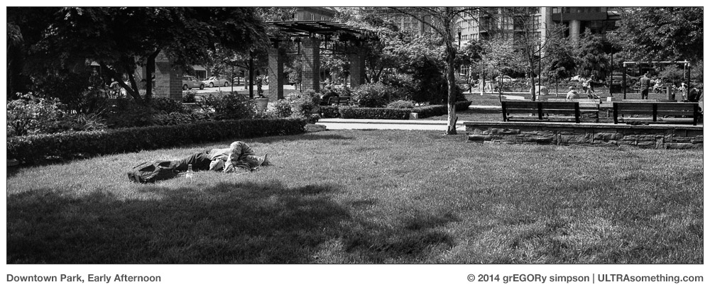
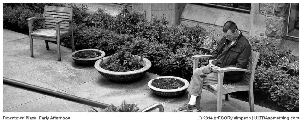
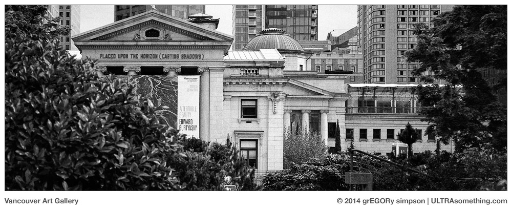
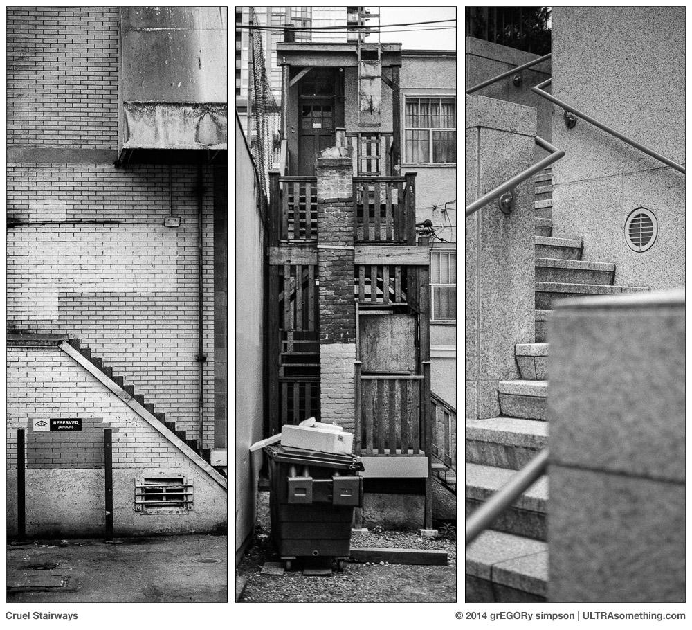
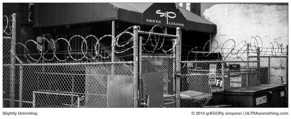
When you’re wandering around aimlessly, trying to blow through a roll of film as quickly as possible, you tend to look for “themes” to pull you along. In this case, I chose stairways. Three of these images make up the “Cruel Stairways” triptych, while several others populate the roll but remain unpublished. All were shot with a Hasselblad Xpan, a 90mm lens, a roll of Kentmere 100 and the mixture of Caffenol-C-M outlined in the article. I was also inexplicably aware of the presence of sleeping men — each napping with his beverage of choice, be it coffee or something with a bit more kick. The “Downtown Park” sleeper was shot with a 45mm lens, while the “Downtown Plaza” fellow was photographed with a 90mm lens. Business establishments also served as handy test subjects — their immutable nature conducive to careful exposure, and thus controlled fodder for analyzing developing techniques. Both “Vancouver Art Gallery” and “Slightly Uninviting” were photographed with a 90mm lens on that same Hasselblad Xpan with that same Kentmere 100 film… And you thought all these photos were just boring and random, didn’t you?

If you find these photos enjoyable or the articles beneficial, please consider making a DONATION to this site’s continuing evolution. As you’ve likely realized, ULTRAsomething is not an aggregator site — serious time and effort go into developing the original content contained within these virtual walls.

Categories : Photo Techniques
Tags : Black and White Photography, Caffenol ingredients and techniques, Caffenol-C-M, Film Developing, Hasselblad Xpan
Posted by Egor 
· May 18, 2014 

Sigma vs. Nerd (Part 3: The DP3)

Once a product designer, always a product designer. Never mind that I established my design legacy in the arena of professional music software and hardware — my need to improve a product’s usability knows no boundaries.

So naturally (given my passion for BW photography), if a manufacturer misses a golden opportunity to produce a unique and affordable BW camera, an obsessive need to rectify the situation overwhelms me. Such was the case earlier this year, when Sigma announced their upcoming Quattro series of compact cameras. Looking at the Quattro’s specs and design dictates, I knew Sigma was zeroing in on a near-perfect camera for BW photographers — though I felt the addition of two specific features would help separate these photographers from their cash. Specifically, it’s my belief that Sigma needs to make the following software additions to the upcoming Quattro cameras:

1. Implement a user-selectable black & white raw format. This would have two significant benefits: First, it would allow photographers to implement a pure BW workflow — one in which files were never once rendered or viewed in color. Second, because the BW raw file would consist of a single layer of data, it would allow BW photographers to eliminate the extra workflow hassles of using Sigma Photo Pro software. Instead, BW raw files could be opened and edited directly within Lightroom, Aperture or whichever raw converter the photographer preferred.

2. Implement software-based contrast filters. By offering in-camera software-selectable contrast filters that emulate the use of traditional colored glass filters, photographers would be able to adjust a scene’s contrast before a photo is taken, rather than in post. These software-based filters would essentially alter the way the Foveon’s three layers are “mixed together” prior to writing the BW raw file, creating a “film like” BW shooting experience without necessitating the actual use of colored glass filters.

Rather than filing my email under “c” for “clown” (as many manufacturers have been known to do), Sigma actually responded — mentioning their intrigue with the suggestion, and asking if I’d like to borrow a DP3 to familiarize myself with Sigma’s unique Foveon sensor.

“Of course,” I answered. And a week later, the DP3 arrived at my front door for a two week loan.

While this might seem like plenty of time to familiarize oneself with a camera, there were a few factors that conspired against me: First, smack in the middle of my review period, I went on a 5-day trip that afforded me very little opportunity for photography. Next, I succumbed to a head cold that dampened both my energy and my enthusiasm for several days. Then, speaking of dampening, the two weeks also coincided with a significant stretch of typical Vancouver weather.

So my two week romp with the DP3 actually worked out to something more akin to a few days. But it was still long enough for me to form some rather potent impressions about both the camera and its Foveon sensor.

Part 1 and Part 2 of this series focussed extensively on the camera’s Foveon sensor — particularly on its unique capabilities for BW photography. Those two articles built a justification foundation for the two suggestions I submitted to Sigma.

Here, in Part 3, I’ll look specifically at the Sigma DP3 Merrill as a camera, rather than as a box that holds a Foveon sensor. As per my nature, I’ll also offer several other suggestions, which I believe would greatly improve the usability of future Sigma compact cameras.

A Semi-Organized Cacophony of Thoughts

I love cameras. All cameras. I believe there is no such thing as a bad camera — there are only bad matches between cameras and the photographers who operate them.

The Sigma DP3 and I were never meant to be a couple. We are not soul mates; we are not lovers; we’re not really even friends. Mostly, we’re like a pair of co-workers who have absolutely nothing in common — save for a moderate disdain for one another — but who must somehow coexist on a 2-week business trip. In other words, everything I’m about to write is a subjectively tainted observation of a photographer whose needs do not match the camera’s capabilities.

The single biggest reason for this mismatch is that I am a photographer of things that move. Sometimes the subject is moving. Sometimes it’s me that’s moving. Usually both of us are moving. Conversely, the Sigma DP3 is a camera that excels at photographing things that are stationary. If you primarily shoot landscapes, portraits, products or architecture, you’ll likely dismiss many of my observations as “irrelevant.” And you should — because if I possessed a broader photographic repertoire (or still had my job as the photographer for BC’s Provincial Parks), I would seriously consider owning a set of these cameras.

So with all requisite caveats out of the way, I present — in no significant order — a random collection of observations, recommendations, plaudits and complaints:

1. Autofocus is much slower than other current-generation mirrorless cameras. In good light the camera will, on average, focus in about 2 seconds. In dim light, look for something closer to 3 seconds. On paper, these values sound perfectly acceptable — unless you shoot things that move. In this case, both your subject and the context that surrounds it will have joined the annals of history long before the camera locks focus. Sigma has attempted to address this issue through a menu item, which lets you limit the distance through which the camera hunts for focus. This can speed things up a little bit, but it does require you to know that your subject will be within the specified distance limits — a non-issue for those shooting planned or static subjects, but a problem for a photographer who tends to dart in, out and around his subjects.

2. Speaking of mingling amongst subjects, another camera attribute I desire is inconspicuousness. In general, the Sigma does quite well in this category. It’s small(ish), black and unassuming. It allows you to disable all its various electronic beeps and burps. Its shutter is quiet, and its rear LCD can be disabled. That’s the good stuff. Unfortunately, when that rear LCD is off, a ring around the camera’s rather large power button pulses bright green. Having any large, bright and conspicuous light is bad enough — but having it pulse is like a beacon that draws people’s eye to the camera. I searched through Sigma’s menu items several times, hoping for a way to disable the Power button’s glowing light, but could find no such option.

3. Having just mentioned the LCD, this might be a good time to address the elephant in the room — this camera has no viewfinder. While it may be possible to blindly guess framing with a wide angle lens, the DP3’s 75mm (equivalent) demands that the photographer have some way to view and carefully frame his subject. Since I’m genetically unable to photograph with a camera held at arm’s length, I dug out my old Voigtlander 75mm optical finder and affixed it to the DP3. While this significantly improves the camera’s ergonomics, the solution is not without its own set of issues.

Focusing is one such issue, since with an optical viewfinder, there’s no way to see exactly what the camera chooses to focus on. As is my custom with every finder-less cameras, I “solved” this problem by first configuring the camera to use only the center focus point. Then I spent a bit of time “teaching” myself to know exactly where the center of the frame was when peering through the viewfinder. Through simple, rote practice, I’m able to train my eye to compensate for the vertical parallax that inevitably occurs whenever the focus distance changes.

Kudos go to Sigma for placing the hotshoe directly over the lens, so one needs only to compensate for vertical parallax, and not horizontal. And as long as I’m awarding kudos, I’ll award a second for Sigma’s placement of the focus confirmation LED, which sits atop the camera and is easily seen in one’s peripheral vision when peering through an optical viewfinder.

4. Getting back to the LCD, I should probably mention that images previewed on this screen are of relatively low quality. As such, the LCD is probably best used to verify that you got the shot, and not to judge an image’s focus, tonality, noise or color. Fortunately, as a Leica M9 shooter, I’m accustom to a quasi-useless LCD, and I rarely (if ever) chimp my shots.

5. If the lack of fidelity displayed by the LCD doesn’t convince you to stop chimping shots, the agonizingly long wait times will. Because, once you take a photo, you need to wait between 14 and 18 seconds before you can push the Play button and see the image on the LCD. Different levels of visual complexity seem to affect the wait time. If you’re the sort who takes a shot, then sometimes wants to verify that you got the shot, those 15 odd seconds might as well be an eternity — even for someone who shoots static subjects. But if you shoot things that move, the problem isn’t simply a case of boredom — it’s the fact that whatever scene you’re waiting to verify will be long gone should you realize you need a “do over.” Sure, you could simply take a second shot without bothering to verify that you need one, but wasting shots with the DP3 is not something you want to do. “Why not” you ask? Read on…

6. Throughout my time with the DP3, I averaged only about 24-25 shots per battery. In other words, each battery was basically the equivalent of a 24 exposure roll of film. Personally, I like shooting film. In fact, about 90% of last years’ shots were taken on one film camera or another. But here’s the deal: I shoot 36 exposure rolls, not 24. 24 exposures is simply not acceptable — at least not for a photographer who spends his precious few brain cells hunting for shots, rather than counting exposures. Plus, with film, you get a visible exposure counter to keep you abreast of how many shots remain. With the DP3, all you get is a tiny 3-bar battery indicator that’s of little real use. With so few exposures per battery, Murphy’s Law easily asserts itself: the battery always seems to be dead right when you’re presented with your best shot opportunity of the day.

Many reviewers have stated that they get about 70 shots on a charge, so I suspect my well-used demo camera came with a pair of equally well-used batteries. I know my paucity of shots per charge is definitely not due to any configuration issues. I set the LCD to economy mode, which turns off the LCD after a mere 10 seconds. I set the LCD’s brightness two-notches dimmer than its default value, insuring I couldn’t adequately see anything when trying to compose outdoors. I even set the Power Off time to 1 minute, but missed too many shots because the camera had turned itself off — so I reverted to the default setting of 5 minutes.

On one occurrence, I actually got 34 exposures from a single battery. I felt like a five year-old on Christmas morning! Alas, the extra juicy battery was but an anomaly. It’s great that Sigma ships the camera with two batteries, but if I owned this camera, I wouldn’t even think about leaving the house with less than 4 or 5 batteries in my pocket. Which brings up yet another problem…

7. … It takes 2 hours to charge a battery, and the charger handles only one battery at a time. Let’s do the math: If I shoot 5 batteries in a day, then it’ll take 10 hours to charge them all for the next day. That would require setting an alarm to wake me every two hours at night, so I could get up and swap batteries. Optionally, I could buy twice as many batteries as I need — meaning I could sleep through the night — but every waking moment would then be dedicated to swapping batteries out of the charger. A better solution is to purchase several additional chargers. The best solution would see Sigma selling a charger that handles multiple batteries simultaneously. Any way you slice it, batteries are an issue with this camera.

8. If the camera is turned off (which will be the case several times each day, since the battery drain issue necessitates very short auto-power off settings), it will take 2-3 seconds for the camera to power up and be ready to shoot. That’s a bit slower than today’s norm, but isn’t too bad if you’re shooting static subjects. Alas, as I’ve mentioned numerous times, I shoot things that move — if I have to wait three seconds for the camera to turn on, I’ve missed another shot.

9. Speaking of turning on the camera, I’d like the option of having it remember which menu item I used last. As it works now, powering the camera off and on causes it to default to the first menu page. I’d much prefer it remember the last setting so, for example, I wouldn’t have to scroll through a bunch of infrequently used menu items just to reach one that I use all the time, like “Format Card.”

10. Unlike many modern cameras, which have 1/4000s as their fastest shutter speed, the DP3 tops out at only 1/2000s. I’d be fine with this, except that you can only achieve this speed at f/5.6 or higher. From f/4 through f/5, the fastest speed drops to 1/1600s, and below f/4 the top shutter speed is a paltry 1/1250s. In other words, the more likely you are to need a faster shutter speed, the less likely Sigma is to give you one. Unless you want every photo to have expansive depth of field, you’ll need to rely on neutral density filters to shoot below f/4 on a semi-bright day. For this reason, I’d like to see Sigma include a built-in neutral density filter, much like Ricoh has done with their GR camera.

11. The model I tested, the DP3, is one of three nearly identical offerings in Sigma’s compact camera lineup. These three models are distinguished mostly by focal length. The DP3 sports a 75mm (equivalent) focal length; the DP2 has a 45mm (equivalent) focal length; and the DP1 clocks in at 28mm. Since the majority of my photography is on the wide side, I personally classify 50mm lenses as “telephotos.” 75mm might as well be a birding lens in my hands. Needless to say, a lot of my time with the DP3 was spent backing away from the subjects I wanted to photograph. Still, I enthusiastically applaud Sigma for releasing a range of compact cameras with varying focal lengths. It’s something I wish more manufacturers would do. I’m from the school that says “I’d rather carry multiple camera bodies with different focal lengths, than carry one body and have to swap lenses.” It’s the whole “shooting things that move” aspect — swapping lenses takes time — grabbing a body with the right lens attached takes far less. Personally, if I were to own an entire set of DP compact cameras, I’d probably use the 28mm model about 66% of the time, the 45mm variant around 33% of the time, and the 75mm DP3 for those 1% fringe cases. Your shot mix might be totally different.

12. Speaking of lenses, I feel the DP3’s f/2.8 aperture is a stop too slow for a camera that dedicates itself to 75mm photography. Many customers may wish to use this camera for portraiture and, though I don’t necessarily subscribe to the notion that “portraits = shallow depth-of-field,” that extra f-stop could be quite useful for anyone hoping to achieve this look. The issue is exacerbated further by the camera’s APS-C sized sensor, since obtaining a 75mm (equivalent) field-of-view means the camera actually uses a 50mm lens — and thus produces the deeper depth-of-field characteristics of that lens. All that said, the lens is already quite large, and I suspect an upgrade to f/2 would likely result in either a much larger lens or a more expensive camera (or both).

13. Writing about shallow depth-of-field leads handily into the next topic: bokeh. Bokeh rendering is a matter of taste, and thus purely subjective. Personally, I find the DP3’s to be particularly ragged and swirly when areas of high contrast are rendered out-of-focus. For a camera dedicated to 75mm photography, I would want and expect a smoother out-of-focus rendering. But that’s me and my own idiosyncrasies talking. Your photographic aesthetics are (very likely) quite different than mine.

14. Returning to focus issues for a moment, I want to touch on the camera’s manual focusing capabilities. Once again, as a photographer of things that move, I tend to rely heavily on manual focusing — if implemented correctly, it’s simply much faster (and sometimes more accurate) than relying on auto-focus. Alas, manual focus on the DP3 seems to be more of an afterthought than a feature.

One of my biggest issues with the DP3 (and many mirrorless cameras) is that setting a focus distance requires using the rear LCD. To set the focus distance, you need to turn the focus ring on the lens while squinting at the little distance scale on the rear LCD. Ergonomically, I find it quite cumbersome to hold a camera at arm’s length and rotate the lens — I would much prefer a focus dial somewhere on the camera body, which would enable me to set the focus distance with one hand (again, similar to the Ricoh GR). Actually, what I’d really like is a distance scale on the lens itself — that way I could quickly and easily zone focus, and not have to worry with the rear LCD at all. Of course, this has traditionally required a mechanically coupled focus ring, but there are ways around this. I’d suggest Sigma emulate Olympus’ clutch focus solution for its compact camera line. Since the DP3 possesses some quasi-pokey auto-focus times, it could be made much “speedier” if it just had a more thoughtful and useful implementation of manual focus.

15. My remaining issues relate to Sigma Photo Pro. I mentioned many of these in Part 2 — the instability of the software; its poorly developed UI; its intrusive addition of extra work into every digital photographer’s workflow. But there are a few other issues I’d like to address, as well:

First, Sigma’s file format and the software required to interpolate it, are both proprietary. This makes me instantly concerned about whether or not I’ll be able to access my images in the future. It’s never good to have the access to your photo library hang on the fate of a single company.

Second, one really needs to keep two versions of each photo on their hard drive. First, there’s the proprietary x3f file that the camera generates. Then there’s the TIF file that you’ll need to create using Sigma Photo Pro (which is necessary for working on your photos in Lightroom, Photoshop or any other industry-standard photo editor or filing program). You might think, once you convert an image from x3f to TIF, that you could throw away the x3f file. That would be a huge mistake. It’s always possible that Sigma will improve its raw conversion at some future date, or that you might want to re-interpret how you render a particular raw file. So, not only are x3f files much larger than standard raw files, but the need to retain both the TIF and X3f files means you’ll be making a significant investment in hard drives.

Wrap Up

It probably seems as if I’m being unduly harsh on the Sigma DP3, but the fundamental reason for this is actually one of positive intent: I like the look of the camera’s output so much, that I really want it to be a “better” camera (for me) than it actually is.

It’s important to note that, while I might have a significant number of complaints about this particular camera, I have very few complaints about Sigma’s Foveon sensor. Personally, what I need is better access to this sensor’s capabilities than what the DP3 provides.

Of course, I was aware of this long before Sigma lent me a DP3 — I know what my own peculiar needs are as a photographer, and I knew the current Sigma line would not be able to satisfy those needs. But what I didn’t know was just how seductive that Foveon sensor would be.

The bottom line is this: The files from the DP3 are so good that I’m almost willing to forgive Sigma for the sins of its camera, its firmware, and the Sigma Photo Pro software. And this says a lot about the Foveon sensor, because I really didn’t much care for the camera, its firmware or the Sigma Photo Pro software. Because the upcoming Quattro series will likely address several of my DP3 complaints, I’m now even more convinced that Sigma would be crazy to not implement my BW software suggestions. But then, anyone egotistical enough to maintain a photography blog all these years is bound to think such thoughts…


©2014 grEGORy simpson

ABOUT THESE PHOTOS:

All photos were, of course, shot with a Sigma DP3 with its fixed, 75mm equivalent lens. They were rendered to TIF files in Sigma Photo Pro, using its Monochrome tab, then further processed in Lightroom and/or Photoshop. Because of both the 75mm lens and the camera’s rather deliberate handling dictates, you’ll notice a dearth of my signature “people” shots. Fortunately, the gentleman depicted in “Covert Pursuit (version 1)” was moving quite slowly and cautiously as he crept up on the tulips — allowing for one of the very few “candid” photos I managed to secure with the DP3.

If you find these photos enjoyable or the articles beneficial, please consider making a DONATION to this site’s continuing evolution. As you’ve likely realized, ULTRAsomething is not an aggregator site — serious time and effort go into developing the original content contained within these virtual walls.
Categories : Photo Gear
Tags : Black and White Digital Camera, Black and White Photography, Monochromatic camera, Sigma DP review, Sigma DP3 Merrill review
Posted by Egor 
· May 15, 2014 

Sigma vs. Nerd (Part 2: The BW Merrill)

In Part 1 of this article, I discussed why, as a black and white photographer, I became intrigued by the upcoming Sigma Quattro cameras. This intrigue lead me to contact Sigma — arrogantly offering to help them insure the Quattro line achieved its full potential as a tool for dedicated BW photographers. Although my interest in Sigma cameras lies primarily in the upcoming Quattro series, Sigma generously lent me their current-generation DP3 for two weeks. Who knew such a loan, so simple in intent, would result in such a dense and weighty tower of words? With Part 1: Sensor School fully occupying the tower’s ground floor, it’s time to add another couple of stories to the Sigmascraper. In this article, I’ll discuss how Sigma’s DP Merrill cameras require altering one’s BW processing techniques, and how these techniques result in some significant differences in the tonality of black & white images. Later, in Part 3, I’ll report on the overall handling and ergonomics of the Sigma DP3 Merrill camera. It will be a report utterly tainted by the subjective viewpoint of someone (me) who prefers cameras that fulfill the curious and specific requirements of “street” photography (or, as I dubbed it in my Roadkill article, “observational” photography).

Shades of Grey

When working with any BW capture medium (film or digital), one of the first things I want to know is this: How does the film/camera translate color into tonality? In other words, what shade of grey will each color create? The following image illustrates four different versions of a photogaphed X-rite Color Checker chart:

  • On the far left is the chart as shot with the DP3, and processed in Sigma Photo Pro (SPP).
  • To its right is the same photograph after converting it to BW using the standard Adobe Lightroom (LR) default.
  • To the right of that is, again, the same photo — only this time converted to BW using Sigma Photo Pro’s default BW setting inside its Monochrome processing panel.
  • To the far right is a similar color chart, photographed with a film camera loaded with Tri-X and exposed at ISO 400.

What does this tell us? First, it illustrates some significant differences between grey tones when Lightroom and Sigma Photo Pro each employ their own default values. For example, we see that blues are rendered much darker (by default) in SPP than in Lightroom (LR). Conversely, we see that SPP renders red and orange much brighter than LR. Finally, we see that neither renders tones in exactly the same way as my “go to” film — Tri-X, but there’s little doubt that Lightroom’s default conversion comes substantially closer.

Shading the Shades

Of course, default values are just that — defaults. In the case of BW film, photographers affix colored filters to their lenses — changing the scene’s tonal balance by modifying colors before they ever reach the film. For example, a BW landscape photographer might use a red filter on the front of his camera lens. This makes anything that’s red photograph as a much lighter grey, while everything blue photographs as a much darker grey. Obviously, by darkening the greys that correspond to blue, the landscape photographer effectively darkens the sky — making clouds stand out, and giving photos a more dramatic appearance. In the case of BW digital, photographers apply the colored filters after the image is shot — as part of their post-processing workflow. Specifically, the typical (non-Foveon) BW digital workflow is:

  1. Point camera at shiny object, and release the shutter. Your camera photographs the scene using its imaging sensor — usually some variant of a color filter array, as described in Part 1.
  2. Convert all this raw color filter array data into a color image using the demosaicing algorithms built in to your RAW processing software of choice.
  3. Convert the color image into BW by selectively applying a series of colored filters in varying amounts — thus altering the relative grey luminosities in the BW image.

This is how the left-most BW rendering was created in the previous illustration. If desired, one could employ this same color-to-BW conversion technique with any of Sigma’s Foveon-based cameras. But to do so would be to completely ignore a significant imaging advantage of the Foveon sensor: its lack of a color filter array. It’s this very absence of the traditional color filter array that makes the Foveon sensor so appealing for BW photographers.

Monochrome Mode in Sigma Photo Pro

As described in the Sensor School article, the Foveon sensor eliminates the standard color filter array used by most cameras to derive a color image. Instead, Foveon sensors contain three “monochromatic” sensors, which essentially use the thickness of the sensors themselves to “filter” out certain colors. Because Sigma knows the exact spectrum of light capable of reaching each sensor layer, their Sigma Photo Pro software can derive a color image by analyzing the luminosity data contained on each of the three layers. But unlike a color filter array, which must always be demosaiced into a color photo before BW conversion can occur, Sigma Photo Pro software has a special “monochrome” mode. This mode allows BW photographers direct access to the monochromatic data recorded by each of the Foveon’s three stacked sensor layers. Since all three layers see every color in the visible spectrum (but in varying proportions), each layer effectively gives a photographer a different monochromatic version of the same scene — varying only in tonality (and noise, which I’ll discuss later). Within Sigma Photo Pro’s Monochrome editing panel is a little color mixer that lets you combine outputs from these three different layers to create a monochromatic image with the tonality you desire. You can create a BW conversion using only the “blue” layer, only the “green” layer or only the “red” layer. And of course, you can mix these layers in any desired proportion (the default being 33% from each of the three layers). Below is a very pedantic example that illustrates exactly this:

Notice how the monochrome image’s tonal balance changes depending on which sensor layer one chooses to display. There is, however, one significant caveat: noise. Specifically, since the so-called “Blue” layer is the top layer of the sensor stack, it contains almost no noise whatsoever. Conversely, the so-called “Red” layer is derived mostly from the bottom layer of the sensor stack and therefore contains significantly more noise than the “blue” layer.

Personally, I don’t mind the Sigma’s red “layer” noise at all, but then I also really love film grain. The noise is much less ‘offensive’ than the sort of noise created by the demosaicing algorithms necessitated by color filter arrays and, in general, it’s something I just don’t worry about. However, there is a very significant difference in noise level between layers, so depending on what your photographic needs are, this might affect how much of the red “layer” you’re willing to include in your BW images.

Hue-bris

You might be tempted to assume that choosing between Sigma’s blue, green and red layers correlates with using these same colored filters during the more typical color-to-BW conversion performed by Lightroom, Photoshop and others. Do not succumb to this temptation. The tonal renderings resulting from Sigma Photo Pro’s color mixer are, in fact, substantially different than those from a standard image processing program. The following examples should effectively illustrate the difference between red, green and blue filtering in Sigma Photo Pro versus the same red, green and blue filtering applied by a popular BW conversion application (in this case, Nik Software’s Silver Efex Pro 2). The first image (shown below) illustrates four different BW conversions of an X-rite Color Checker chart, as performed by Silver Efex Pro 2 (SFX). Specifically:

  • On the far left is the color version of the chart.
  • The left-most BW version was converted using a red filter in SFX.
  • The middle BW version was converted using a green filter in SFX.
  • The right-most BW grid was converted using a blue filter in SFX.

The second image illustrates four different BW conversion of the same X-rite Color Checker chart, this time performed by monochrome “layer mixing” in Sigma Photo Pro:

  • On the far left is the color version of the chart.
  • The left-most BW version was converted by setting SPP color mixer to 100% red.
  • The middle BW version was converted by setting SPP’s color mixer to 100% green.
  • The right-most BW version was converted by setting SPP’s color mixer to 100% blue.

What do these two illustrations show us? They show us that the blue, green and red “filtration” used by SPP is much more subtle than when the filtration is performed on a fully rendered color file. This is to be expected, since the so-called “blue,” “green” and “red” layers in a Foveon sensor are actually panchromatic — capable of recording a full spectrum of colors, but in varying proportion that simply skew toward blue, green or red. Below is a less clinical (though still pedantic) illustration of this effect. There are three columns to look at:

  • On the left is the color scene as shot with a Sigma DP3.
  • The middle column contains three different BW renderings from a cropped region — the top taken with Sigma Photo Pro’s “blue” layer, the middle from its “green” layer, and the bottom from its “red.”
  • The right-most column contains three different BW renderings from the same cropped region — this time performed by Silver Efex Pro 2 on the previously-rendered color image. The top is SFX’s default blue filter, the middle is its default green filter, and the bottom is its default red filter.

Look first at the upper-left corner of each crop — where the graffiti is painted onto a red building. Notice how drastic the differences are between each of the Silver Efex Pro conversions. Note how the conversions aren’t nearly so severe when performed by Sigma Photo Pro. Next, look at the colored banners in the lower right corner, and make note of the same tonality differences. It’s up to you to decide which tonalities you prefer. Personally, I much prefer the less-drastic renderings from Sigma Photo Pro — I can always further-amplify the contrast in Lightroom or Photoshop if I need to.

New Camera, Old-Skool

Since there are basically three monochromatic sensors inside each Foveon-based camera, and since each sensor gives us a different tonal balance, does this mean Sigma’s DP Merrill cameras are 3 times better than Leica’s Monochrom? No. Not by a long shot. First and foremost, there’s the issue of ergonomics. I’ll discuss this aspect in Part 3 of this article, so let’s move along to the next issue: tradition. This is one of those “nebulous” fundamentals that, intellectually, seems completely insignificant — until you actually try adhering to it. One of the wonderful things about shooting BW film (and a benefit that’s shared by the Leica Monochrom), is that the photographer never once sees a color rendering of his photograph. There is a purity to working in BW that simply cannot be replicated by a workflow that injects color into the equation. This is what I mean by “tradition.” It’s a psychological aspect that many (who are not BW photographers) ridicule, but it’s a mindset shared by many true BW photographers. One of the main reasons I’ve been shooting film for the past couple of years is that, after reviewing the Leica Monochrom (and falling in love with the all-BW workflow), I detested returning to a color-conversion workflow. So I didn’t. I started shooting mostly BW film instead. There are ways, using Sigma Photo Pro, to mostly prevent yourself from ever having to see a color representation of a photograph. But there is a complexity to it that seems utterly unnecessary. Here, specifically, are my issues:

  1. You need to run a separate program (Sigma Photo Pro) that converts Sigma RAW files into TIF files, which you then must import into Lightroom, Aperture, or whatever other standard workflow software you use.
  2. Sigma Photo Pro is highly unstable. Rarely was I able to process more than 1 or 2 images on my Mac Pro before needing to reboot the program. Expect to restart SPP dozens of times for each hour you spend working with it.
  3. Sigma Photo Pro is in serious need of a User Interface designer. I know. I spent 20 years designing User Interfaces for Macintosh professional music programs. Using SPP is like taking a trip to the 1990’s — the bad 1990’s, and not the retro-cool 1990’s. I could easily write a 3 part article describing only those things wrong with the user interface and how Sigma should correct them.
  4. Because of the whole post-processing layer filtering thing, there’s way too much fiddling required in order to extract the BW image you want.

Fortunately, I have a solution: Sigma could get rid of all four issues if they simply offered users the ability to record images in a BW RAW format. Through an on-camera menu option, users could select whether they wanted the camera to record a standard color RAW format or a BW RAW format (much like selecting whether to load a camera with color or BW film). By offering a BW RAW format, it’s no longer necessary to run each file through Sigma Photo Pro. The whole complicated 3-layer Foveon calculation is removed from the equation. Instead, the BW file would be a single layer file (exactly like a Leica Monochrom file), which could therefore be read by standard image editing programs, like Lightroom and Aperture. The convoluted and frustrating step of translating every file through Sigma Photo Pro disappears. Not only that, but having a BW RAW format means us BW photographers are never forced to view a color image — meaning we’ve restored purity (and a sense of integrity) to our image making. Alas, while this suggestion removes the pain of SPP from the BW photographer’s lifestyle, it would still remain for color photographers. Here, too, I can help. Sigma could definitely use some organized beta testing to address issue #2 (something I’ve done in the past), and issue #3 is a direct match for my previous (pre-photography) career. In other words, I’m suggesting that Sigma solve these issues by doing something else old-skool — hire me to work on it.

Finally (returning to the topic of Sigma’s Foveon sensor vs. the Leica Monochrom), there’s the issue of color filtering. Leica’s Monochrom, in spite of being a digital camera, allows BW photographers to work with filters exactly as they would with a film camera. Because the Monochrom is a rangefinder, the photographer frames and focusses the scene through a viewfinder window that’s separate from the lens. This lets Monochrom photographers place colored filters on their lenses without colorizing their view of the scene. The sensor sees the altered tonality, not the photographer. Alas, with an SLR (like the Sigma SD1 Merrill) or a mirrorless camera (like the DP1, DP2 and DP3), photographers view their intended scenes by looking directly through the lens. This means, if you use colored filters with a Sigma camera, you’ll be looking through that filter when you shoot — something I find truly discombobulating. But using filters on lenses is the essence of BW photo purity and, as I opined, this purity is one of the things that makes the Leica Monochrom so desirable. Fortunately, I have a solution for this, as well… Sigma should offer “in camera” filters that emulate the look of various colored glass filters used by traditional BW photographers. Specifically, rather than screwing filters onto their lenses, BW photographers would select a “software” filter prior to shooting. This would change the way the Foveon’s three layers are mixed together to create the single BW RAW file. In other words, it restores the purity of BW photography, including the use of filters before an image is taken, further helping turn Sigma cameras into BW dream cameras. For BW photographers, Sigma’s cameras offer truly spectacular resolution, gorgeous (and pliable) tonality, an unbelievably noiseless top layer sensor, and a much noisier (but ultimately inoffensive) bottom sensor layer. The way I see it, there are only two things preventing Sigma cameras from “owning” the BW photography market:

  • The myriad issues, complications and hassles surrounding Sigma Photo Pro and the resultant workflow impact.
  • The handling and function of the cameras themselves… but that’s for Part 3 to dissect.

completely necessary that they be boring — it’s just that an adherence to aesthetic dictates will do little to advance whatever fiddly topic the photo is meant to illustrate. The only photo posted with the intention of being “enjoyed” as a photo (rather than as an illustration of some topic) is “Points of View,” which was shot (obviously) on a Sigma DP3 and processed into BW using Sigma Photo Pro’s Monochrome editing tab.

If you find these photos enjoyable or the articles beneficial, please consider making a DONATION to this site’s continuing evolution. As you’ve likely realized, ULTRAsomething is not an aggregator site — serious time and effort go into developing the original content contained within these virtual walls.

Categories : Photo Gear
Tags : Black and White Digital Camera, Black and White Photography, Monochromatic camera, Sigma DP3, Sigma Foveon Sensor for Black and White photography, Sigma Quattro
Posted by Egor 
· May 1, 2014 

National Biplane Lady Day

I’ve always found the notion of world “awareness” days somewhat curious. First off, if it’s something people genuinely need to be aware of, then one day a year is completely inadequate for fostering a full-scale change in public consciousness. Secondly, there are many more causes than there are days in a year. So inevitably, your special awareness day will have to duke it out with dozens of other awareness days — most of which will be completely irrelevant and unrelated to whatever message you hope to spread. And third, does anyone actually pay attention to these awareness days? I mean, is there a giant calendar somewhere that lists them all?

Back in college, my friends and I maintained just such a wall calendar — except that ours was populated solely by thousands of bizarre holidays that we, ourselves, invented. Granted, thinking up ridiculous celebratory days probably consumed brain cells that would have been better spent learning to solve non-linear differential equations. But hey — that’s what college is for.

Our biggest made-up day of the year was National Biplane Lady Day — the existence of which we owe entirely to one fellow’s girlfriend and her penchant for fashion magazines. While leafing through one of her trendier publications, we happened upon an article showcasing elaborate new hairstyles — one of which looked to have been significantly influenced by the Sopwith Camel. After deciding such a coiffure was worthy of its own “day,” we crammed it onto our busy calendar in the only space available — April 31st.

While it was far from our silliest day, and though we had long since discarded the only known photo of the eponymous model, National Biplane Lady Day took on a growing annual significance — most likely due to its presence on a heretofore undiscovered date within the Gregorian Calendar. It became our Christmas, our New Year’s, our Labor Day and our collective birthdays, all rolled into one. On the eve of National Biplane Lady Day, April 30th, we’d throw a party, count down the seconds until midnight, blow our party horns and check the calendar — only to see it was now May 1st, and not April 31st. Undaunted, we would then regale one another with tales of how we each had spent National Biplane Lady Day.

Like most college buddies, we drifted apart after graduation, though for several more Aprils we continued to reach out and wish one another a happy National Biplane Lady Day. But as the years turned to decades, National Biplane Lady Day was forgotten…

… until a couple days ago, when I read something about Film Photography Day having taken place this past April 12th. What?! Really?! Is an entirely new generation of college kids making up days again? As best as I can fathom, Film Photography Day seems to be something that the Lomography company made up. And if they didn’t invent this day, then as the only company that likely derives the bulk of its income from film and film camera sales, it’s certainly an awareness day that Lomography aggressively markets.

But why do we need a film day at all? What possible purpose can it serve? I suspect Lomography’s bottom line requires they sell film and film-related products every day of the year, and not just on April 12th. So marketing the notion that people should shoot film on one special day each year doesn’t seem like an effective way to fortify Lomography’s balance sheet.

Besides, if someone’s never shot film, I can pretty much guarantee you that one day isn’t going to convince them to give up their lazy, pixel-peeping digital ways. Learning to see, appreciate and perfect the nuances of film is a lifelong labor of love — not a Hallmark Holiday.

And what about the former film photographer — the one who traded his chemicals and darkened dwelling for the ease of the digital workflow? The one who chose the allure of extensive resolution over tonality, and who rejoiced in the freedom to shoot a limitless number of identical images in the relentless pursuit of the one “perfect” image? What possible effect can a Film Photography Day have on this photographer, other than to remind him why he stopped shooting film in the first place?

And if someone is already a dedicated, hard-core film shooter (like me), then it only ticks us off to have some special “awareness” day to remind us of what insignificant, anachronistic, knuckle-dragging dinosaurs we really are.

So do we really need a Film Photography Day? Designating an arbitrary spot on the calendar and suggesting everyone shoot a roll of film will not increase the relevancy of film. Nor will it “save” film, since film is in no need of rescue — rather, film has simply shifted from a mass-market consumer item to a specialized tool for the arts, much like chalk, charcoal or oil paints. Besides, Film Photography Day had to share April 12th with National Nanny Training Day and National Grilled Cheese Day, which (as everyone knows) is the one that gets all the press.

To illustrate my point that film is a lifestyle, and not just a “day,” I’ve adorned this article with a random sampling of casual, walk-about snapshots — the sort most people would take with a smartphone. Only these were all taken on film; and on whichever day of the year I felt like taking them; and yet, curiously, none of them were taken on world Film Photography Day. Coincidentally though, I did write this article on National Biplane Lady Day. But in strict observance to both tradition and the Gregorian calendar, I waited until May 1st to tell you about it.


©2014 grEGORy simpson

ABOUT THESE PHOTOS:

“Concrete Tornado” was shot with an Olympus PEN FT fronted with an Olympus 25mm f/4 lens, exposed on Tri-X at ISO 320, and developed in a 1:50 solution of Rodinal.

“Riemannian Plane” was shot with an Olympus Pen FT fronted with an Olympus 42mm f/1.2 lens, exposed on Tri-X at ISO 320, and developed in a 1:50 solution of Rodinal.

“Frame of Reference” was shot with a Leica M6TTL fronted with a Voigtlander 15mm f/4.5 Super Wide Heliar lens, exposed on Tri-X at ISO 320, and developed in a 1:50 solution of Rodinal.

“Princess Lane” was shot with a Leica M6TTL fronted with a Leitz 50mm f/2 Summar thread mount lens, exposed on Delta 3200 at ISO 3200, and developed in a 1:25 solution of Rodinal.

“Reflected Past” was shot with an Olympus Pen FT fronted with an Olympus 42mm f/1.2 lens, exposed on Tri-X at ISO 320, and developed in a 1:50 solution of Rodinal.

“Approach” was shot with an Olympus Pen FT fronted with an Olympus 38mm f/1.8 lens, exposed on Kentmere 100 at ISO 50, and developed in a 1:50 solution of Rodinal.

“Conformity” was shot with a Leica IIIc fronted with a Letiz 35mm f/3.5 Elmar thread mount lens, exposed on Tri-X at ISO 320, and developed in a 1:50 solution of Rodinal.

“Mayan Influence” was shot with an Olympus Pen FT fronted with an Olympus 38mm f/1.8 lens, exposed on Kentmere 100 at ISO 50, and developed in a 1:50 solution of Rodinal.

If you find these photos enjoyable or the articles beneficial, please consider making a DONATION to this site’s continuing evolution. As you’ve likely realized, ULTRAsomething is not an aggregator site — serious time and effort go into developing the original content contained within these virtual walls.

Categories : Musings
Tags : Black and White Photography, Film Photography, Holidays
Posted by Egor 
· April 14, 2014 

Sigma vs. Nerd (Part 1: Sensor School)

Anyone who has followed the ULTRAsomething journey for the past several years knows how passionately I’ve lusted for a monochromatic digital camera. A simple perusal of this site should effectively confirm just how little use I have for the color features inherent in modern cameras. Were you to gain access to my private stock of color photos, you’d also see how little talent I have for shooting color. I am a black & white photographer — through and through.

Since the dawn of digital, I’ve known enough about the technology’s inner workings to know that removing a camera’s color capabilities would have significant advantages for BW imaging.  Naturally, I assumed that manufacturers would hear a deafening din of demand from other, similarly-minded BW photographers, and that such a camera would soon arrive on the market. But it never did. Even more surprising was my realization that my BW brethren seemed to have no interest in the idea of a BW digital camera and, worse, some of them even mocked those of us who held fast to such crazy desires. Undaunted, and determined to do something about it, I decided it was time to start lobbying for the camera of my dreams. Since the bulk of my photographic activites demand that I use old-school rangefinder cameras, I started actively pestering Leica to release a BW camera. This time, I apparently wasn’t alone. Because much to my (and everyone else’s) surprise, Leica did exactly that in 2012. That camera — the Leica M Monochrom — is, without a doubt, the most perfect camera ever created for my particular needs and proclivities, with just one single exception: its price.

When Leica first released the Monochrom, they graciously allowed me to borrow one for a couple of months. This experience lead to my three part “Fetishist’s Guide to the Monochrom” review. Sadly, it also increased my already pathological desire to one day own a monochromatic camera, which caused me some serious postpartum depression once I shipped it back to Germany.

After my Monochrom experiences, I had little interest in returning to the quaint and ridiculous process of converting compromised color images into BW. Because of this, I spent the past two years shooting mostly BW film, while waiting patiently either to win the lottery, or for some company to follow Leica’s example and release a monochromatic camera — one that I could actually afford.

So when Sigma announced their new Quattro series cameras a couple months ago, I was intrigued. Sigma uses a unique type of sensor in its cameras — a Foveon sensor. Even though Foveons are designed for color photography (and produce some of the most beautiful color images I’ve yet seen emerge from a digital camera), it’s their untapped potential as monochromatic cameras that interests me.

The more I thought about the redesigned sensor in these new Quattro cameras, the more convinced I became that Sigma was just a couple of marketing decisions away from engineering a monochromatic RAW file format — thus creating a camera with many of the same imaging advantages currently enjoyed by the Leica M Monochrom.

I contacted Sigma and expressed my wishes that the upcoming Quattro camera support a second, user-selectable RAW format — one that basically used only the data collected by the camera’s top sensor layer. Unlike Leica (who had to design a special sensor to remove the ubiquitous Bayer filter), Sigma is already manufacturing cameras with Bayer-less sensors — actually they’re manufacturing cameras with three Bayer-less sensors stacked together. Theoretically, it seems, Sigma could make a true monochromatic camera by simply coding an additional RAW data format (one that retains the luminosity data from the top, high-resolution, low-noise layer), and ignores data from the other two layers (which would normally be used to help define color). Not only would this enable Sigma to ship Quattros that worked as both monochromatic and color cameras, but the simplicity of the monochromatic RAW file should make the data files accessible to industry-standard RAW processors, like Adobe Camera Raw, Lightroom, Aperture, and so on.

Sensor School

Before you can understand why Sigma’s Foveon-based cameras have such potential as monochromatic cameras, you need to understand at least a little something about how the Foveon sensor works — particularly in comparison to the way nearly every other digital camera functions.

It might surprise you to know that digital camera sensors are, in fact, inherently monochromatic devices — capable of measuring luminosity and only luminosity. A camera’s sensor is made up of millions of little photosites — each of which has the singular job of reading how much light is falling upon it. 16 million of these arranged in a grid and spread across your sensor gives you 16 million little points of light — each of which defines a pixel in your final image.

At least that’s how it would work if your camera shot only in black & white. Alas, most people want color cameras. But the photosites used on a digital sensor are nothing more than simple light meters: they’re able to measure the brightness of light, but unable to discern the color of that light. So, in order to create a color image from what’s essentially a monochromatic technology, engineers have employed some rather complex work-arounds.

The most common technique involves placing either a red, green or blue colored filter on top of each and every one of the millions of photosites. Each photosite is then limited to measuring only the luminosity value of the color of light corresponding to its filter. An interpolation algorithm then analyzes all these red, green and blue data points and constructs a color image from the millions of various filtered luminosity values.

The problem with this method is that no single photosite records an accurate representation of the color that strikes it. No single photosite is going to say “I saw yellow light.” Rather, it’s going to say “I saw this much red,” while the site next to it might say ‘I saw this much green,” while another neighboring photosite will say “I saw this much blue.” To deal with this issue, engineers arrange these colored filters in a specific mosaic pattern, from which they construct elaborate mathematical demosiacing algorithms that “guess” the true color of each pixel by examining each photosite in context with all the photosites that surround it. The most commonly used pattern is called the Bayer pattern, though alternate patterns exist (such as Fuji’s X-Trans pattern).

The method works surprisingly well, but it’s not without issues. Specifically:

  • The array of colored filters placed above the light-gathering photosites decreases the intensity of light hitting the sensor, thus increasing the base noise level in the image.
  • Because no single photosite sees an accurate representation of the amount of light in front of it, image resolution suffers — since it’s the demosaicing algorithm that defines the overall luminosity of each pixel, rather than a pure reading from the photosite.
  • Because of the pattern-based nature of image creation, this sort of sensor is prone to inducing moiré patterns in your photos. To combat this, most digital cameras add a second, anti-alisasing filter in front of the sensor — a filter that robs the sensor of even more light and, by design, smears the image details. Some cameras have chosen to forgo the anti-alisaing filter, but the trade-off is an increased probability of moiré patterns appearing in your photos.

Obviously, for a BW photographer, the whole notion of Bayer filters (and their ilk) is ridiculous. The sensor has the ability to record an unadulterated monochromatic version of the scene before it — in gloriously high fidelity, and without interpolation or filtration. But because most people want to photograph in color, we have to endure a tremendous amount of image degradation to support the creation of color photos — an output medium we don’t even desire.

Sigma’s Foveon sensor takes a completely different approach. Rather than a single layer of photosites, the Foveon has three layers, which take advantage of the fact that different colors of light possess different wavelengths. Photosites on the top layer in a Foveon sensor can see every color of visible light. The second layer sees only the green and red parts of the spectrum, since the thickness of the top layer serves to filter out the short-wavelength blue light. The third sensor layer sees only the red part of the spectrum, since the thickness of the top two layers is such that it filters out the mid-wavelength green light, allowing only the long-wavelength red light to reach the bottom. (Addendum: Sigma has pointed out that this is, perhaps, a bit too much of an oversimplification. In reality, all three layers “see” every color in the spectrum, but in different amounts. So, for example, the bottom layer doesn’t see only the red part of the spectrum, it sees mostly the red part of the spectrum. My description is, perhaps, a bit more… umm… “black & white” than what’s actually occurring.)

A sophisticated mathematical algorithm then examines each stack of three photosites and — by analyzing the relative proportion of luminosity reported by each layer — determines the actual color of each pixel.

The benefits of the Foveon method include:

  • Increased color purity — The camera is able to determine the color of light on every stacked photosite, rather than approximating each color based on the relative luminosities of several neighboring photosites.
  • Increased resolution — Each pixel in the final image contains accurate luminance information, as measured by the sensor’s photosites (in contrast to a color filter array, which must interpolate a luminance value for each pixel).
  • Less noise (at low ISO settings) — Because each photosite doesn’t have a colored filter in front of it (nor, possibly, an antialising filter to alleviate the moiré patterns inherent in the demosaicing process), the top sensor layer requires far less signal amplification than a Bayer-type sensor, meaning less noise.

The downsides of the Foveon method include:

  • Larger data files — Because Foveon sensors have three times as much data per final pixel, their file sizes are quite large, resulting in increased computational and storage demands. Note that this metric will change somewhat when the new Sigma Quattro arrives.
  • More noise (at high ISOs) — Sadly the benefit of having so much unfiltered luminosity data available on the top sensor layer is quickly offset as one increases the ISO speed. That’s because, in order for light to penetrate all the way to the bottom layer, more and more amplification is needed in order to ascertain luminosity values in that bottom layer — and at some point (which appears to be around ISO 400-800 on the current Sigma DP3), the amount of amplification needed to read the bottom layers becomes greater than the amplification needed by a sensor that uses a standard color filter array.
  • Limited computer processing options — Because nearly every digital camera uses some sort of color filter array (rather than the Foveon technique), very few computer-based RAW processors can actually read and interpret the RAW files from Sigma cameras. Photoshop, Lightroom, Aperture, DxO, Capture One — none of these popular industry-standard programs can read Sigma files. This means, if your photographic endeavors revolve around one of these programs (and pretty much everyone’s does), then using a Foveon-based sensor is going to add an extra layer of complexity to your workflow. Essentially, you’ll need to use Sigma’s own Photo Pro software to read camera files and convert them to TIF, or you’ll need to use the only known third-party alternative — Iridident Developer.

At this point, you can probably see why (as a BW photographer), I’ve been so intrigued with the idea of Foveon sensors. That top-layer on a Foveon sensor is an unfiltered, full-spectrum monochromatic light gathering machine — the best thing today’s digital world can offer a BW photographer.

Applied Knowledge

So, basically, inside every Sigma camera is a monochromatic camera just begging to get out. And while there are ways to extract all that monochromatic goodness using various bits of computer-based software, it would be much easier and more convenient if Sigma simply offered a monochromatic RAW format — particularly given some of the technical modifications made to the Foveon sensor in its upcoming Quattro series of cameras.

And this is why I contacted Sigma — to offer my assistance in helping them develop and/or test such a RAW format. I have no idea whether or not Sigma is planning such a thing, nor if they’re even taking my suggestion seriously. What I do know is that they wrote back with an offer to let me mess around with the current-generation DP3 camera for a couple of weeks — thus getting up to speed with the Foveon sensor until such time that the Quattros become available.

Although there is very little overlap between Sigma’s current generation of cameras and my own photographic proclivities,  I do have a rather nerdy (obviously) interest in using a Foveon camera, and in learning just how much monochromatic juice I can extract from the Foveon sensor as it currently exists. So, I accepted their offer to borrow a DP3. Besides, who knows? Maybe shooting a camera with such high-caliber color capabilities will reveal within me some heretofore unknown and latent interest in color photography…

… hmm, on second thought, I think I’ll stick with black & white.

The Sigma DP3 is now in my hands, and I will be shooting with it for the next couple of weeks. Sometime after that — once I’ve analyzed the images and worked through some various BW processes — I’ll publish a pair of follow-up articles: Part 2 will focus on the DP Merrill’s usability and capabilities as a tool for the BW photographer; and Part 3 will discuss the handling, ergonomics and general feature set of the DP3 camera.


“Dysmorphic Selfie” was shot with a Sigma DP3 during an afternoon spent valiantly (though ultimately unsuccessfully) attempting to coerce the camera to perform a function it was never really intended to perform — street photography. I chose this image for its (not so) obvious visually metaphoric interpretation of the fidelity aspects of recording an image onto a sensor. “Toward the Light” is just that — an experiment in seeing how well the DP3 handles contra-lighting. “Port-o-Test” attempts to show some of the advantages of the Foveon sensor for BW photography — in what should have been a rather unfair fight, I pitted the DP3 (which has a cropped sensor and 75mm equivalent lens) against my full-frame Leica M9 (fronted with my exquisitely sharp sample of the Voigtlander 75mm f/2.5 thread mount lens). The results indicate exactly why it is I’m anxious to explore the next generation of Sigma cameras in a monochromatic environment. “Houseboats” is simply a throw-away shot taken on my first outing with the DP3 — the full-size version has such extreme resolution and tonal clarity, you’d think it was a stitched panorama — but in reality, it’s simply a crop from a standard DP3 frame.

If you find these photos enjoyable or the articles beneficial, please consider making a DONATION to this site’s continuing evolution. As you’ve likely realized, ULTRAsomething is not an aggregator site — serious time and effort go into developing the original content contained within these virtual walls.
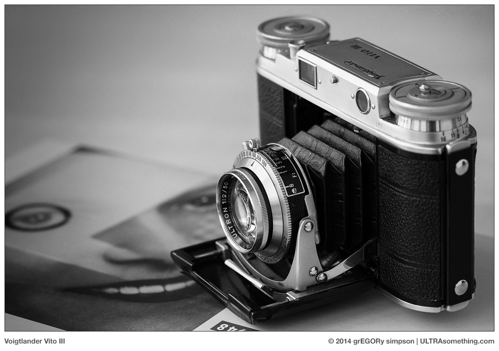
Categories : Photo Gear
Tags : Black and White Digital Camera, Black and White Photography, Monochromatic camera, Sigma DP3, Sigma Foveon Sensor for Black and White photography, Simga Quattro
Posted by Egor 
· April 1, 2014 

A Treatise on X and Z

Before Apple amputated the final seven characters from the word internet, leaving only the “i” to designate the latest iThis or iThat product, the hippest letter in the Western world was “e.” Itself a truncation of the word electronic, the letter “e” once ruled the techno-chic roost, giving us words like eCommerce, eMail and eBay — edgy in their time, but now the linguistic siblings of zoot suits and flagpole sitting (go ahead, look it up).

As a cavalcade of characters take turns basking in their 15 minutes of cultural fame, there remains a pair of classic Western letters that are seemingly always in style. These letters — “X” and “Z” — are every marketing team’s metaphorical little black dress. Need a cool product name? Toss in an “X:” The X Files and X Factor television shows; Leica and Fuji’s duelling X-branded camera lines; Microsoft’s X-Box; the X Games. And do you really think it’s purely accidental that the coolest movies from the late 1960’s and 1970’s were all rated “X?”

But what if your company decides a particular product is so revolutionary that the letter X doesn’t do it justice? Then you toss a Z in front of it, that’s what: The Kawasaki Ninja ZX motorcycles; the Datsun 280 ZX and Citroen ZX automobiles; the Sinclair ZX computer; Adidas ZX sneakers. If you want to mix things up a bit, just reverse the letters. That gets you such product designations as the Olympus Stylus XZ camera, the HP Pavilion XZ computers and, hippest of all, the Su Group’s XZ Series Gravity Discharge Batch Centrifuges.

Why are these characters popular? What is it that makes them so cool, and why do they endure? One theory revolves around the fact that they’re less utilized than other characters, thus making their impact more obvious. Another theory is that their location at the end of the alphabet renders them “exotic” to those who were forced to practice their ABC’s in strict sequential order. I have my own counter-theory, which actually focuses on the way the letters appear. Specifically, both the letter X and the letter Z feature strong diagonal strokes.

The diagonal strokes employed to form the letters X and Z go from corner-to-corner, unlike the diagonal strokes employed in the letters A, K, M, R, V, W or Y — all of which are abbreviated in length. Z features a single corner-to-corner diagonal stroke, while X features two corner-to-corner diagonal strokes (thus explaining why it’s more popular than Z). So what about the letter N? It also features a corner-to-corner diagonal stroke, so shouldn’t it be as popular as Z? The answer is “no,” and the reason for this can be found in its lowercase representation. A lowercase “n” has no diagonal at all, while a lowercase “x” and a lowercase “z” both maintain their corner-to-corner diagonals, and thus their full impact.

I think this provides irrefutable evidence as to why X and Z are the two hippest letters in the Western world. But even more importantly (and to the supposed point of the ULTRAsomething photography site), this same theory explains what’s happening with my own photographic endeavours.

For many years, I’ve taken a rather cavalier attitude toward the horizon line. Frankly, I just don’t see why it’s so all-fire important that is runs perfectly level across my frame, and it’s a dictate I first dismissed publicly back in my original collection of Bartlett’s Rejects photography quotes. It’s one of those so-called compositional “rules” that should be enshrined in The Museum of Antiquated Notions — right along with the rule-of-thirds and the slavish dictate that wide angle lenses are for landscapes.

A few weeks ago, in an article called Fractured, I revealed my intention to explore “fractured photography” — a term I coined for a style that I hadn’t quite defined. Since we’re all an amalgamation of our influences, I mentioned my own inspirations and how it was fairly obvious that my fractured photographs contained elements of both the Provoke era photographers and the Pictorialists. But I still hadn’t figured out how another driving force behind my fractured photography — the Czech avant-garde — was shaping this style. I felt its influence when I photographed, but I couldn’t see its influence in the photos.

Hoping to draw some parallels between their work and mine, I pulled a Jaromir Funke book from my shelf and began to study it carefully. Bang! The answer was so obvious: Funke appeared to hold the horizon with as much contempt as I do. But upon further examination, I noticed that it wasn’t so much that he was anti-horizon, it’s that he was pro-diagonal. Looking back over many of my photos, I noticed the same thing — diagonals. The answer was right there in the opening two shots of the Fractured article (reproduced below), and yet I failed to draw the connection.

More and more, I tend to place strong visual elements along the diagonal. It’s not something I’ve necessarily done deliberately and consciously, but rather as means to some other visual end. For example, in the top photo called Spider, I chose to angle the camera because I saw all the various lines extending outward from the central figure, and I realized these line would become more visually obvious (and more web-like) if they didn’t conform to the expected orientation. In the photo called Corner Tableau, I spotted a man watching a woman walk by. His demeanor was the key to this shot, so I knew I had to get his entire body into the frame. But if I exposed vertically, I’d lose the woman. And if I composed horizontally, I’d lose a part of his body — so I composed on a diagonal, thus getting all the desired elements into the photo. Alas, in the spit second it took me to decide this, the man’s attention had shifted from the woman and onto me. Still, in spite of losing the original context surrounding my decision to tilt the camera, the diagonal framing works to instill a sense of unease to an altered narrative, which now casts me as the voyeur, rather than the gentleman.

So there we have it — a direct link between Jaromir Funke, the hippest characters in the Western alphabet, and my own (albeit non-conformist) photographic proclivities. Maybe I should start calling it FraXured Photography — at least until I figure out how to shoehorn a “Z” into that branding…


©2014 grEGORy simpson

ABOUT THESE PHOTOS: “Spider,” “Corner Tableau,” “Father Figure” and “Vampyr” were all photographed with a Ricoh GR digital camera. “Funke Town” was snapped with an Olympus OM-D E-M1 and a Leica/Panasonic 25mm f/1.4 lens.

If you find these photos enjoyable or the articles beneficial, please consider making a DONATION to this site’s continuing evolution. As you’ve likely realized, ULTRAsomething is not an aggregator site — serious time and effort go into developing the original content contained within these virtual walls.

Categories : Musings, Photo Techniques
Posted by Egor 
· March 13, 2014 

The Fallacy of Saw

Our world is awash in myth. So prevalent and pervasive are most myths that most people don’t even give them a second thought. I must admit that I sometimes wish I was “most people,” because the blind acceptance of misconception tends to irk me far more than is psychologically healthy.

Take, for example, the “what I saw” fallacy. Have you ever opened a photography magazine, and seen a photo that was so overly-processed that you feared it might cause spontaneous macular degeneration? Of course you have — such photos continue to be wildly popular, and are therefore quite ubiquitous. But have you read the photographer interviews that generally accompany such photos? Nine times out of ten, the photographer will inform us that all his Photoshop manipulations were needed to “make the final image look the way I saw the scene when shooting it.”

Every time I read this hoary old fable, I have a little mini-stroke. I mean, if you want your photos to lacerate someone’s retinas, then go for it. I don’t care. That’s your bag, that’s what you like, that’s what you do, and that’s just fine. But don’t justify it by invoking the “it’s how I saw the scene” myth. Who sees the world in candy-coated colors in which highlight and shadow are one and the same? What kind of fiendish scientist replaced your human eyeballs with bionic cyborg orbs?

I’ve seen this “what I saw” fallacy employed to explain everything from extreme tone mapping to unnatural color shifts; from artificial depth-of-field enhancements to excessive clarity adjustments; from a savagely wielded cloning tool to the application of an overly contrived spot-color treatment.

I find such faulty rationale particularly irksome whenever it’s invoked by portrait photographers. What sort of photographer is unable to see a single wrinkle, pore or discolouration on human skin, yet can plainly see the swirls, lines, blooms and pattern in a subject’s iris? Under what bizarre atmospheric conditions is light rendered such that this is “what you saw” when you snapped that impromptu portrait?

You want to know what I see when I shoot? I see squat, that’s what I see. Frankly, I consider myself lucky if I walk across a room without bumping into any furniture. So I’m certainly not going to be seeing the chartreuse-tinted wingtip of a butterfly at 500 meters — my camera might, but I won’t.

The first photo accompanying this article is indicative of how most of my photos would look if I showed ‘em as I saw ‘em — or, in this particular case, when I don’t quite see ‘em. I was on the street late one night, when I suddenly became aware of a sinister and rapidly approaching presence. I could hear the heavy shuffling of feet, the laboured breathing, and the swishing of stiff fabric as something bore down upon me. I felt the hairs stand up on the back of my neck, and quickly turned to face (and photograph) the impending danger as it lurched past me — brushing my shoulder before it disappeared back into the darkness from which it came. The photo shown here is, indeed, exactly what I saw — which, I surmise, was likely some sort of troll.

And what of the banshee photo? It’s obviously been heavily processed, but not for the purpose of accentuating “what I saw.” Rather, I’ve processed it to accentuate what I didn’t see. In this particular case, the fact I didn’t quite see my subject is a good thing, since banshees usually appear only as harbingers of violent death. Much rarer and even more elusive is the male of the species — the banhee. Banhees traverse the space between light particles, making them particularly difficult to photograph. Since I was capable of only intuiting the banhee’s presence, I simply aimed my camera toward the cold spot to my left — hoping some light particles from the visible spectrum would reflect a portion of the banhee’s image onto my camera’s sensor. In order for either you or I to actually see the banhee, excessive post processing was required — bringing out many details, which initially appeared obfuscated in shadow. And isn’t this the real reason for most processing decisions? To enhance subjects beyond the reality of the scene? Beyond what we “saw?”

Feel free to photograph whatever you want. Process it to look however you want it to look. But if you’re going to make up stories about what you saw, at least make ‘em entertaining. Dragging out the old “this is the way the scene looked to me when I shot it” fallacy is both tiresome and trite — unless, of course, you really do have bionic cyborg orbs.


©2014 grEGORy simpson

ABOUT THESE PHOTOS: “Troll” and “Banhee” were both photographed with a Ricoh GR digital camera — which I’m quickly coming to realize might well be the single best camera available for those wishing to photograph supernatural phenomena.

If you find these photos enjoyable or the articles beneficial, please consider making a DONATION to this site’s continuing evolution. As you’ve likely realized, ULTRAsomething is not an aggregator site — serious time and effort go into developing the original content contained within these virtual walls.
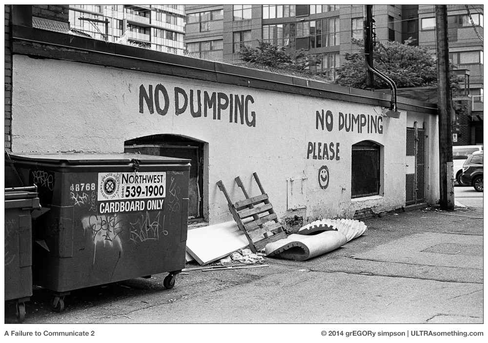
Categories : Musings
Tags : Black and White Photography, photo humor, Photography clichés, Post-Processing choices, supernatural photography
Posted by Egor 
· February 17, 2014 

Fractured

I’m not sure when I first came to realize that the big statistical bell curve of public taste didn’t actually include me.

Maybe it was during my teenage years. My friends would forever argue over who was hotter, Farrah Fawcett or Cheryl Tiegs. I remained mute on the subject — quietly confident that the answer was “neither,” and that Carol Kane (from “Annie Hall,” “When a Stranger Calls” and “Taxi”) had them both beaten. Never mind that Carol didn’t have a swimsuit poster to promote her “hotness” — her appeal went beyond something that could be tacked on a wall.

Come to think of it, I might have grasped the situation even earlier — grade school, perhaps. While all my friends were trying to figure out whether they’d grow up to marry Ginger from “Gilligan’s Island” or steal Jeannie away from Major Nelson, I had my sights set on Lily Munster. Now that was a woman worth growing up for.

But it’s not just a female-related phenomenon. It’s an anything and everything phenomenon.

Music? I spent my entire adult life involved with the arts (in general) and electronic music (specifically). So you’d probably never guess that “Cowboy in Sweden” — Lee Hazlewood’s loungey, psychedelically-infused, mawkishly addictive collection of tumbleweed pop — would be my all-time favourite album… but it is.

Movies? With my Top-10 list populated with such titles as Juan Lopez Moctezuma’s “Alucarda,” I doubt it shares many entries with the Top-10 lists of cinephiles residing beneath the bell curve of motion picture appreciation.

And so it goes with everything — fashion, food, travel, design, philosophy. Name most any topic, and I’m so far removed from the bell curve, I’d have to take a taxi just to get to the long tail.

Curiously, it’s photography that once provided the lone exception. Granted, I always had a disinterest in the “pretty” photos that occupy the fat juicy center of the curve — the sort of photos that would land a photographer an assignment with some nation’s tourism board, or a studio gig with Farrah Fawcett or Cheryl Tiegs. My heroes had names like Frank, Friedlander, Koudelka, Erwitt, Smith and Winogrand. Thanks to society’s mid-20th century hunger for photojournalism and John Szarkowski’s influential good taste, there was enough room in photography’s long tail for an assemblage of photos that actually spoke to me. These aforementioned photographers (and many others of their ilk) are the ones who taught me how to see and, more importantly, how to communicate what I saw through photography.

Unfortunately, since the turn of the 21st century, photography’s big bell curve has been shifting steadily away from the metaphorical poetry of the photojournalists and Szarkowski’s “new documentarians,” and toward the pedantic and obvious — images manipulated into idolatry and scrubbed free of character and soulfulness. My position within the fringes of today’s photographic bell curve is really nothing but an anachronistic remnant of photojournalism’s past popularity. As we who continue to appreciate the genre grow old and expire, our numbers decline and our position under the big curve grows more tenuous.

Truth be told, my position within the bell curve was always more tenuous than I let on. While there was (and still is) a part of me that loves traditional photojournalism, I always had another “side” — a side in which I would be inexplicably moved to take photos that John Szarkowski would have detested, and that my photographic heroes would have mercifully denied with a match and some lighter fluid. It’s a side filled with photos that favor innuendo over fact; photos written in coded riddle rather than lucid prose; photos that reward the quixotic and condemn pragmatism.

Unlike the photojournalists, who all feast from the same trough and share a similar vision and passion, there’s no single group of photographers to help me figure out exactly why I’m compelled to take the most fractured of images. Or to figure out exactly what it is I’m hoping to achieve by doing so. There’s not even a single genre or designated nomenclature under which these sorts of photos can be grouped.

There’s an undercurrent of pictorialism, of course. There’s also a smattering of influence from Japan’s “Provoke” era of the early 1970’s. Yutaka Takanashi, Takuma Nakahira, Daido Moriyama — all come close to describing the visual language I seek. But I’m also drawn to early 20th century avant-garde Czech photography. And yet Frantisek Drtikol, Jaromir Funke, Jaroslav Rössler and Josef Sudek often took photos as different from one another as from those taken by the Pictorialists and Provoke practitioners. So what’s the common thread? Where do all these styles intersect? The answer lies buried somewhere in the haze of my own photography.

I must admit, after a lifetime spent on the outside of every bell curve known to man, I enjoyed the little bit of camaraderie I experienced beneath the long tail of the photography curve. I never felt alone, knowing there were at least a few photographers just like me. It’s what enabled me to create this little slice of photo-existentialism known as ULTRAsomething. I can’t lie — it’s nice to be liked. But the problem has always been that, in order to stay snug and warm beneath the ULTRAsomething security blanket, I had to keep downplaying those anti-fidelity tendencies of mine — those tendencies to create photos that are so far outside the bell curve, they don’t even have a stylistic designation. On occasion, I’ve allowed these photos to grace an article — usually sprinkled amongst a far greater number of “typical” images, so as not to draw a lot of attention to themselves. But I’ve always feared that straying too far from my photojournalism leanings (and the current quasi-trendiness of “street” photography) meant certain exile from the bell curve.

Maybe it’s the utter revulsion I have for modern commercial photography. Maybe it’s the fact that I can spend hours perusing magazines at a newsstand, and not see a single compelling photograph. Maybe it’s the demotion of the photojournalist to a class subordinate to “dude with an iPhone and an Instagram account.” Maybe it’s that I just don’t care any more. But, whatever the reason, I’ve finally awakened to the realization that I no longer belong within photography’s bell curve and that, by leaving it, I free myself to experiment, find and define the photos that comprise my “other half” — photos that might be a whole lot like the ones included with this article… or maybe not. I don’t know yet. But then that’s the point — it’s time to find out.

So it’s “¡Adiós!” to the bell curve, and “¡Hola!” to photo obscurity. ULTRAsomething will continue its exploration of so-called “street” photography as long as I continue to explore the streets, but the time has come to give equal attention to exploring my other side — a side that I’m calling, for lack of a better term, “fractured” photography.

I welcome any and all readers who wish to ride shotgun on this journey. And who’s to say? If 4 or 5 of us can find and define this language, we might just create a tiny little bell curve of our very own.


©2014 grEGORy simpson

ABOUT THESE PHOTOS: The religious innuendo of “Father Figure”; the Murnau-esque suggestiveness of an obsessive “Vampyr”; the three-martini appreciation of “Elegance”; the clandestine and shadowy “Conversation”; the milky luminescence of “Pulse” — all were shot with a Ricoh GR camera. I’ll leave it to you to decide whether they should have been shot at all…

If you find these photos enjoyable or the articles beneficial, please consider making a DONATION to this site’s continuing evolution. As you’ve likely realized, ULTRAsomething is not an aggregator site — serious time and effort go into developing the original content contained within these virtual walls.

Categories : Musings
Tags : Black and White Photography, Blur, Fractured Photography, Japanese Provoke Era, Pictorialism, Ricoh GR, Street Photography
← Previous Page
Next Page →

CATEGORIES

SEARCH SITE

SUBSCRIBE

Receive new post announcements via Email

LATEST POSTS

Something Pleasant

Tell Us How We Did Today

Book Report

EXORCISM 08

Dredging the Tide Pools

Drift

© 2025 ULTRAsomething
Articles | About | Privacy Policy | Donate | Contact
Manage Cookie Consent
ULTRAsomething uses plugins (which use cookies) to organize and optimize the site. It's kinda how blogs work.
Functional Always active
The technical storage or access is strictly necessary for the legitimate purpose of enabling the use of a specific service explicitly requested by the subscriber or user, or for the sole purpose of carrying out the transmission of a communication over an electronic communications network.
Preferences
The technical storage or access is necessary for the legitimate purpose of storing preferences that are not requested by the subscriber or user.
Statistics
The technical storage or access that is used exclusively for statistical purposes. The technical storage or access that is used exclusively for anonymous statistical purposes. Without a subpoena, voluntary compliance on the part of your Internet Service Provider, or additional records from a third party, information stored or retrieved for this purpose alone cannot usually be used to identify you.
Marketing
The technical storage or access is required to create user profiles to send advertising, or to track the user on a website or across several websites for similar marketing purposes.
Manage options Manage services Manage {vendor_count} vendors Read more about these purposes
Preferences
{title} {title} {title}