• Home
  • Blog
  • Gallery
  • Music
  • STORE
  • About
  • Contact
Posted by Egor 
· April 18, 2013 

Masquerade

mas•quer•ade (noun): A false show or pretense.

Masquerade from grEGORy simpson on Vimeo.


©2013 grEGORy simpson

ABOUT THESE PHOTOS:

There are 74 of them in this vBook — shot with all manner of cameras, lenses, film and sensors, and processed with all sorts of chemicals and software. They were sequenced in Final Cut Pro X and set to a custom score, which was recorded into Ableton Live using all 10 of my fingers and at least that many software-based synthesizers. Anyone intrigued enough to learn the meaning of the vBook’s final frame should mosey on over to another ULTRAsomething article — the one with the coincidentally apropos title of Reject Intent.

If you find these photos enjoyable or the articles beneficial, please consider making a DONATION to this site’s continuing evolution. As you’ve likely realized, ULTRAsomething is not an aggregator site — serious time and effort go into developing the original content contained within these virtual walls.

Categories : vBook
Tags : photo book, photobook, vbook, video photo book
Posted by Egor 
· April 1, 2013 

Making Contact

ULTRAsomething’s web stats have been gradually declining the last few weeks — a consequence of letting too much time lapse between articles about photo gear. If there’s one thing web analytics have taught me (besides the rather depressing realization that dancing like you’re riding a horse is apparently mankind’s greatest achievement), it’s the fact that gear-related articles deliver over 2,000% more visitors to ULTRAsomething than articles about photographic techniques, education, history or philosophy. That’s a two followed by three zeros — not exactly something I can write off as a statistical anomaly.

Ostensibly, if I want to bring more readers to my site, then I need to write the occasional paraphernalia-related article — a thoughtful, detailed, first-hand account of my experiences with some brand new, fancy-pants photographic merchandise.

So I’m pleased to announce that I’ve recently rented extra security personnel and installed an abundance of virtual port-a-potties — all in anticipation of the drunken, gear-hungry hordes who will soon descend upon ULTRAsomething to read my first-hand account of the photography world’s latest electrifying, compelling, must-have new product.

Are you ready?

Are you stoked?

Are you feeling the anticipation?

Then without further delay, I present my discussion of the brand new Lomography Smartphone Scanner!!!!!!

Hey, where’s everybody going? Come back here…

Lifelogging

OK. So it turns out that my ostensible desire to bring more readers to ULTRAsomething isn’t as ostensible as one might think. Given that I don’t sell banner ads or receive microscopic click-through payments from online retailers, web stats don’t mean a thing to me. They have no pecuniary value whatsoever. And, while some bloggers might get an ego boost from lofty stats, my own ego is sated more by writing something that resonates with a few, than by writing something that serves merely as pablum for the many.

Speaking of pablum, I need to set aside my discussion of the Lomography Smartphone Scanner for a moment, and talk a little about the growing trend known as “lifelogging.” Lifeloggers, for the benefit of the uninitiated, are people who record every aspect of their lives by wearing a camera that monitors and automatically photographs everything the wearer sees, does and interacts with. Once just a nerdy cyber trend, it’s now flirting with the fringes of mainstream acceptance, with more and more people filming and uploading their every non-catatonic activity — whether it be a recreational bike ride, their morning commute, or that taco salad they consumed at lunch. And now, with the imminent arrival of Google Glass, a whole new flock of folks will begin to experience yet another novel new way to photograph every waking moment of their self-obsessed lives.

The iGlitterati all seem to believe this lifelogging thing is some sort of new-fangled invention. Obviously, they’ve never heard of contact sheets. But then, how would they? Since the cloud-hopping beau monde have never shot film, they can’t exactly know about the practices of analog photographers; that they once cut their developed film into short strips, arranged an entire roll’s worth on a sheet of photographic paper, then exposed it to light — thus creating a contact print of every shot contained on that roll.

Photographers made these contact sheets as a way to view and evaluate every photo they took. If they shot 300 rolls of 35mm film in a year, then they’d have 300 contact sheets containing over 10,000 little 36mm x 24mm photographs. Contact sheets may have helped photographers decide which photographs to enlarge, edit and publish, but they had an accidental secondary purpose — they acted as a lifelog: a permanent visual record of everything the photographer deemed significant enough to photograph.

Read that previous sentence again. It explains my belief that a lifelog stored on contact sheets is several orders of magnitude more effective than the modern cyber version. Today’s technique, in which someone wears a camera that monitors what they see and automatically records it at predetermined intervals, creates a lifelog that catalogs the wearer’s chronology, location and activities — but it tells us nothing about that person’s mood, intellect, personality or proclivities. Contact sheets, on the other hand, illustrate so much more. Because the photographer himself decided which direction to point the camera, what lens to use, where to focus, how to expose and when to release the shutter, each photograph is more than a mere chronicling of facts — it’s a detailed psychological record of the photographer’s state of mind. And in collection with all the other photographs on all the other contact sheets, it documents a photographer’s cognitive approaches to life.

The demise of the humble contact sheet is, I believe, one of the greatest tragedies of collateral damage inflicted by the digital camera revolution. Contact sheets provide insight and understanding. Contact sheets are the reason why I bought the expanded version of Looking In: Robert Frank’s The Americans. They’re why I own Daido Moriyama’s Labyrinth, Capa, Chim and Taro’s The Mexican Suitcase, and why I’m still saving my pennies for a copy of Magnum Contact Sheets.

One could easily argue that shooting digitally doesn’t preclude anyone from keeping every image they shoot. And while technically true, very few photographers do this. The reasons are many and varied, but they all boil down to a common denominator: human nature. Since digital photos are “free,” it’s human nature to take far more than we need to convey a thought or an idea. It’s human nature to make editing decisions based on how we feel at that point in time. It’s human nature to assume we will always feel the same as when we made our selects. It’s human nature to believe we’re the sole arbiters of our own photography’s value. It’s human nature to discard that which we deem unacceptable — particularly when it might provide a visual reminder of our failures.

The irony, of course, is that one cannot learn the value of retaining photographs if they haven’t retained them. Analog photographers, by the physical nature of the medium and the dictates of the workflow, have witnessed this value first hand. But now, a generation into digital, the value of these photographic logs has been lost — only to be rediscovered (albeit in a totally different guise) by the lifeloggers.

I have little doubt that — like the pet rock, the leisure suit, and people asking “Where’s the beef?” — lifelogging will one day disappear; probably right around the time that someone realizes they’re spending $1000/year on hard drives to store a bunch of mind-numbingly boring material that they’ll never view again. I also have little doubt that some creative people will turn lifelogging techniques and practices into worthwhile new forms of art, journalism and communication that will far transcend their trendy techie beginnings. But that person won’t be me.

So What About That Lomography Scanner, Dude?

By now, the three of you still reading this article are probably wondering what all this has to do with a review of the Lomography Smartphone Scanner. And the answer is simple: without a wet darkroom, this device is the fastest and easiest way I’ve found to create digital “contact sheets” from my 35mm negatives.

Previous articles in which I discuss the Spinner 360 and the Lomokino 35 reveal an ongoing love/hate relationship with Lomography products. I dislike their ridiculously cheap and rickety build quality, yet it’s this very tawdriness that allows them to fit within my budget. And that’s definitely something to love.

The Smartphone Scanner fits the same Lomography profile — a one trick pony with a design requirement that hovers around “bare minimum.” Each time I use it, I handle it more gently than I would handle an egg, and I’m extra careful to keep it away from huffing and puffing wolves, since it would surely topple quicker than little pig #1’s straw house. Since I haven’t actually broken this (or any) Lomography product, these precautions may simply be a case of paranoia — but it’s a paranoia I don’t suffer with any other photographic equipment.

Because I switched to a hybrid film workflow back in the early 1990’s, I’ve long been without a darkroom facility for making wet prints, and thus without a way to make traditional contact sheets. In the early days of SCSI-based scanners, the process was so laborious, tedious and slow, that I actually stopped developing my own B&W film and switched to slide-based color film — thus enabling me to review my shots without having to make contact sheets. By the early 2000’s I had switched to an entirely digital workflow, and was merrily acetate-free. But by the early 2010’s, I had most curiously returned to shooting significant quantities of black and white film, and was once again struggling with a way to make “contact sheets.”

Initially, I tried scanning an entire negative sleeve on a flatbed scanner, but this worked totally counter to the rest of my workflow. I wanted to see, catalog and annotate every photograph in the same way — regardless of whether the source material was digital or analog. Scanning an entire negative sheet, while reasonably simple, resulted in a single image file that contained 36 photos, rather than 36 individual image files. Eventually I wrote a little Photoshop action that would slice the single scan into 36 smaller files, which I could catalog right along with the digital photos. But this required a lot of extra time and effort that simply wasn’t worth the spectacularly poor results.

So I switched to the method I employed for the last three years: scanning each and every frame at its maximum quality setting, regardless of whether or not I thought the photo was “worthy” of additional consideration. This means every roll of film I shoot necessitates a 2-hour scanning ordeal. I pull each negative from its polypropylene storage sleeve, load it into a negative carrier, insert it into the Plustek, launch the SilverFast scanning software, and make a pre-scan of one individual frame. At this point, I’ve completed 100% of the mechanical effort required to make a scan, needing only to select a final resolution before pushing SilverFast’s scan button. It didn’t take me long to decide that, because all the actual hassles were behind me, I might as well go for the full-resolution scan — it required no additional effort on my part, just a lot of additional time waiting for the scanner to complete its mission.

The good thing about this method is that every negative on my contact sheet is ready to be processed at any time — no additional scanning is required. The bad thing about this method is that it takes so much time and effort to scan 36 negatives, that I sometimes find myself avoiding film simply because I won’t have the time to scan it. I needed to find a quicker way to make “contact sheets” — something that didn’t take the time and energy that the Plustek demands.

Along the way, I experimented with alternate ways to make contact sheets, including placing the negatives on an iPad and photographing each frame with a digital camera. Alas, this technique yielded some rather hideous images, since iPad displays don’t feature a uniform light source, but 800,000 tiny little LED light sources — each of which is gloriously visible in any photographed negative. I experimented with diffusing the iPad display, but the results were no more satisfactory — particularly once I realized that this cobbled together process still required nearly an hour of hands-on hassle time.

Enter the Lomography Smartphone Scanner. In reality, it’s not a scanner at all. It’s a clamp that holds your smartphone atop a plastic bellows, which sits on a little battery-powered light panel that’s the size of a 35mm negative. There’s a slot to feed your film into the “scanner,” and a knob to crank the film through, allowing you to photograph one frame at a time using your smartphone of choice.

Since my iPhone contains an 8 megapixel camera, I initially assumed this would result in 8 megapixel “scans” from my smart phone. But, contrary to any logic I can fathom, Lomography designed the device so that the long edge of a 35mm negative runs parallel to the short edge of the iPhone. That’s right, the device is designed such that landscape-oriented negatives are photographed with a portrait-oriented iPhone. The end result is that your 8 megapixel iPhone photo contains only 4 megapixels of actual image data.

Ultimately, in spite of these frustrations, the Smartphone Scanner may well be the ideal solution to the problem of making 35mm “contact sheets” for the digital age. It reduces what was once a 2-hour endeavour into a butt-simple, thought-free 15 minute process.

Of course, none of this helps me one bit with the ever-increasing quantities of 120 film running though my collection of medium format cameras… but perhaps, since Lomography sells the ever popular Holga and Diana cameras, a 120 model is on the horizon. I’m sure I’ll have a love/hate relationship with that product, too.

Workflow (For Those Who Care)

For any 35mm film photographer who might choose to follow my lead and adopt a Smartphone Scanner as their “contact sheet” maker, here’s a brief overview of my workflow:

FIRST: “Scan” Negatives Into Your Smartphone

After the negative has dried and before I cut it into 6-frame strips, I run the entire uncut strip through the Lomography Smartphone Scanner. I’m currently using an iPhone 4s running the 645 Pro iOS camera app. This app bypasses the jpeg creation process and saves the photos as uncompressed TIFF files. Truth be told, I haven’t really seen any benefit to this since an iPhone TIFF is not a true RAW file, but a demosaiced and processed file that simply hasn’t been compressed into a jpeg. But 645 Pro (like many other 3rd-party camera apps) does let me define an auto-exposure region that’s in a different location than the focus point, and this helps me achieve optimum exposure for each negative that I photograph.

SECOND: Transfer the “Scans” to Your Computer and Name Them

Once I’ve photographed all 36 frames (a process that takes less than 10 minutes, thanks to Lomography), I transfer the photos from my iPhone to my Macintosh. Since I demand my photos adhere to my standardized personal file naming convention, I next select all 36 files and drag them onto a custom Automator application that renames the files appropriately.

THIRD: Invert the Negatives

Because I’ve photographed negatives, I need to convert them to “positives” in order to view and assess them more easily. To do this, I simply drag all the images onto a Photoshop droplet I created that does exactly this. (NOTE: Lomography is promising they will soon have their own scanning app, which will invert the negative automatically. Unfortunately, this app was not yet available at the time of this article).

FOURTH: Import to Lightroom and Crop

At this point, I drag the exposures into a new folder I created in Lightroom, sync that folder inside Lightroom, and my contact sheet is complete. However, because the Smartphone scanner has that silly design in which the orientation of the negative is contrary to the orientation of the iPhone, the scans have a lot of unnecessary border around them. So, in order to clean things up, I perform a bit of global non-destructive cropping in Lightroom. Specifically, I open the first file in Lightroom, type “R” to bring up the cropping tool, then draw a slightly roomy crop around the image. To then apply the crop to the remaining photos, I select all 35 remaining negatives in Lightroom and paste the “develop settings” from that first negative onto them. (NOTE: I’m currently considering an alternative workflow in which I integrate the cropping process into the Photoshop inversion droplet — that way I won’t waste hard drive space to store the unused border that surrounds each frame).

And that’s it. I now have a collection of 4 megapixel images that I consider “good enough” to catalog and evaluate all the photos on a film strip. I can then look through the “contact sheet” and select those images I want to scan properly with the Plustek, while the rejects remain visible and accessible for future consideration — just like a real contact sheet.

And the best part is, thanks to the speed with which I can crank film through the Smartphone Scanner and photograph it, coupled with those custom little Automator and Photoshop droplets, I can knock out a contact sheet that integrates seamlessly with my digital workflow; and I can do it in under 15 minutes. Because of this new workflow, I now have more time for more important things: like writing gear reviews or, perhaps, learning to dance like I’m riding a horse…


©2013 grEGORy simpson

ABOUT THESE PHOTOS: “35mm Contact Sheet” doesn’t really qualify as a photo — instead, it’s simply a screen shot illustrating the “contact sheet” I made after ingesting a fresh roll of 35mm film using the techniques discussed in this article. “Smartphone Scanner Action Shot (A Recreation)” also barely qualifies as a “photo.” The fact I shot it with my Ricoh GXR and its 50mm ‘lensor’ isn’t as significant as the fact that the settings shown in the 645 Pro iOS app are not the same as the settings I actually use to “scan” negatives — so don’t go trying to copy these and then wondering why your scans don’t seem right. “Scattered Glances,” “Hands,” “Mega Cliché” and “Eye Spy” were all scanned on my Plustek 7600i from the same roll of film — the one shown at the top of this article. As such, all were shot using the same camera (a Leica M2), the same emulsion (Tri-X exposed at ISO 400), and developed in the same solution (Rodinal 1:50). Curiously, they were all shot with the same lens — a Leica 21mm f/2.8 Elmarit-M. And, best of all, the photos in this article are a miniature ULTRAsomething lifelog — representing what I saw and how I chose to photograph it during the 48 hour period in which this film was inside my Leica M2. Any people think I’m not trendy…

If you find these photos enjoyable or the articles beneficial, please consider making a DONATION to this site’s continuing evolution. As you’ve likely realized, ULTRAsomething is not an aggregator site — serious time and effort go into developing the original content contained within these virtual walls.

Categories : Photo Gear, Photo Techniques
Tags : Black and White Photography, Contact Sheets, Film Photography, Lomography Smartphone Scanner Review
Posted by Egor 
· March 19, 2013 

Get Y’ur Lurnin’

I’ve long enjoyed working face-to-face with any photographer who’s sought my tutelage. The happy result of these relationships is, more often than not, many of these photographers have discovered photographic avenues, personal expressions and styles that are uniquely their own.

Every photographer I’ve worked with has struggled with the same question — what to photograph? After exhausting such typical subjects as family, friends, pets, vacations and scenic vistas, many photographers grow restless. They want to say something more with their camera; something different; something personal.

Fortunately, I have answers. Unfortunately, my answers are not what many wish to hear. My answers cannot be distilled into a single universal answer, like “42.” My answers don’t require an investment in new camera gear, but in introspection, courage and dedication. My answers are not a finish line, but a doorway to a new beginning.

While I occasionally find individual photographers ready to face this level of commitment, I sometimes wonder if enough exist to form a workshop? After all, the same philosophies and coaching techniques I’ve employed with individuals are equally suited to small workshop environments. But in this age of push-button solutions, is it wise to create a seminar requiring that the photographer puts the “work” in “workshop?” Are there enough casual photographers who are ready to admit that the best photo opportunities do not announce themselves with trumpet blares and flashing lights? Are there enough who’ve found only emptiness in the bottomless abyss of chasing trends? Are enough photographers ready to find their subjects by exploring the person behind the camera?

These are questions I’ve asked myself the past couple years, as I pondered whether or not to design a new and unique series of workshops.

You Got Peanut Butter on My Chocolate

In the make-believe world of television advertisements, Reese’s Peanut Butter Cups were invented when two people collided with each other on the street. One person, euphorically enjoying a chocolate bar, ran headlong into a second person who, curiously, was wandering about whilst snacking on an open jar of peanut butter. Most surprisingly, this collision resulted not in a string of personal injury lawsuits, but in a great new taste treat: peanut butter combined with chocolate.

Quinton Gordon and I collided, metaphorically, last summer. The Leica Akademie asked me to audit one of their street photography workshops, and provide them with feedback and suggestions. Quinton was that workshop’s instructor. We hit it off instantly — kindred photographic spirits who completed each other’s sentences, followed similar thought patterns and adhered to the same teaching methodologies. Although our photographic styles are rather different, our photographic philosophies are very much the same — the way we approach our work, choose our subjects, and search within ourselves for the answer of how best to photograph what’s external to us.

It was a meeting every bit as serendipitous as the one that brought Reese’s Peanut Butter Cups into the world. In Quinton, I found someone who mirrored my belief that learning to take photographs was not the same thing as learning to be a photographer. Here was someone who was already hosting the sorts of workshops that I was merely conceptualizing.

From that point forward, the end result was inevitable: Quinton and I would join forces to create a workshop entirely unlike any other.

Ferreting Mantras

“Ferreting Mantras” is the first workshop to come about from my collaboration with Quinton. It’s designed to teach photographers how to find photographic subjects they might otherwise miss — by learning how to recognize their own internal photographic inclinations, and then looking for these predilections in the world around them.

This two-day workshop is planned for the weekend of May 11 and May 12, 2013 at the Lost & Found Cafe in Vancouver Canada. It includes lunch, snacks, coffee and as much psychological prodding as we can legally dispense without a medical degree.

You can check out all the details of this workshop over on Quinton’s website, where you can also follow the registration link. In order to insure maximum benefit to all involved, attendance is limited to only 12 participants, so don’t delay.

I hope to see some of you there.


©2013 grEGORy simpson

ABOUT THESE PHOTOS: “Hope (Scenario 1)” was shot with a Leica R4 and a 50mm f/2 Summicron-R lens on Tri-X at ISO 400, developed in a 1:35 solution of Rodinal. “Hope (Scenario 2)” and “Hope (Scenario 3)” were both shot with a Leica M6TTL, fronted with a 1938 Leitz 50mm f/2 Summar screw mount lens, exposed on Delta 3200 and developed in a 1:25 solution of Rodinal… mmm, crunchy!

If you find these photos enjoyable or the articles beneficial, please consider making a DONATION to this site’s continuing evolution. As you’ve likely realized, ULTRAsomething is not an aggregator site — serious time and effort go into developing the original content contained within these virtual walls.

Categories : Musings, ULTRA news
Posted by Egor 
· February 22, 2013 

Jim’s Victory

Cause

Back when hippies roamed the earth and astronauts roamed the lunar surface, I was the typical 10 year-old suburban globule who, like thousands of other 10 year-old suburban globules, was being subjected to weekly piano lessons. Don’t misunderstand; I liked music — loved it, actually. But the piano lessons weren’t doing it for me. My pedantic plunking of some dumbed-down Bach or Brahms ditty had no apparent connection to the rock and roll that streamed forth from FM radio. Piano lessons, I figured, were just another of the many things that all kids were forced to endure — much like going to school or eating vegetables.

I met my 30 minute-per-day practice requirements with uncanny precision — never once cheating with a 29 minute session, nor giving generously of myself by stretching it to 31 minutes.

One day, about a year into the grind, I entered the local piano store for my weekly lesson, and was surprised to find my teacher had left. In her place sat Jim Victor: a young man in his early 20’s; long hair; John Lennon glasses. He asked me to call him “Jim.” In truth, he looked a little more like John Denver than John Lennon, but he was still far cooler than any music teacher I’d ever seen.

Jim asked me to play what I’d been working on, so I began my soulless rendition of the musical notes that sat propped before me on the piano — notes to which I’d dedicated exactly three and one-half hours of my life to learning. I finished the piece and waited for the critique.

“Do you like this music?” Jim asked.

Suspecting a trick question, I responded “It’s OK.”

“You know you don’t have to play this if you don’t want,” he said.

Now thoroughly convinced that trickery was afoot, I began to scan the little recital room for Allen Funt’s hidden camera.

“What kind of music do you like?” asked Jim.

“The Beatles?” I answered tentatively.

“Then buy a Beatles music book, and bring it to your lesson next week.”

“Really?” I asked disbelievingly.

“Of course. If you’re going to learn to play the piano, you might as well learn by playing music you like.”

Over the next month, my life changed dramatically. I stopped watching the clock, and found myself happily exceeding my 30 minute practice dictate — sometimes playing for an hour or more. It was satisfying to learn to play something I knew; something I liked.

A couple months later, after I finished playing yet another rock song by some currently popular artist, Jim sat quietly — seemingly hesitant to respond.

“It’s good,” he said, “but wouldn’t it sound even better if you played it like this?”

He then proceeded to play a groove-oriented jazz interpretation of the song that, though obviously having its roots in the original melodic structure, veered into entirely new territory. I was enraptured.

“You don’t have to play the notes that are written on the page,” said Jim, pulling out a pencil and scribbling in an entirely new bass line and modifying the chord structure of the chorus. “Try it now,” he said.

It was the first time I’d ever had my mind blown. It exploded into a billion little pieces. From that point forward, I never again played a piece of music the way it was written. In the weeks that followed, Jim and I would rewrite music together, but it wasn’t long before I started modifying all the pieces myself. Practice soon consumed every spare moment of my day, and I would rush home from school, plow through chores and snub my homework — just to get a few more moments behind the keyboard.

Before long, I started to think “why am I rewriting existing material? I’m modifying these songs so much, I might as well just write them from scratch.” And so I did — my piano lessons were no longer ‘lessons,’ but the ‘world premiere’ of that week’s new composition. And now, because all I cared about was music, I began to appreciate other musical genres that most kids wouldn’t dream of listening to — I started to develop a strong interest in classical music and wanted to understand its structures and theories. I wanted to learn about orchestration and counterpoint. I became fascinated by the avant-garde. I wanted to absorb everything I possibly could — and I had barely even entered my teens.

Jim took my unwired, uncooked brain and taught me that rules were merely suggestions — that my own soul was where music really comes from, and not from the notes on the printed page. It launched me on a music-based career that lasted decades.

Jim’s approach to teaching piano has had a direct impact on every creative endeavor in my life. His technique taught me to seek inspiration from those whose work I admire; to understand it; absorb it; reinvent it; then make it my own. This process — repeated endlessly throughout my life — is what enables me to find my own voice, my own passions, and unlock my creativity. This strategy — though taught in front of a piano — works for anything and everything with a creative component. For this reason, my childhood piano lessons became the best (and only) photography lessons I ever had.

Effect

Last week, reinforcing my status as an overly predictable creature of habit, I went to my local bookseller to peruse their latest inventory of photography monographs. Squatting to see the contents of a bottom shelf, I saw a pair of shins shuffle toward me, then pause perilously close to my face. Thinking I was obstructing someone’s view, I stood to move.

“You’re a pro photographer, aren’t you?” asked the man to whom the shins belonged.

“More so in spirit than by any accepted accounting standards,” I answered.

“I knew it,” replied the gentleman. “You look like a photographer.”

My mind quickly attempted to construct a composite image of a de-facto photographer. I mentally sequenced and re-sequenced DNA strands from Winogrand, Frank, Friedlander, Cartier-Bresson, Smith, Koudelka and others in an effort to create a profile of a generic photographer, but I just couldn’t find a match for my own reflection. I sprinkled in a bit of Diane Arbus, Ruth Bernhard and Lisette Model in hopes of accentuating some of my softer features, but still couldn’t concoct a doppelgänger. Just as I was beginning to compare Richard Avedon’s hair to my own, Mr. Shins spoke again.

“Can you recommend a book or a class that will teach me to become a photographer?” he asked.

The poor fellow couldn’t have been more surprised by my response. “First,” I said, nodding toward the ‘Photography Techniques’ section, “don’t even bother looking through those books. They purport to teach you photography, but they don’t tell you anything about yourself.”

My inquisitor looked puzzled.

“What motivates your desire to photograph?” I asked.

“I don’t really know,” he replied.

“Who is your audience? What do you want your photos to communicate? What are they about?”

Again, he couldn’t answer.

“The only thing those how-to books will teach you is how to take photos that look like everybody else’s photos,” I said. “Sure, you’ll manage to take generic facsimiles of the photos contained in the book, but what’s the point? A million other people are reading the same book and trying to take the same photos. If you want to learn photography then what you really need is to learn how to see.”

I saw the light turn on behind the eyes of Mr. Shins.

“Photography isn’t about the mechanical act of photographing things,” I said, “it’s about showing the viewer what’s unique about you — about how you see the world and about how you interpret it.”

Mr. Shins’ shins began to do a little dance. “Yeah! I hadn’t really thought of that, but you’re right!”

Approaching maximum pontification, I continued with my monologue. “That’s why the best way to start learning how to photograph is to look through all these monographs,” I said, plagiarizing myself as I waved a hand to and fro at the bookcases before us. “You need to find some photographers whose style, photos, subject and vision connect with you and then figure out what that connection is. The more you recognize how they see and interpret their surroundings, the more photo opportunities you’ll see in your own life.”

“That’s my problem!” exclaimed my new friend. “I can never find anything to photograph.”

“And that’s the key to becoming a photographer,” I said. “At any given moment, there are thousands of potential photographs all around us — being a photographer is about learning how to see them, and then choosing the ones that mean something to you. Most people restrict their photography to the visual cataloging of various objects, people and places — but great photography is more about emotion and interpretation than about replication.”

“I see what you mean,” said the man. “But how do I learn the basics? How do I know if I’m doing it right?”

“There’s no such thing as right or wrong in photography,” I said. “You just have to start shooting. Then keep shooting. Then shoot some more. The more you shoot, the more you learn.”

“But how do I know if my pictures are any good?”

“Simply by looking at them, and being honest about how they make you feel,” I answered. “Unless you’re a commercial photographer with a client, it doesn’t matter which of your pictures other people like — it only matters which ones you think are good. When you look through all these monographs, you’ll see dozens of photographers whose work does nothing to inspire you — but that doesn’t mean they’re not great photographers. It just means their likes and interests are different than yours. They’re not trying to satisfy everyone who views their work, and neither should you. The more people you try to satisfy, the blander your photos will be. But if you’re honest with yourself when assessing your own photos, then you’ll find yourself developing your own style and your own voice; one that will be unique to you and not just a copy of someone else’s idea of a photograph.”

“I’m so glad I talked to you. I can’t wait to get started!” exclaimed Mr. Shins; a smile stretching widely across his face.

“Good luck,” I replied, “and have fun with it.”

As I turned to leave, the gentleman took up residence in front of the photography monographs, reached onto the top left shelf, and extracted the first book.

I felt somewhat optimistic that maybe, perhaps, I helped steer someone toward an approach that will launch them on a long and pleasurable journey with photography. Decades later, Jim Victor is teaching pupils he doesn’t even know he has in an art form he didn’t even practice. For an educator, that’s a significant victory.


©2013 grEGORy simpson

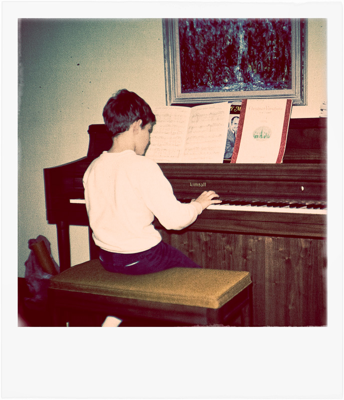
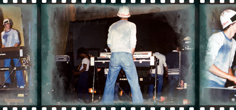
ABOUT THESE PHOTOS: “Soylent Green” was shot with a Leica M9 and 28mm f/2 Summicron lens. “The Rote Year” and “Early Gig” were both likely shot by my Dad and don’t look nearly as bad as I’ve presented them here — purposely, stylishly and artificially “aged” for use on another website. “A Closer Look” and “Jailer’s Muse” were both shot during a Vancouver Street Photography workshop that the Leica Akademie asked me to assist with. Though nothing overly special, they remind me of how much I like helping other photographers find their own voices. Both were shot with a Leica M9 and a 28mm f/2 Summicron lens.

If you find these photos enjoyable or the articles beneficial, please consider making a DONATION to this site’s continuing evolution. As you’ve likely realized, ULTRAsomething is not an aggregator site — serious time and effort go into developing the original content contained within these virtual walls.

Categories : Musings
Tags : photo education, Photographic Philosophy
Posted by Egor 
· January 14, 2013 

This Past Fast

There are many who proclaim that the human body was never meant to receive three square meals a day — that since we evolved as a species of hunters and gatherers, our bodies neither expect nor want to see a daily caloric intake. It sounds like a reasonable theory, which probably explains why I just completed a nice little five week fast. You can hold your admiration — I didn’t actually go five weeks without food. I have an iron will, not a tungsten one. Instead, I went five weeks without something else — photography.

True to my nature, I simply appropriated a procedure from one discipline and applied it to another. Photographically speaking, I’m every bit the hunter and gatherer. I seek images in the wild — too primitive to master the art of farming frames, and too crude to manufacture them. In my book, that puts my photography and my physiology close enough to share methodologies.

This was not my first photo fast. Occasionally, when I feel my motivation decline or I begin to question my methods and the validity of my work, I simply stop taking photos for awhile. But this past fast was my longest yet.

It began before I knew I was even fasting. It usually does. There’s always some period between catalyst and realization — when my subconscious knows something’s afoul before my intellect gets a clue. That first week, as I walked with camera in hand, I felt increasingly less inclined to release the shutter and more inclined to distance myself from the so-called “street photography” genre.

Though I have long suffered an involuntary clenching of the sphincter regarding the term “street photography,” it was no longer just the label that repelled me — it was the actual act. Over the last couple of years, street photography has become hip. And in today’s world, “hip” means “adopting a culture without bothering to understand it.” If something becomes too hip, it will actually cease to be the thing it imitates and transform into the thing it’s become.

It had reached the point where I couldn’t walk down the sidewalk without tripping over another “street” photographer. Sometimes they travel in packs — emboldened by the group to shoot aggressively. Sometimes they lurk alone in shadows — snipers with telephoto lenses. Sometimes they’re simply schools of smartphone-wielding pilot fish — snapping up whatever little shot opportunities the dSLR sharks leave behind.

If these are the hip new breed of street shooters, then what am I? I’m certainly not the shark. And I know I’m not the pilot fish. Why am I even swimming in this ocean?

So with the first week of accidental fasting behind me, I commenced on an additional four weeks of purposeful fasting — trying to figure out what type of photographer I was; what type I should be; and why I do this at all.

Truth be told, I did take a few photos during the fast. If I saw an interesting product in a store, I’d snap it with my iPhone for later research. And with the iPhone in hand, I’d occasionally photograph random objects with various Hipstamatic effects — thus insuring I could still take photos that looked the same as everybody else’s. I also blew through a roll of Tri-X to test a Leica R4, and I did my best Kertész/Smith imitation by shooting a few photos from my apartment window.

But that hunting and gathering style of photography? The old search-and-shoot? I wrapped it all up in a lead-lined duffle bag, and sat it on the shelf for five weeks.

The goals for any dietary fast are to cleanse the body of toxins, reset our biological systems, increase mental alertness, fight off illness and enhance our sense of well being. So what were the tangible benefits of my photographic sobriety?

Zip. Zilch. Zero. Nada. Nothing. In the words of the obnoxious, crudely-animated, pipe-smoking, repugnantly-bigoted xenophobic sailor known as Popeye, “I yam what I yam.”

But upon further contemplation, I realized that “I yam what I yam” is exactly the result one should expect from a successful fast. Fasting doesn’t give you a brand new digestive system; it simply repairs the one you already have. It’s silly that I had to stop taking photos for five weeks in order to figure out what I already knew, but perhaps that’s the whole point of fasting? The term “street photography” always was and always will be a meaningless label. This is precisely why I dislike it. So why should it matter to me if the genre suffers yet another redefinition? Society’s shifting interpretations of street photography don’t change the way I see the world. They don’t change the way I photograph it. And they certainly don’t change my attraction to all things charmingly inane.

Relieved by the realization that I yam what I yam, and even more so by the knowledge that I yam in absolutely no other way similar to Popeye, the fast has ended. I’m back on the streets, indulging once again in the heaping portions of the droll and the ironic that seem to be my oeuvre. Bon appétit, dear readers!


©2013 grEGORy simpson

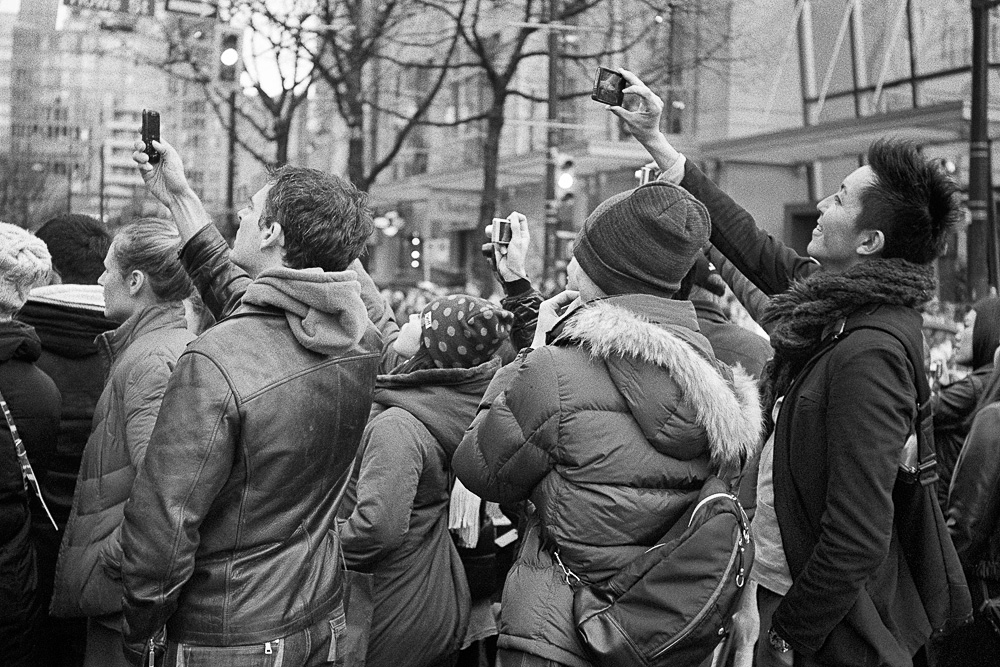
ABOUT THESE PHOTOS: “The Tog Pack” was shot with a Leica M9 and a somewhat rare 1999 Leica 50mm f/1.4 Summilux screw mount lens. “Stealth” was shot with a Leica M-Monochrom using a lens I forgot to document, but have reason to believe was a Leica 21mm f/2.8 Elmarit-M (pre-ASPH). “Pilot Fish” and “The Moiré the Merrier” were both shot with a Leica IIIf (black dial) and a 50mm f/3.5 Elmar Screw Mount lens on Tri-X, and developed 1:35 in Rodinal. “Diagonals 2” was shot from the warm and cozy confines of my condo using a Pentax K5 with a Pentax-M 120mm f2.8 SMC lens.

If you find these photos enjoyable or the articles beneficial, please consider making a DONATION to this site’s continuing evolution. As you’ve likely realized, ULTRAsomething is not an aggregator site — serious time and effort go into developing the original content contained within these virtual walls.

Categories : Musings
Posted by Egor 
· January 6, 2013 

More Bartlett’s Rejects

Concision is a virtue. Some writers express themselves thoroughly with only a laconically minimalist assemblage of words. These wordsmiths — deities of pithiness — are my inspiration. For unlike them, I am an adjective junkie cavorting in the company of the loquacious. I imbibe in drunken orgies of word gluttony and succumb most decadently to the pleasures of literary contrivance, chasing after bare naked semantics and groping at nubile symbolic metaphors — vices all glaringly illuminated by this very paragraph.

Of the 19 articles I penned previously for the Leica blog, 18 of them feature prose with an unequivocally purplish hue. The only one that didn’t — the one in which I managed an air of dignity and sober succinctness, was a little post called “Bartlett’s Rejects.”

At the time, I described the article as “nothing more than a mathematically-challenged baker’s dozen of my own personal photography quotes — unadorned with tedious explanatory prose and contextual verbiage.”

The article was neat, tidy, mussless and fussless. 14 little thoughts that each spoke volumes despite their brevity. So after my recent 3-part, 10,000 word Monochrom review, what better way to celebrate my 20th f/Egor article than with a sequel to my one and only exercise in linguistic economy?

And so, to the blare of imaginary trumpets, I present for your copying, pasting and tweeting pleasure… More Bartlett’s Rejects:

“The most important element in a photograph is the one you can’t see.” – grEGORy simpson

“Never let truth ruin a perfectly good photograph.” – grEGORy simpson

“A monkey could take the same photos I do — my skill is in recognizing which are worth sharing.” – gEGORy simpson

“I’m much more concerned with what a photograph says than what it looks like.” – grEGORy simpson

“I’d rather have a phone in my camera than a camera in my phone.” – grEGORy simpson

“Photography is story-telling with your fingers crossed.” – grEGORy simpson

“I admire people who are astute enough to criticize my photos for all the same reasons I like them.” – grEGORy simpson

“A photographer who judges others by the cameras they use would be better off owning an endoscope.” – grEGORy simpson

“Imagine how visually rich the world would be if photographers took their craft as seriously as they take themselves.” – grEGORy simpson

“If your prints aren’t good enough, you’re not distant enough.” – grEGORy simpson

“My primary photographic motivator is a fear of irrelevance.” – grEGORy simpson

“No matter how awful they are, I won’t discard photographs — that would be akin to denying my own existence.” – grEGORy simpson

“I know I’ve done something worthwhile when a large number of strangers feel compelled to tell me how horrible I am.” – grEGORy simpson

“I don’t photograph what I see, I photograph what I feel.” – grEGORy simpson


©2012 grEGORy simpson

This article (along with many of its associated comments) first appeared in my f/Egor column for the Leica Camera Blog on December 4, 2012.

ABOUT THESE PHOTOS: “Envision The Future” and “Distant Skywalker Relations” were both shot with a Leica M9 and a 28mm Summicron. “From The Inside Outside” was shot with a Leica M9 and a 1999 50mm Summilux Thread Mount Lens (no, that’s not a typo — it’s a fairly rare lens released only into the Japanese market). “Melancholia” was shot with a Leica M9 and a 1982 v4 35mm Summicron (though, frankly, it probably wouldn’t have mattered what I used for this particular shot).

If you find these photos enjoyable or the articles beneficial, please consider making a DONATION to this site’s continuing evolution. As you’ve likely realized, ULTRAsomething is not an aggregator site — serious time and effort go into developing the original content contained within these virtual walls.

Categories : f/Egor (Leica Blog), Musings
Tags : photography quotations, photography quotes
Posted by Egor 
· December 11, 2012 

A Fetishist’s Guide to the Monochrom (Part 3)

After getting downright dirty in details in Part 2, we’re going to begin Part 3 right where we left off — in the mud and the grime and the goo of image quality discussions…

Highlight Fetishists

There’s been a fair amount of internet chatter over the fact that clipped highlights in a Monochrom are well and truly clipped, and that you can’t reclaim highlight detail from the RAW file, as you might with a color file. The reason color cameras have a little extra highlight headroom is that they assemble an image from three different color channels — so if one of the channels isn’t quite clipped, your RAW converter can interpret this unclipped channel as “detail.” Contrary to this, the Monochrom records only a single (albeit much higher fidelity) luminance channel. So, when a highlight clips, there’s no second or third channel from which to recover possible data.

I spent an inordinate amount of time (days) shooting specular highlights and purposely overexposing scenes using both the M9 and the Monochrom. I took hundreds of shots to compare how the Monochrom responded to blown highlights, versus the M9.

Here’s what I found: When I purposely overexposed a scene (such that large expanses of highlight detail would “clip”), I could indeed recover a tiny bit of additional highlight detail in the M9 files. Interestingly, when shooting the M9 and the Monochrom under identical conditions and with identical exposure settings, my M9 shots are consistently a half-stop less exposed. So, I wonder if that factor (more than the three color channels) isn’t ultimately responsible for the M9’s ability to display just a wee bit more highlight detail in an identically exposed file?

To see how minuscule the differences really are, take a look at the following shot, in which an entire strip of windows on the high-rise building blew out the highlights on both the M9 and the Monochrom files. Using Lightroom 4, I was able to reclaim some of the “blown” M9 highlights, resulting in the crop shown on the left. The Monochrom file, which contains no recoverable highlights, is shown on the right. Pixel peeping and a whole lot of squinting reveal that there’s slightly more detail in the M9’s blown highlight region than the Monochrom’s… but the difference is really rather insignificant.

I’ll spare you from the gory details and the burden of looking through any more of the hundreds of comparison photos that I took, and will jump right to the conclusion: If you accidentally overexpose a shot, the M9 will allow you to recover some highlight details that the Monochrom will not. If you accidentally underexpose a shot, the Monochrom will allow you to extract much more shadow detail than the M9. If you properly expose a shot, the Monochrom will give you a much cleaner file across the board, and with more usable dynamic range.

The shot below is a classic example of overexposure. It was a sunny day, and I failed to take the man’s white shirt into account — blowing out a rather large section of highlights. Plain and simple, I botched the exposure. But whether I used the M9 or the Monochrom, the man’s shirt would still be blown out. From my tests, I know the M9 would have allowed me to recover a tiny amount of the shirt detail (a percent or two, at best), but it would not come anywhere close to “fixing” my exposure error.

You might think the key to using the Monochrom is to underexpose, but it’s not — it’s to expose correctly. And in the Monochrom’s case, “correctly” means “don’t expose to the right.” This is somewhat counter to everything we’ve been told about color digital photography, and it took me about a week to get comfortable with this notion. Initially, I would err in the other direction, and purposely underexpose my shots. But there’s no reason to underexpose unless you truly don’t care about the shadows. In the case of specular highlights, they’ll always be there (at least that’s true in my city of glass-enrobed high-rises).  No amount of underexposure will prevent these specular highlights from blowing — so who cares if the Monochrom’s specular highlights are a pixel or two larger than the M9’s? Particularly when the Monochrom’s shadows are so much cleaner and its mid-tones so much richer. But that’s a topic for the next group of fetishists…

Low Light Fetishists

For every up there’s a down — for every give, a take. Thinking in terms of the Zone System, I’ve seen that the M9’s Bayer filter gives me a slightly extended Zone VIII. But, in exchange for that, it takes away visual fidelity from Zones 0 through V — In my book, that’s a pretty fair tradeoff in favor of the Monochrom — lose a little something in one zone, gain something in six zones!

You might wonder why I’m including Zone 0 — after all there’s no detail there — it’s just black. The reason is that the Monochrom’s noise floor is so much lower that, unless you’re using high ISO’s, black really is black — not some dithered, noisy grey. Not only that, but files from the Monochrom contain ridiculously greater shadow detail (zones I and II); much less obvious noise in zones III and IV; and even a tiny bit more discernible detail in zones V and VI.

Removing the Bayer filter (and thus the camera’s color capabilities) means over an entire stop of additional light reaches the camera’s sensor. And with no color, there’s no need for color management or white-balancing — both of which require additional signal amplification, which also magnifies the noise. Furthermore, in color cameras, the noise gets processed through the de-mosaicing algorithms right along with the rest of the image. This tends to “spread” the noise even further across the image. When you use software to convert a color photo to B&W, the negative impact of that color noise does not disappear — it merely desaturates while it continues to rob the image of actual detail.

I’ll write more about the Monochrom’s noise characteristics when I address the Noise Fetishists, but for now I want to talk a bit more about the Monochrom’s shadows and mid-tones.

As you’ve probably learned over the years, digital sensors are linear. This means each stop contains twice as much data as the stop below it. Under ideal conditions, a perfectly exposed 14-bit file might contain over 4,000 shades of grey in Zone VII, but it will contain only 64 shades within the shadows. That’s why we’ve all been told to “expose to the right” with digital cameras — that’s where most of the data is!

Of course, just because the sensor can theoretically record this many individual shades of grey doesn’t mean it can actually “see” that may. Lens performance can obviously affect what the sensor sees, as can any filters applied in front of that sensor. Antialiasing filters and Bayer filters both rob the sensor of light and, therefore, resolution. Since the Monochrom contains neither an antialising filter nor a Bayer filter, it delivers maximum light to the sensor, meaning it can come closer to displaying the theoretical maximums outlined above. This is particularly important in the shadow regions, where digital sensors are already less-equipped to deal with minute levels of detail and smooth tonalities.

Almost every photographer who’s spent time with the Monochrom, has written about its rich and beautiful greys. This comment is almost always met with great derision from detractors who can’t or won’t understand why this is true. And the reason it’s true is that, with more light reaching the sensor, the sensor is able to distinguish between a greater number of luminosities, which results in far less visible dithering. Consider the following illustration. All three blocks represent an attempt to draw an area filled with 38% luminosity. On the left, I used 1-bit (2 greys) of data to create a 38% luminosity. In the middle, I used 2-bits (4 greys) to create a 38% luminosity. On the right, I used 4-bits (16 greys) to create a 38% luminosity.

All three blocks represent an attempt to display the exact same shade of grey — but it’s obvious that the higher-bit version does a better job of it. And this is why the greys appear so much richer in the Monochrom: The more bits of data you capture, the more shades of grey you can display. Removing the Bayer filter allows more light to reach the sensor, which increases the apparent bit-depth of each zone, meaning each zone can display more greys. In the case of the shadows and mid tones, this is a huge advantage since, as explained above, those zones inherently contain far fewer greys than the highlight zones.

Noise Fetishists

As discussed in my dissertation to Low Light Fetishists, the absence of a Bayer filter lowers the Monochrom’s noise floor substantially.

Unlike the film days, when “grain fetishists” were defined as people who actually liked the appearance of grain, “noise fetishists” are the opposite — they despise the appearance of digital noise. And well they should. Digital noise is just plain ugly. That’s why it’s so great to have a camera that minimizes it (rather than masking it). I have no problem claiming that an ISO 10,000 Monochrom file has far fewer detail-obfuscating “artifacts” than a Tri-X negative shot at ISO 400 — but that doesn’t mean I’d never use Tri-X again. Quite the contrary. Film grain is made from clumps of tonal clusters and adds a rich texture to a photograph, while the Monochrom’s noise looks like a very fine dusting of static spread evenly across the frame. The Tri-X simply looks more organic. But the reality is, the light dusting of Monochrom noise steals very little image data from a photo. If you’re a resolution nut, you’ll be thrilled at what the Monochrom is capable of resolving at high ISOs.

I’m simply stunned by the low noise characteristics of the Monochrom, and by the very fine character of that noise.  And frankly, up to ISO 3200, that “dusting” of noise is so minimal as to be essentially non-detrimental. At ISO 3200 and higher, the “static” is more visible, but I wouldn’t be inclined to call it objectionable. If smooth tonality is your goal, the Monochrom is your camera.

Curiously, as a self-professed grain fetishist (and as I mentioned in my discussion of Film Fetishism in Part 2), I actually find the Monochrom’s high ISO files too clean. I know this sounds ridiculous, but when I shoot at dusk, night, or in dark environments, I actually expect to see grain. No, I don’t want to see noise, but neither do I want to see a file so smooth and detailed that someone would think it was taken at noon on a sunny day. For this reason, when I shoot dark scenes at higher ISO’s, I actually use software to add some artificial film grain to the image. I know some of you will consider this sacrilege, but I’ve got a psychological aversion to clean files shot in darkness. So, yes — I’m actually complaining that the Monochrom has too much fidelity at high ISO’s. And though I would never wish for a higher level of digital noise, I do kind of miss the grain. Like I said way back at the beginning of Part 1, we’re all just a bunch of fetishists, and this happens to be one of mine.

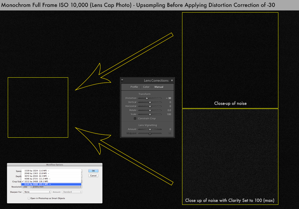
To illustrate how low the noise really is, I present the following photo, which I suspect will go down in the annals of history as “the most pedantic test photo ever published.” Yes, it’s a full-frame photograph of my lens cap taken at ISO 10,000. A small section is shown zoomed in, so you can see how unobtrusive the noise really is — even with Lightroom’s Clarity slider set to its maximum value of 100.

Unfortunately, I did uncover one noise-related issue that I don’t think will find too many devotees — a situation that, for lack of a better phrase, I’ll call noise patterning. Specifically, if I shot at ISO 3200 or higher and then used the geometric transformation parameters in Lightroom’s Lens Correction panel, it would induce an underlying visible noise pattern throughout the image. Similarly (and more egregiously) if I simply rotated an image in Lightroom, it would induce a checkerboard-like pattern within the noise, which would appear throughout all the shadow regions in a photo.

If I pretended to be Cartier-Bresson — never rotating or geometrically altering an image — then I was never able to see any noise patterning, and no amount of aggressive dodging, burning, or contrast modification would ever reveal even the slightest hint of a pattern. But since my photographic skills are aligned more with mere mortals, I occasionally wanted to rotate or geometrically alter an image — and when I did that with an ISO 3200 (or higher) file, I’d induce a noise pattern into the photo. Although I suspect at least one photographer somewhere in the world would employ this flaw as a “special effect,” I can safely say that the majority of us do not want this.

I have been working on this issue with Leica, and the problem appears to be related to Adobe’s interpolation algorithms. Specifically, the Monochrom’s noise is so “clean,” that when you use Lightroom/Camera Raw to either rotate a high-ISO image, or perform any lens distortion or perspective corrections, moire-like patterns are introduced into the noise. This doesn’t happen with color cameras because the noise is blurred by the interpolation process.

The following example illustrates this phenomenon (as well as why I resorted to photographing lens caps). Here, the lens cap photo shown above has been subjected to a distortion correction of -30 in Lightroom’s Lens Correction module. Unless you have optimal room lighting and a well-calibrated monitor, it might be a little difficult to see the moire-like pattern in this down sampled web version, but you should be able to make out the design when you look at the zoomed-in section where Clarity is set to 100:

Leica informs me that Adobe is actively involved and is now working to modify their algorithms for the Monochrom. In the meantime, those who own a Monochrom and shoot at high ISO values might want to avoid rotating an image or modifying its geometry in Lightroom or Camera Raw. Fortunately, if such actions are unavoidable, there is a reasonable work around available: simply up-sample the image before applying the transformations.

Specifically, you can open the Monochrom file in Camera Raw and up-sample it from 18.1 megapixels to 25.1 megapixels. Save the up-sampled file and use this as the basis for your image manipulations. Up-sampling the image dithers the noise just enough to make Adobe’s rotation and lens correction algorithms far less intrusive.

The following example illustrates the workaround. Here, the lens cap photo has first been resized to 25.1 megapixels in Camera Raw, then subject to the same -30 Distortion Transformation in Lightroom. As you can see, this almost completely eliminated the moire-effect.

Although I certainly don’t consider this a “show stopper” (particularly since an effective workaround exists), those who routinely work at high ISO’s and who perform a lot of geometric alterations or rotations need to be aware of this issue. Hopefully, Adobe will be able to tweak their algorithms sooner rather than later, and the extra up-sampling step will no longer be required.

Interface Fetishists

I’ll grant you — there probably aren’t too many Interface Fetishists reading this. But I didn’t spend 15 years designing professional audio hardware and software products without learning at least a little something about user interface design. Consequently, during the time I was investigating the camera’s dynamic range, I “designed” what I think is a much better interface for alerting photographers to the presence of blown highlights and/or blocked shadows. I will present these recommendations as a series of escalating suggestions to Leica:

Suggestion 1: If highlights or shadows clip, put a big thick red (or blue) bar across the screen. Make it big, bold and obvious. Currently, there are only two ways to see if any highlights clipped: you can look at the far right of the histogram and try to see if the right-most 1-pixel wide line is red (indicating clipping), or you can look at a tiny thumbnail of the image and see if there are any red pixels within it. If there’s a lot of ambient light (which there always is when I clip a highlight), then it’s nigh impossible to see a few tiny red pixels on that LCD. If I’ve taken a photo and mostly just care whether I’ve clipped anything, it would be nice to have a couple “idiot” lights appear on the LCD — that way, I’d know with just a glance whether or not I need to retake the shot.

Suggestion 2: As long as you’re mucking about with the firmware, add an option to the “alarms” menu for highlight/shadow clipping. This would make the camera beep if the image clipped within the constraints set by the “amount” menu. Normally, I’m the first person to turn off every audible sound in his camera, but this function would be very useful to any photographer who worries about clipping, but who doesn’t want to check the LCD after every shot (event and/or wedding photographers, for example).

Suggestion 3: Better still, since I really don’t like a camera to make noise, make it vibrate instead! Granted, this feature would require a hardware modification (and not just firmware), so consider this a ‘freebie’ suggestion for some future model of Leica M.

Suggestion 4: If you’re feeling ambitious, I would like to offer a further improvement on Suggestion 1: instead of a big red (or blue) bar, put a big red (or blue) number on the screen, indicating what percentage of the pixels clipped. For example, if 2.3 percent of the pixels clip the highlights, put a big red “2.3” on the screen. That way I can decide quickly whether or not I care about the clipping.

Suggestion 5: To refine Suggestion 4 even further, consider this: It’s not as important how many pixels clip, as it is how many contiguous pixels clip. A few small regions of clipping likely indicates specular highlights, and I’m less likely to be concerned about that. What I’m more concerned about is clipping large regions where I would prefer to see a tiny bit of detail. So, instead of indicating the total percentage of clipped pixels, the big red/blue numbers could indicate the largest area of contiguous clipping in the image. Like it or not, the camera has an LCD, so let’s at least use it effectively!

Beach Fetishists

A few years ago, in a fit of jaundiced lucidity, I realized that nearly everything mankind had ever invented — nearly every moment of inspiration or technological leap — was ultimately motived by one of two purposes: laziness or the urge to procreate.

“What about money?” you ask.

“Merely a means to an end,” I counter cynically. “A way to buy oneself more recreation; more relaxation; more procreation.” Mankind is, perhaps, the only species that will work incredibly hard for the sole purpose of banishing even the most simple tasks from their lives. It’s all part of some grand master plan. Even global warming, I theorize, is nothing more than a way to create more warm, inland beaches. We can’t all live in Rio, so let’s make more Rios.

Man’s ultimate desire to turn life into a popular bossa nova does, at times, infuriate me. Like, for example, every time I read an article on the internet that complains about the Monochrom’s default output being too “grey.” ¿Que? Grey is good! Grey is desirable! Grey allows you, the photographer, to manipulate an image the way you want to manipulate it. Grey lets you add contrast where you want it. It lets you accentuate micro-contrast where you want it. It lets you dodge, burn and create a path through the image for the eye to follow. It lets you call the shots. Just because the files come out of the camera with a lot of beautiful grey tonality does’t mean you’re required to display them that way. You could, instead, spend 60 seconds inside Lightroom, Photoshop, or one of a myriad other applications and make the file look the way you want it.

Have we really gotten so lazy that we demand our cameras make all our processing decisions for us? I suspect it’s only a matter of time until a camera is nothing more than a little ball that sits atop our heads and continuously records everything in the spherical space around us —analyzing it, comparing what it sees to a giant database of the most “liked” images on Facebook, then selecting those moments within our sphere that best match those images. Our little head cameras will then apply “appropriate” processing to the images it selects, and wirelessly upload them to the web before sending out an automated tweet from our Twitter account, linking to our Flickr page and exclaiming “Hey, look at these 7 amazing photos I just took!” Yet all we’ve really done is walk 2-blocks to the local coffee shop for a machiatto and a chance to chat up that cute barista.

Grey is good. Grey is malleable. Grey is traditional. And grey is exactly the way I want my raw images to appear. But then, I’m not one for lazing about on beaches…

Purity Fetishists

Besides the beach fetish, there’s another sort of hang-up that prevents some folks from accepting the notion that the Monochrom’s low contrast file is an ideal starting point for image processing — and that’s the fetish that dictates that no image processing should ever be needed if a photo is taken correctly. There are those who believe a camera can be judged only by examining its pure, unprocessed and unadulterated images, and that any form of processing obscures the capabilities of the camera in question. But what constitutes a pure and unprocessed image? There’s no such thing. In the digital world, an image is nothing more than bits and bytes. There is no image — there is only a mathematical interpretation of an image. Your computer’s RAW or JPG converter (or the camera’s built-in converter) merely interprets these numbers and assembles an image based on a conservative estimate of what the software thinks the photo should look like. I don’t necessarily buy into the belief that a bunch of algorithm coders know more than I about how I want my image to look.

The idea of a “pure” image is a myth. Many whose photographic lives began after the demise of film seem to believe all those great, classic film photographs are somehow “pure” — that they couldn’t possibly have been manipulated since Photoshop didn’t exist. Little do they know about the magic of darkroom chemical selection; the mysterious art of the dodge and burn; the wonders of graded contrast papers; the flexibility of multigrade papers and variable contrast filters; and of the miracles of potassium ferricyanide. You don’t really think W. Eugene Smith would get hopped up on poppers and spend 72 straight hours working on a single print just for the fun of it, do you?

Freudian Fetishists

Some people believe that a camera is just a camera, but the Freudian Fetishists know better — they know that a camera is a mainline to their soul. Some believe a photograph is something to be seen, but the Freudian Fetishists believe it’s something to be understood. Are you a theorist? A thinker? An existentialist? A reader of the ULTRAsomething photography site? Then you’re a Freudian Fetishist, and you’ll understand what I mean when I say that one of the Monochrom’s greatest attributes is the psychological advantage you gain from losing any possibility to shoot in color.

If this statement makes you roll your eyes in disagreement, it stands to reason that you are not a carrier of the Freudian gene. Those who manifest Freudian proclivities are the type who prefer prime lenses to zooms, since primes force them to see their surroundings within the confines of a particular focal length, which sharpens their eye and heightens their sense of photographic opportunities. By restricting focal length, Freudian photographers know they actually increase their photographic options.

The same applies to shooting B&W. I’ll admit, even though the majority of my M9 images get converted to B&W, that knowing it can shoot color means I still keep an eye out for color. Such flexibility actually dilutes my vision. I’m well aware that 99% of the people will read this and dismiss it as ridiculous. But, for me, it’s true. There’s just something about the rigidity of shooting in B&W that inspires me. Post-capture B&W conversion has always felt wrong; like cheating; like a special effect rather than a dedicated choice. The Monochrom frees me from the distractions of color and from feelings of fraudulence.

Egor Fetishists

By all rights, this should be a rather small and exclusive group of fetishists, with a membership hovering somewhere around one.

I’m always surprised how many people seek the opinions of others as guidance. But then, nearly every one of my favorite movies rates below a “3” (out of 10) on IMDB, so you can see why I might think this. My tastes can best be described as “fringe.” Whether I ultimately like a camera should have no bearing on whether anyone else likes the camera.

Still, anyone who’s made it to the end of this article deserves some kind of closure — some indication of my overall personal assessment of this camera. And so, for the purpose of “entertainment” and with all caveats firmly articulated, I’ll deliver my final proclamation… right after I admonish one more group — the Impulse Fetishists.

Impulse Fetishists are people who form strong opinions about cameras and lenses simply by looking at a few photos on the web. I have no idea how someone can look at a photo on a website — a photo that they didn’t even take — and draw a conclusion about the camera that took it? Or how that same person can reach a conclusion about a camera’s imaging capabilities by simply looking at a web photo that displays only about 3% of the RAW image’s total resolution? I suspect, having seen enough Impulse Fetishists to polish my cynicism to a blinding glare, that hundreds (if not thousands) of people will see this article and instantly leap to a conclusion. They won’t read the article. They won’t even look at more than one or two pictures. But they’ll have seen “enough” to draw a decisive and incontrovertible conclusion. I’m quite comfortable publicly dismissing this fetish and all its practitioners, since I know none of them will actually be reading this text.

There is no doubt that I love the Monochrom. I am a B&W photographer. If I never had to worry about pleasing anyone other than myself, I would be perfectly happy to never take another color photo. I have always wanted a black & white digital camera, and ever since I first learned how color digital cameras worked, I’ve known that a black & white version would have certain fidelity advantages over its color counterpart. The fact that this camera was developed by Leica, and not one of the more mainstream companies like Canon or Nikon is, for me, a real stroke of luck. Not because I’m a brand loyalist, but because I’m a rangefinder shooter — and the advantages of a rangefinder are essential to the way I photograph. So to have my dream camera (a black & white digital) available in my preferred format (a rangefinder) is like winning the lottery.

But winning the lottery is what I’d have to do in order to afford this camera. Truthfully, if I sold my M9 (plus some other cameras and lenses), I could scrape together enough cash to buy the Monochrom. But that would leave me without a single color digital camera. And while it’s true that I would personally be happy to only ever shoot B&W, such ideology does not mirror that of any clients I might wish to pursue.

In one hand, I’m holding the camera of my dreams — the single best match for my photographic proclivities of any digital camera ever manufactured. In the other hand I’m holding nothing — no wad of cash; no list of clients clamoring for B&W photos; and no galleries screaming for my quirky and blurry little slice-of-life prints. In order to achieve equilibrium, I must either free up one hand by relinquishing the Monochrom, or I must find something of equal value to put into the empty hand to balance its cost. And so, unless any of you readers know someone who wishes to employ a discursive wordsmith with a black & white photography fetish, my time with the borrowed Monochrom has come to an end — replaced with a fond but fading memory of the best digital camera I’ve ever used.


©2012 grEGORy simpson

This article (along with many of its associated comments) first appeared in my f/Egor column for the Leica Camera Blog on November 7, 2012.

If you find these photos enjoyable or the articles beneficial, please consider making a DONATION to this site’s continuing evolution. As you’ve likely realized, ULTRAsomething is not an aggregator site — serious time and effort go into developing the original content contained within these virtual walls.

Categories : f/Egor (Leica Blog), Photo Gear
Tags : Black and White Photography, Leica M-Monochrom Review
Posted by Egor 
· December 11, 2012 

A Fetishist’s Guide to the Monochrom (Part 2)

In Part 1 of this series, I theorized that nearly every element of a photographer’s perceived needs are really nothing more than his fetishes — and each photographic fetish comes with its own adherents and detractors. I began with a discussion of the camera’s build quality and here, in Part 2, I’ll discuss various imaging fetishes, and how the Monochrom might or might not satisfy some of the more popular fixations.

Color Fetishists

As you might expect, a camera called the “Monochrom” is fundamentally incapable of delivering gorgeously saturated colors. If color photography is your bag, then the Monochrom has no place inside it.

But color fetishism isn’t the sole domain of color photographers. B&W photographers often obsess over color, because color translates into luminosity and tonality in a black and white image. In the film era, photographers often selected one film stock over another because of differences in their color interpretations. Similarly, B&W photographers always stocked a wealth of colored filters, knowing that a filter applied to the front of any lens would alter the scene’s relative contrast. For example, in the following photo I used an orange filter to drastically darken the bright blue sky, which I knew would be the predominant “color” in this photo. As contrary as the notion might seem, being a good B&W photographer once required having a much better understanding of color than many color photographers.

For this reason, one of the first things I did when I got the Monochrom was to run a series of tests to see how it responded to color. I had to know how the Monochrom “saw” color, so that I could train myself to see it in the same way.

The first thing I noticed when comparing output between the M9 and the Monochrom was their exposure difference. Specifically, when using the same lens and identical exposure settings on both cameras, shots from my M9 were consistently a half-stop less exposed than the Monochrom. The second thing I noticed was that a desaturated M9 shot looked nothing like a Monochrom shot — the M9 exhibited greater tonal contrast across a scene. Although you might think this is a good thing, it’s not. Too much contrast allows too little room for manipulation. By starting with a richer, smoother greyscale, there’s more opportunity to adjust an image’s tonal balance to your liking. When it comes to black and white, starting with a greyer image is, for me, preferable to starting with a contrasty image.

The following comparison shows an X-Rite color chart photographed with an old Leitz 50mm thread mount Elmar lens. On the left is the color version, as photographed by my M9. On the right is the same chart, as photographed by the Monochrom. In the middle is a desaturated version of the M9 file after adding a 1/2 stop exposure adjustment in Lightroom. Notice how the desaturated M9 image has much more built-in contrast — with much darker blues and much lighter yellows than the Monochrom file.

Next, I compared what happens when I let Lightroom perform a default B&W conversion on that same M9 file. On the left is the desaturated M9 file. On the right is the Monochrom file. In the middle is the default Lightroom B&W conversion. Notice that this file interprets color much more like the Monochrom, but with numerous subtle differences across the various colors.

Finally, I spent some time tweaking Lightroom’s B&W color conversion parameters to yield an image as close as possible to the one from the Monochrom. In the following comparison, you can see my custom results in the left image. In the center is the Monochrom output. Notice that they are nearly identical now. Furthermore, I shot the same color chart using the same 50mm Elmar lens mounted on my Leica IIIf, which was loaded with Tri-X (and which I developed in Rodinal). The Tri-X color rendering is shown on the right. It’s very similar to the Monochrom rendering, varying only slightly in the way it interprets greens. This is a good thing since my experience shooting Tri-X means I’ll have a pretty good idea how colors will render in the Monochrom.

The custom color-conversion preset that I created in Lightroom proved very useful for further analyzing differences between M9 files and Monochrom files, since it “levelled” the playing field — minimizing exposure and tonal differences between the two cameras. Some of these comparisons will be discussed further when other fetishes are addressed.

Film Fetishists

Now that we know the Monochrom has a color response that’s reasonably similar to Tri-X, it’s only fair to ask the next logical question: do images from the Monochrom look anything like film? This is a slippery slope, since film has a long and storied existence, and is thus laden with its own fetishes, feuds, facts and fictions.

In order to at least hint at the answer, I again took to comparing shots from the Monochrom with shots from my Leica IIIf. (NOTE: Should anyone wonder why I used the IIIf and not my M2 or M6TTL, it was simply a matter of access — both film M-bodies were loaded with some rather specialized film stock, but my IIIf had a roll of Tri-X inside and a few remaining exposures to burn). In order to minimize the differences between Monochrom files and Tri-X files, I performed these comparisons with old Leica thread-mount lenses, since they’re easily adapted to the Monochrom. Similarly, since I’d been exposing the Tri-X at ISO 400, I chose to set the Monochrom’s ISO to 400, as well. I used a tripod to minimize any external vibration and insure that both cameras would photograph the same scene from the same angle. The photos you see below were taken about 30 seconds apart, using identical exposure settings and the exact same lens.

So what do we see? Other than the Tri-X being obviously grainier (a side-effect of some aggressive Rodinal development), we don’t see a whole lot of tonal difference. The midtones render almost identically. The Tri-X shot has, perhaps, a tiny bit more contrast — but these are unaltered, straight-from-camera (or scanner) files. Any such subtle difference could be quickly altered with only the slightest nudge of a gamma curve.

The differences become more apparent when we pixel (grain) peep, and the following series of comparisons allow us to do exactly that:

The left column contains a detail from the top of the high-rise at the left of the frame. This part of the structure is clad in highly reflective metal panels, and a large section of this area completely blew the highlights on the Monochrom. The top image shows this blown-out area in the Monochrom file, and the bottom image shows this same blown-out area on the scanned Tri-X negative. (NOTE: For the edification of detail fetishists, I should mention that I scan my negatives using a Plustek 7600i scanner with SilverFast Ai Studio 8, and optimize each scan to extract the full dynamic range from each negative, which I then store as a 16-bit greyscale TIFF file). Frankly, I expected the Monochrom’s blown highlights to look somewhat posterized and the Tri-X’s to appear more gradual. This was not the case — both files gracefully handled the overexposure in a very similar way.

The next column contains another blown highlight detail — this one a specular highlight from a reflection in some building windows. Here, perhaps, we see a slight bit of posterization in the clipped region of the Monochrom file, while the Tri-X seems to clip ever-so-slightly more gracefully. But is that really the case, or is it just a side-effect of the Monochrom’s extreme level of detail?

The third column contains an extraction from the lower-right corner of the frame — where the sidewalk and trees are cast in deep shadows. Again, save for the fact that the Monochrom file is so much cleaner and more detailed, the two files contain almost identical amounts of shadow detail.

The right column is merely a random detail, which I extracted from the center of the frame. Again, we see almost identical tonality, but the Monochrom file is simply in another class when resolution is considered.

I must admit that I’m a bit of a film fetishist myself — in fact, prior to the Monochrom’s arrival, I’d shot more film “keepers” this year than I’d shot digital — the first time in over a decade this has happened. Please don’t interpret this statement as fodder for the ever-tiresome film vs. digital debate — it’s not.  I shoot and love both, because both have different characteristics. So what are the characteristics that make me still use film? And will the Monochrom allow me to repurpose my stainless developing tanks into stylish storage containers for screws, coins and buttons?

There are two reasons why I sometimes grab a film camera on the way out the door. The first is film’s tonality, and its response to light. The Monochrom definitely closes the gap here, but it doesn’t quite eliminate it. There are still differences with toe and shoulder response that, in some “real-world “situations, make me choose film. Note that I define “real world” as meaning “oops, I really screwed up the exposure on that shot!” And in these conditions, film’s unique toe and shoulder response curves completely save my butt. If I were more in control of my exposure, I wouldn’t hesitate to claim that the Monochrom could effectively eliminate the tonal advantages I get from film. But on the streets, where photo opportunities occur so quickly that I have to “make do” with dubious exposure and even more dubious focus, film remains somewhat more forgiving, and thus a viable medium.

The second reason I’ve been shooting more film is simply that I really like grain. My photos are often heavily flawed and, frankly, once I’ve drifted so far from perfect image quality, I adopt a “more the merrier” attitude when it comes to the presence of additional flaws. That’s why I like higher speed films, and it’s why I develop that film in Rodinal, rather than in some lower acutance developer. One look at the detailed “Monochrom v Tri-X” images shown earlier  will tell you that “grain” is not something I’m going to get from a Monochrom file.

In truth, when I shoot in dark environments and pump up the ISO, I’m almost dismayed by the Monochrom’s low noise floor. I expect images shot after sunset to be grainy — but the Monochrom remains spectacularly clean. There are, of course, grain emulators built in to today’s software, and the simulations in both Silver Efex Pro and Lightroom are quite capable, providing you use them carefully and intelligently. One advantage of the Monochrom is that any noise it does contain is a bit more like a dusting of static than a jagged assemblage of digital artifacts. So I’ve taken to adding a bit of artificial grain to the Monochrom’s high ISO shots — simply because this is how I expect these images to look, and the absence of grain seems somewhat strange to me.

The earlier image of the man sitting in a chair is a prime example. That photo was taken at dusk using ISO 1600, yet it was smooth as a double shot of Patrón. It’s not the way I wanted the image to look, so I “roughed it up” a bit in software. Let’s just say that it’s far easier to rough up a high-fidelity file than it is to polish a low-fidelity file. So is this cheating? I’ll leave it to the debaters to debate. Meanwhile, I’ll be out shooting the heck out of the Monochrom, and enjoying every second of it — even if it’s not film’s exact digital doppelgänger:

Ultimately, if you want something that looks like film, feels like film and smells like fixer, then let me point you to a little website called “eBay.” There you’ll find all manner of film cameras just waiting for a new home and a loving owner. If I owned a Monochrom, I would still continue to shoot film, but I’m quite certain that the quantity of Tri-X flowing through my cameras would drop precipitously. The fact that the Monochrom’s fidelity is higher (and its noise floor lower) than any camera I’ve ever used (film or digital) is not something to take lightly. In spite of its film-like tonality, the cleanliness and detail contained in these files still make them appear uniquely digital. Is this good or bad? That depends totally on you, your fetishes, and how flexible you are.

As I speculated in an article called Hatch Battening, which I wrote for ULTRAsomething, the Monochrom indeed has its own look — its files are cleaner, richer, sharper and more detailed than my M9, which makes the Monochrom a very enticing alternative to simply post-converting a color file. If a very realistic film “look” is what you’re after, the Monochrom won’t quite give it to you — but its capacity to give you so much more is not something film shooters should dismiss. The Monochrom is its own world — one that’s worthy of exploring for anyone seeking maximum overall fidelity in a black and white image.

Henri Cartier-Bresson Fetishists

At one time or another, we’ve all succumbed to the Henri Cartier-Bresson fetish. If you haven’t, you will. And if you have, it’ll always be with you — at least to some extent. My Cartier-Bresson fetish haunts me every time I consider cropping a photo. I know there’s absolutely nothing wrong with improving an image by cropping it, yet the ghost of Cartier-Bresson always appears and admonishes me quite sternly every time I reach for Lightroom’s cropping tool.

When I think of Cartier-Bresson’s photos, so many factors come to mind — the geometry, the timing, and the rich but subtle grey tonality, which is like a soothing sanctuary from today’s over-amped, hyper-contrast, hyper-reality photos. I have not nearly his eye nor his talent, but the knowledge that such abilities are within human grasp continue to motivate me to at least try.

Leica, too, was influenced by their own Henri Cartier-Bresson fetish when they developed the Monochrom, which they code-named “Henri” during its development cycle. Curiously, this knowledge had a major impact on the lenses I often chose for my time with this camera. I figured that if Leica was trying to create a digital camera worthy of Henri Cartier-Bresson, the least I could do was use some of the lenses that Cartier-Bresson would have used in his heyday — lenses like my 35mm f/3.5 Elmar LTM and, for maximum authenticity, my 50mm f/3.5 Elmar LTM.

It feels simply amazing to use a tool whose roots extend back nearly 100 years to Oskar Barnack’s first efforts to repurpose 35mm movie film into a still camera. In an age where everything needs to be marketed as revolutionary, Leica understands the value of evolutionary — and that each generation of products doesn’t need to supplant the previous generation, but enhance it. I don’t suspect there are many companies making bleeding edge products (like the Monochrom) that still work flawlessly with system components dating back to the 1920?s. The fact is, if you learned to use a Leica in 1935, you would instinctively know how to use one in 1957, and in 2012 and, most likely, even in 2041. For me, the Monochrom is the purest digital Leica yet, and while technically superior to my old Leica III in nearly every conceivable way, it’s still unmistakably a part of that lineage.

I cannot be so arrogant as to speak for the dear departed Mr. Cartier-Bresson, so I won’t. But as one of his many million fetishists, I believe the Monochrom is a camera well worthy of its intended association.

Sharpness Fetishists

If it’s sharpness ye seek, and ye seeketh not color, then ye may stoppeth thine search. The Monochrom is, without a doubt, the sharpest camera I’ve ever had the pleasure of shooting — it’s biblically sharp (as you can tell from my introductory prose). Of course, it doesn’t hurt that it’s encased within a Leica M body, meaning Leica’s entire historical inventory of truly stellar optics are all available to supply that camera with some seriously wicked fidelity.

I’ll admit that sharpness rarely plays a starring role in my own photography. As a street and documentary photographer, I simply have too many variables working against me, meaning motion blur and missed focus tend to eliminate whatever sharpness advantages exist in my gear. Those with the previously mentioned Henri Cartier-Bresson fetish are all likely nodding their heads in agreement. After all, it was Cartier-Bresson who once famously told Helmut Newton that “sharpness is a bourgeois concept.” But those who dole out commercial photography assignments don’t suffer from Cartier-Bresson fetishes — for them, sharpness isn’t bourgeois, it’s profit.

But every now and then, even for me, sharpness takes on a measure of importance. Consider the following photo. I was standing in sunlight with my camera’s exposure set accordingly when, off in the distance and in the shadow of some buildings, I saw a couple embrace — the man quickly extending his arm to avoid burning the woman with his cigarette. I am forever a sucker for spontaneous displays of affection, so I grabbed the shot — knowing full well I was too far away, had the wrong exposure dialled in, and had only enough time to guess at the focus distance. What you see here is, in reality, a crop (in spite of my imagined admonishments from Mr. Cartier-Bresson) — an area only about 15% the size of the entire frame. Yet, because of the Monochrom’s incredible sharpness (coupled with its shadow detail), I was able to salvage the shot, and get the photo I’d intended.

So, while sharpness is often unimportant to my own photographs, I’d rather have an abundance of it, then too little — and the Monochrom is the very definition of “an abundance of sharpness.”

In Part 3, I’ll continue combing through the various imaging fetishes before segueing into some of the more psychological aspects of Monochrom photography — exactly the sort of stuff that’s guaranteed to set off at least a few rants on photography forums around the world.


©2012 grEGORy simpson

This article (along with many of its associated comments) first appeared in my f/Egor column for the Leica Camera Blog on October 31, 2012.

If you find these photos enjoyable or the articles beneficial, please consider making a DONATION to this site’s continuing evolution. As you’ve likely realized, ULTRAsomething is not an aggregator site — serious time and effort go into developing the original content contained within these virtual walls.
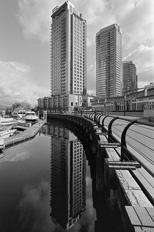
Categories : f/Egor (Leica Blog), Photo Gear
Tags : Black and White Photography, Leica M-Monochrom Review
Posted by Egor 
· December 11, 2012 

A Fetishist’s Guide to the Monochrom (Part 1)

Sharpness is nothing more than a fetish. So, too, is tonality. Noise, contrast, micro-contrast and megapixels? All fetishes. Even black and white. Show me a photographer and I’ll show you a fetishist.

Every new camera will titillate some photographers, while disgusting others. Fortunately, none of us are so dysfunctional that we possess every known photo fetish, but we all possess at least a few. Curiously, most of us fail to see our own proclivities as fetishes — believing that our desires represent a photographer’s “true” needs, while anyone with contrary needs is some kind of deranged sicko. In reality, we’re all deranged sickos.

When Leica asked me to shoot with the Monochrom and articulate my impressions, I knew I could follow one of two paths: either I could look at the camera strictly within the confines of my own specific fetishes, or I could use it more liberally in situations where I wouldn’t normally be motivated to take photos. Because the latter path would benefit a wider range of sickos photographers, it became my roadmap for this series of articles.

Knowing that my Monochrom impressions would be read by thousands of potential purchasers had a profound influence on what I shot and how I shot it. Normally, I tend to be a very frugal photographer. I prefer to make my selects before I press the shutter rather than after. If a shot doesn’t make my heart skip a beat, I’ll usually skip the shot. Thus, if I go out for a day with my old M2, I’ll probably come home with only 3 or 4 shots — one of which might be vaguely worthy of some future consideration. With the M9, I’ll come home with about a dozen shots, though it remains likely only one still warrants any future consideration. When the Monochrom arrived, I knew such an austere methodology would yield an article with only 2 or 3 photos. Since my readers would definitely want more, I needed to devise a way to take a lot of photos in a very short time. To meet this task, I released my inner-Winogrand. Quite famously, Garry Winogrand once stated, “I photograph to find out what something will look like photographed.” This became my mantra for my time with the camera — I photographed to find out what something will look like photographed with the Monochrom.

As a result, the goal for this article is not to shine a light upon my photographic “brilliance” (cough), but to instead illuminate the various attributes of the Monochrom, and how those attributes might appeal to a wide range of users. This is an article in which the pictures serve the story, rather than the story serving the pictures. Consequently, some of the images are trite; some are pedantic; but they exist to edify rather than entertain.

The sad result is that I can no longer write disparagingly of people who photograph walls when they write about cameras, as I’ve now joined their dubious ranks.

So without further ado, I invite all you photographic deviants to search this 3-part article for your various fetishes, beginning with the mechanical here in Part 1, and decide whether or not the Monochrom might be right for you.

Leather Fetishists

Let’s get the kinky fetish out of the way first — leather. Unlike the previous digital M’s, the Monochrom ships with a swanky leather strap. Sure, it looks nice dangling from your shoulder — but who carries their Leica like that? If you’re using your Monochrom for sport, rather than for show, you’re going to be wrapping that leather strap around your wrist, not draping it oh-so roguishly from your shoulder. I carry my Leica in-hand, where it’s ready to respond instantly to the dynamic world around me. Stiff leather does not conform to a bundle of twists about the wrist nearly as lithely as nylon. On more than one occasion, I felt the urge to open my toolbox, extract a hammer, and smite that strap into submission. On several other occasions, I fantasized about tossing the strap onto the middle of Vancouver’s Burrard Street bridge, where heavy vehicular traffic would pummel it into something approximating “pliable.” But, conscientious citizen that I am, I knew the next recipient of this demo camera would not appreciate receiving a strap that looked like week-old road kill, so I refrained. Ultimately, were I to own a Monochrom, I’d have to decide whether to cudgel the strap into something more supple, or simply purchase a nylon strap — thus leaving the supplied leather strap unscathed, and more enticing to whomever purchases the Monochrom from the estate sale that follows my demise.

The next topic in my leather litany is the camera’s synthetic leather body wrap. The Monochrom’s body “leather” is different than any other M-body I’ve owned, thus continuing Leica’s long tradition of changing covers with each new M-body release. It’s much more finely grained than my M9, meaning it’s much smoother. “Smooth” normally means “less grip,” which isn’t exactly a desirable trait for someone who carries their Leica in-hand. But looks can deceive — and while the Monochrom is definitely smoother than my delightfully pebbly M9 wrapping, I found it afforded an almost identical amount of grip when my hands were dry, and a surprisingly more reassuring grip when my hands were sweating. Sadly, none of my digital M’s have had wraps that grip nearly as well as my M6TTL which, in turn, isn’t nearly as grippy as the original vulcanite on my M2. I wish Leica could wrap these cameras in the same kind of materials used in the old days, but I suspect price and/or environmental issues prevent it.

Talking about leather may seem trivial, but when you spend all day, every day, carrying a camera, comfort and security are important.

Metal Fetishists

There are those who believe plastic — any plastic — on a camera is blasphemy. I’m happy to report that, like all the M’s before it, the Monochrom retains the highest metal percentage of any modern camera, and features the same die-cast magnesium alloy body and solid brass top deck and bottom plate as the previous models. This is a camera that will simply delight metal fetishists.

I’m somewhat less happy to report that the brass top deck is finished in black chrome, rather than black paint. The type of black finish is, not surprisingly, its own sub-fetish in the Leica world — with black paint fetishists occupying one dungeon and black chrome fetishists occupying another. Black chrome has a tendency to look a bit dull and weathered out of the box, but takes a pretty good beating without ever becoming duller or more weathered. The black chrome finish on my old M6TTL is virtually indistinguishable from the black chrome finish on the brand-new Monochrom — meaning either that the M6 looks “new” or the Monochrom looks “old,” depending on whether you’re a “glass is half empty” or “glass is half full” kind of person.

The powdery luster of a black paint body (like my M9) is, I believe, the “prettier” of the two black finishes. One of the main characteristics of black paint is that, over time, it wears away and the brass shows through. Some find this look “ugly,” while others (like me) think it’s beautiful. To me, a brassed camera is a loved camera. My M9 is just beginning to show the tiniest hint of brassing, and I couldn’t be happier — it’s like a badge of honor. Leica designed the Monochrom for maximum stealth, so one could argue that an old brassed camera becomes “flashier” and thus less “stealthy” than an old black chrome camera. But I think the older a camera looks, the more stealthy it becomes — simply because people tend to completely dismiss any photographer they see carrying what they perceive to be an old camera.

Ultimately, if you’re going to let the fact the camera is finished in black chrome rather than black paint influence your purchase decision, you’re not a fetishist — you’re just plain nuts.

Handling Fetishists

How does the camera handle? With photographers possessing a profusion of polarizing proclivities (how’s that for some impressive alliteration?!), it’s a question without a definitive answer. The Monochrom is, of course, a rangefinder. It features the same basic body and controls as the Leica M9 which, in turn, is ergonomically similar to every other M-series camera dating back to 1954. Whether or not you think this is a good thing depends on whether or not you like rangefinders. For my photography, there is no better form factor, and I’m absolutely delighted that such a bold and purposeful camera has arrived in rangefinder form. Those familiar with the M9 will find the button layout identical and the menus very similar to (though, obviously, not exactly the same as) Leica’s flagship color digital M9.

Operationally, the Monochrom handles identically to my M9. I had expected that the Monochrom would be even slower than the M9 at writing image files to the SD card, but I ran a series of tests in which I triggered both cameras simultaneously, and they took exactly the same amount of time — even when shooting a 4-shot burst in “continuous mode” (which, admittedly, is a feature I’ve never once used).

Unfortunately, I did experience one recurring issue with the Monochrom that I’d experienced only once in 3 years with my M9 — camera lock-up. Specifically, every few days, the Monochrom would completely lock-up when I pressed the shutter button. It wouldn’t take a photo, it would just die. The camera became completely unresponsive (as if it had no battery installed), which meant the buttons, LCD and power switch did nothing. To bring the camera back to life, I’d simply remove the battery, wait for a few seconds, then re-insert it. The camera and I would then continue on our merry way, though I’d be disappointed at having missed the photo I’d wanted to take. Not surprisingly, in total adherence to Murphy’s Law, it seemed like the lock-up ALWAYS occurred during the most intriguing photo opportunity of the day. Unfortunately, I was unable to identify the root cause. Lock ups would happen whether the battery was fully charged, half-charged, or nearly depleted. They’d happen if I tried to take a couple photos in quick succession, but they’d also happen if I hadn’t taken a photo in hours. They’d happen if the camera had fallen asleep, and they’d happen if the camera was still awake. I have since returned the camera to Leica and they’re investigating whether or not my problems are an isolated case or endemic of a wider problem.

Luxury Fetishists

Some people actually acquire Leica products because of their luxury status. Leica, itself, feeds this market with special edition versions of their products — versions that will sit in display cases as objects d’art rather than in the hands of hardworking documentary photographers. From my vantage point in a completely different universe, I simply can’t imagine the Monochrom having much (if any) appeal to the luxury crowd. It’s not covered in ostrich skin. It doesn’t gleam in the showcase. Shine a light on it, and it’ll suck it dark like a black hole. In fact, I’ll go so far as to say the Monochrom is, perhaps, the most austere, unadorned and restrained camera I’ve ever used. I quite like this about the Monochrom — but I suspect Luxury Fetishists will feel just the opposite.

The camera is flat black with nary a Leica logo in sight. The model name is barely discernible atop the right edge of the hotshoe, and there’s no engraving anywhere except on the back — save for a small serial number stamped atop the body, which makes the camera resemble a piece of bog-standard government issue more than an item of luxury.

Plain, unprepossessing and perhaps a touch “homely,” the Monochrom is designed to draw absolutely no attention to itself — making it essentially the opposite of a luxury camera. Save for the conceit of a leather strap, it is, pure and simple, a shooter’s camera.

So, in Part 2 of this article, I’ll discuss how the Monochrom lives up to its raison d’être — photo fidelity — and all the various image fetishes surrounding it. No more “fun and games.” We’re going to get our hands good and dirty…


©2012 grEGORy simpson

This article (along with many of its associated comments) first appeared in my f/Egor column for the Leica Camera Blog on October 23, 2012.

If you find these photos enjoyable or the articles beneficial, please consider making a DONATION to this site’s continuing evolution. As you’ve likely realized, ULTRAsomething is not an aggregator site — serious time and effort go into developing the original content contained within these virtual walls.
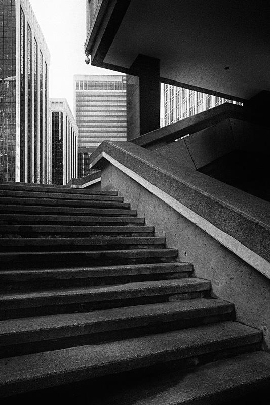
Categories : f/Egor (Leica Blog), Photo Gear
Tags : Black and White Photography, Leica M-Monochrom Review
Posted by Egor 
· November 21, 2012 

The Inverted Maslow

Recently, I ended my ePub-a-Dub-Dub article with a question: “How’s that for a crazy, upside-down world?” I asked. Though meant rhetorically, it prompted a hint of genuine self-curiosity. Why do I always believe the world is upside-down? I know plenty of people who think it’s A-OK just the way it is. There must be some explanation; some viable theory? I filed the question in my mental “To Do” list of existential problems that I’ll likely never solve, then carried on with my daily business.

A couple days ago, while chasing down some unrelated snippet of trivia, I stumbled across a Maslow’s Hierarchy of Needs diagram. Anyone who’s ever been subjected to an introductory psychology class has had this old chestnut foisted upon them.

For the benefit of all who skipped class on Maslow day, I’ll provide a brief overview. In the early 1940’s, Abraham Maslow devised a theory that the human condition has a pre-defined set of needs, and that humans go about satisfying these needs in a certain order — from the bottom up. Maslow theorized that humans must satisfy one set of needs before they can address the next set, creating a foundation upon which ever-more psychologically complex needs reveal themselves.

In Maslow’s model, humans have a primal instinct to first satisfy certain physiological requirements, like food and water, before worrying about much else. Once their physiological needs are met, people become more concerned with safety and security issues — issues that are, in turn, more urgent than the next hierarchy of needs: love & belonging. According to Maslow, once humans have food, water, a job, a home, good health, family, friends and sexual intimacy, they can then go about satisfying their need to be respected and appreciated. Finally, once they’ve gained the respect of their peers and colleagues, they can begin their quest for the ultimate need — the need for self-actualization and the knowledge that one has achieved their full potential as a human being.

Maslow’s pyramid implies that human motivation always builds upon a balanced foundation of needs, and that we’re each distinguished by how high we’ve managed to build our pyramid of sated demands. But like most “catch all” theories involving human existence, Maslow’s has one fatal flaw — it doesn’t “catch” me. In fact, it utterly fails to define the seemingly haphazard way in which my own needs structure has evolved — a structure that looks something like this:

Sadly, I’m not the only person with a needs structure that’s more “shanty” than “pyramid.” In fact, I’ve know people whose needs structures aren’t even “structures” at all — they’re demolition sites.

Unlike Maslow, I don’t profess to have insight into all human motivations, but I do know a little something about the needs of creative people. Mind you, when I use the term “creative people,” I’m not talking about someone who takes a pottery class at the local community center. I’m talking about people who are compulsively driven to create something that will change the world — or, at least, change that one little piece of the world that interests them. This person could be a composer, a writer, a scientist, or even a photographer. These people, who I’ll refer to simply as “creatives,” have needs structures that appear to totally invalidate Maslow’s theory.

For creatives, it’s as if Maslow doesn’t exist. Everything in the creative’s world is sacrificed for the pinnacle of the pyramid — self-actualization. But Maslow’s model dictates that people can only be interested in higher-level needs once their lower-level needs are satisfied.

As I looked at the standard Maslow diagram, the question that began this article entered my head: “Why do I always believe the world is upside-down?”

On a whim, I turned Maslow’s needs pyramid upside-down — and that’s when I saw it: The creative person’s hierarchy of needs was simply an inverted Maslow pyramid!

It all made sense. Maslow’s theory that one must satisfy a lower-level need before addressing an upper-level need is actually sound — it’s just that he got the order inverted for creatives. Self-Actualization is the fundamental need that drives all creatives. It is, in many ways, their most basic need. Of course, once they’ve satisfied their own creative mandates, creatives want others to know and appreciate what they’ve done. Esteem is thus something that can be sought only after a creative has satisfied himself. And though many creatives long for intimate relationships, they’re rarely able or willing to put the time and energy into making them work — love simply takes too much time away from the process of creating. Thus, establishing intimate and meaningful relationships is something many creatives can do only after achieving a certain measure of self-actualization and esteem. Finally, many creatives seem to view their own safety, security and physiological needs with a sort of “disdain” — as if the act of assuaging them (or the effort spent in trying) is so pedestrian, banal and trite that their fulfillment is tantamount to “selling out.” Only the most successful, respected and loved creatives ever seem to achieve the top echelon of the inverted Maslow Pyramid.

Not only does the inverted Maslow do an excellent job of explaining the motivations of creative individuals, but it also indicates why creative people are often more fragile and unstable. Just look at that structure. The entire thing — a creative’s entire existence — balances on a single point. Unless those needs situated above self-actualization are met with the utmost care and balance, the whole pyramid tips over on its side.

All these years I thought Maslow was a crock. Turns out I was wrong. I was just looking at it upside-down. Typical.


©2012 grEGORy simpson

ABOUT THESE PHOTOS: Yes, indeed, they’re all photos of steps. What can I say? I’m a sucker for symbolism. “Into the Light” was shot with a Leica M9 and a 28mm Summicron. “Pyramidal” was shot with a Leica M9 and a 1982 v4 35mm Summicron. “Ascent to Nowhere” was shot with a Ricoh GXR using a 50mm A12 lens module. “Descent to Nowhere” was shot with a Leica M Monochrom and a 35mm Summilux-M lens.  No shutters were activated in the creation of the three Maslow Needs Pyramids, which I created by sprinkling a bit of mirth on a Photoshopped amalgamation of various existing illustrations.

If you find these photos enjoyable or the articles beneficial, please consider making a DONATION to this site’s continuing evolution. As you’ve likely realized, ULTRAsomething is not an aggregator site — serious time and effort go into developing the original content contained within these virtual walls.
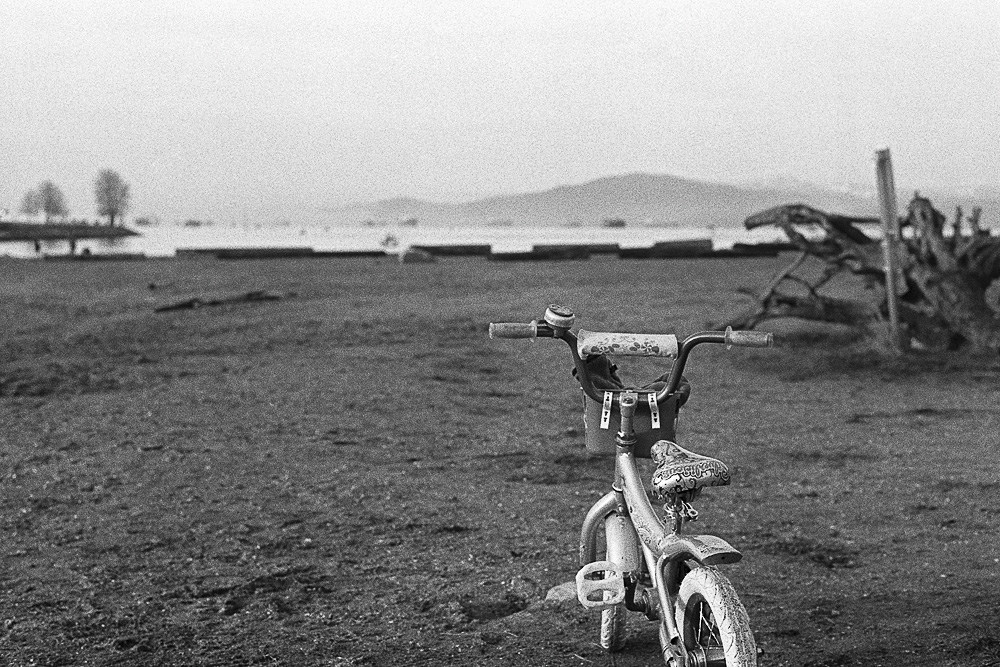
Categories : Musings
Tags : Photographic Philosophy
Posted by Egor 
· November 14, 2012 

ePub-a-Dub-Dub

Wizened elders speak of a time, long ago, when writers wrote, illustrators illustrated, photographers photographed, publishers published and coders (what few there were) coded.

I, myself, am not wizened enough to have lived in these magical times, but I am elder enough to have borne witness to the ongoing elimination of barriers between professions.

In the late 1980’s, if I wrote an article for a music magazine, I would type it up on my Macintosh Plus (typewriters were already anachronistic), save it as a text file, prepare a few PICT illustrations in MacPaint, then drag everything onto a floppy disk, which I’d slide into a cardboard envelope and “snail mail” to the publisher. Three months later, my article would appear in print: formatted, kerned, justified, paginated and nestled amongst several glossy ads for the latest “must have” synthesizers. Since I served as both writer and illustrator, it wasn’t quite the legendary purity of professional separation — but it was the closest I would ever come.

In the early 1990’s I was creating electronic music hardware and software and, while the coders were off coding my latest design, I would write the owner’s manuals. Unlike the halcyon magazine days, I was now my own publisher — creating templates in FrameMaker and learning all about fonts, digital “typesetting,” layout, indexing, and the mechanics of “signatures,” “bindings,” paper “weights” and other esoteric bookmaking terms.

By the mid-1990’s CD-ROMs became all the rage, and it wasn’t cool to have printed manuals anymore — you had to create interactive, hyperlinked multimedia manuals that shipped on CD (saving companies a minor fortune in printing costs). This, of course, meant it was no longer enough to be a writer, illustrator, layout designer and publisher — I needed to also become a graphic designer, an animator, and a code writer.

Time marched on. The CD-ROM died and was replaced by the internet, which required a whole new set of coding skills, along with a new knowledge of server technology and a basket full of new acronyms like HTML, CSS and SQL to wrap my head around. It also coincided with the time people decided they didn’t like to read anymore — meaning I had to learn how to create videos, plus a whole lot of nonsense about frame rates, codecs, color grading, motion graphics, etc.

While all this was happening in my professional music life, it was being mirrored in my photographic endeavors. Marketing my photography meant self-publishing material on the internet, which eventually morphed into the ULTRAsomething website, which meant indulging in numerous publications about WordPress, Search Engine Optimization, Javascript, and even more CSS. Then the world went all social-media crazy, and the internet fragmented into a million different pieces. This required duplicating, triplicating and quadruplicating my efforts so that my content could find everyone — whether they preferred Facebook, Google+, Twitter, Pinterest or some other hip but ultimately unnecessary extraction.

Then came the proliferation of mobile devices and the realization that I must further fragment and repurpose my content specifically for the different types of devices one might use to access that content… which brings us to the point of this article (and after only eight paragraphs)!

My latest article for the Leica Blog, in which I wrote about my impressions of the Leica M Monochrom, was 10,000 words long — perhaps too unwieldy for the attention-deprived tendencies of the blogosphere. I had originally wanted to publish it as a downloadable PDF, but Leica requested a three-part blog entry instead.

After fulfilling Leica’s blog requirements, I returned to the idea of turning the Monochrom article into a stand-alone PDF. Naturally, this decision meant discovering a plethora of additional things I didn’t know. Specifically, I didn’t know how to create a PDF in which photographs could be clicked and zoom to full-screen at a higher resolution. Nor did I know whether the fixed layout of my fancy and beautifully-realized PDF would actually be legible on the new breed of smaller mobile devices, like the iPad Mini. And what about the crazies who might actually want to read this on a smart phone? Influenced by years of internet-induced schizophrenia, I opted not to bother learning the answers. Instead, I shifted gears and decided to publish the Monochrom article as an ePub.

Of course, I knew nothing about how to create ePubs other than the fact Adobe’s inDesign (which I’d used to create owner’s manuals in the early 2000’s) would allow me to export a document in ePub format. So it’s got to be simple, right? Wrong. The document looked absolutely hideous on my iPad — crazy fonts, weird page breaks, and photographs that split across two pages. After some investigation, I learned that many of these issues could be rectified by creating and embedding custom CSS — but what I couldn’t figure out was how to actually get at that CSS in my inDesign file. So, rather than spend even more time learning about inDesign quirks, I decide to switch to Apple’s Pages application, which could also output an ePub file.

The Pages output looked much better, but still had numerous problems that needed to be fixed with CSS. And just as with inDesign, I couldn’t figure out an elegant way to modify and experiment with the CSS stylesheets. It seemed that Pages required that I first generate an ePub and then try to find and modify its CSS, which would require going back and manually re-coding every change each time I updated the Pages document. At that point, it seemed quite pointless to use Pages, since I’d ultimately have to hand-code the ePub anyway. So I dug deeper, and discovered Sigil — a free cross-platform ePub creator. I was able to use Sigil to create the Monochrom ePub, and I was able to fix some of the display problems with custom CSS… and that’s when I realized that, because ePubs are an open standard, no one actually wants to support them. After all, there’s no money in standards. If you’re Apple, you don’t want people reading ePubs when they could be buying iBooks. Same holds true if you make Kindles, or Sony readers, or any of a number of different dedicated devices. Everyone seems to purposely break their device’s ePub reader, just so their own proprietary (and lucrative) format becomes more enticing by comparison. It’s a crazy world.

So after spending way too much time researching work-arounds and dealing with an endless stream of formatting frustrations, the Monochrom ePub is finished:

EPUB DOWNLOAD: “A FETISHIST’S GUIDE TO THE MONOCHROM”

It’s far from perfect (I seem to have no control over orphans or hyperactive hyphenating), but it’s functional — at least on my first generation iPad. Frankly, I haven’t tested it on any other devices because I don’t own any other devices. Besides, I’d probably collapse into a blob of quivering goo if I were to discover that, like the iPad, some other device failed to support the most simple of CSS tags in their ePub reader, thus breaking the format in a whole other manner.

But hopefully, it was worth it for anyone who prefers to kick back and read lengthy articles on their tablet’s ePub reader. iPad users should also be aware of a handy feature in their iBooks application, which enables them to double-tap any photo in the ePub and make it zoom to display full-screen — an absolute necessity for examining some of the detailed image characteristics discussed throughout the article. I have no idea if this is possible on other devices.

Needless to say, I won’t be providing tech support for this. It either works or it doesn’t. If it doesn’t, there’s always the good old-fashioned, 3-part web version:

  • Part 1
  • Part 2
  • Part 3

You know what the craziest thing is about all this? The more professions I need to learn; the more hats I need to don; the more all-nighters I need to pull; the more hurdles I need to clear just to get content into the hands of end-users — the more my income drops. How’s that for a crazy, upside-down world?


©2012 grEGORy simpson

ABOUT THESE PHOTOS: All photos were shot with a Leica M Monochrom camera using various lenses. Specifically: “Encroachment” used a 28mm Summicron lens; “Meter Feeders” was shot with a 1982 v4 35mm Summicron, “The Model” employed a Voigtlander 15mm Super Wide Heliar, and the two “Worst Food Cart Logos,” “Circus Geek Category” and “Ruggero Deodato Category” were shot with a 1991 v5 50mm Summicron.

If you find these photos enjoyable or the articles beneficial, please consider making a DONATION to this site’s continuing evolution. As you’ve likely realized, ULTRAsomething is not an aggregator site — serious time and effort go into developing the original content contained within these virtual walls.
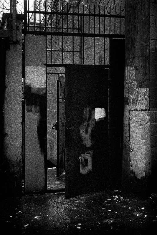
Categories : Musings, Photo Gear
Tags : Black and White Photography, Leica M-Monochrom
Posted by Egor 
· October 19, 2012 

Terrible Parables

One day, I realized that photo blogs are never written as parables. On the second day, I wrote a pair of parables. On the third day, I read my parables and realized why photo blogs are never written as parables. On the fourth day, I published them anyway…

– — –

The Mermaid and the Curmudgeon

One summer’s afternoon, a photographer strolled lazily upon the beach. His mind vacillated between dreams for the future and recollections of the past, while he avoided most adroitly any thoughts of substance.

On the seawall above him, bicyclists zipped to and fro, and he pondered how mankind could still fancy such a primitive mode of transportation some 50 years after witnessing James Bond tool around in a jetpack.

The photographer’s thoughts shifted from Thunderball to Dr. No, and his mind’s eye watched with delight as Ursula Andress emerged from the sea in a fetching yellow bikini. Only the girl wasn’t Ursula Andress and her bikini wasn’t yellow. In fact, there was no bikini at all. “This is not my mind’s eye,” thought the photographer. “This is real!”

The naked girl materialized from the surf, and sauntered most purposefully across the man’s path. But unlike Ms. Andress, who seemed quite miffed to find Sean Connery upon the beach, this Ms. Undress was rather cavalier toward the photographer’s presence. He wanted to believe this was because he was far more handsome and dashing than Sean Connery, but suspected a more likely explanation: that the girl from the sea was simply a bit of an exhibitionist.

In spite of being a photographer, the man completely forgot that he was grasping a camera, and had the mermaid not nodded toward it with a coy smile and a tacit acceptance, he would very likely have failed to take a photo.

The photographer was one of those grouchy, anti-zoom, fundamentalist types with a penchant for wide angle lenses and a righteous attitude that no one ever needs carry more than a single lens of a single focal length. On this day, he happened to have a 21mm Elmarit lens mounted to a Leica M2. Though now quite painfully aware of the error of his ways, he snapped a photo anyway.

MORAL

The only thing sadder than an unprincipled existence is a principled one.

– — –

The Stradivarius and the Punk Rocker

Once upon a time there lived a man vicariously through his camera. Like others with a derivative existence, he was forever searching for increased lucidity within his surrogate world.

As a photographer, he did as others before him: he sought that lucidity in the form of the immaculate image — a quest that lead him to appreciate quality camera equipment and, most specifically, quality lenses.

The man had a profound fondness for a particular league of sorcerers, who practiced their spells and incantations in the fabled land of Solms. There, through a combination of alchemy, mathematics and secret incantations, these magicians crafted looking glasses with preternatural abilities. The man was infatuated with the way these enchanted discs translated and transformed the world — how that world glowed and sparkled; how its colors teased his retina; and how it unambiguously revealed its tiniest secrets.

One day the wizards from Solms loaned the man a parcel, within which resided one of their most mystical lens creations. He knew of this particular lens’ legendary powers, and had witnessed its grandeur through the altered realities of other photographers. So, like them, he set forth and photographed luminous blue oceans, velvety green foliage and autumnally amber sunsets. And each time he would do this, he would throw up a little in his own mouth. Because, while this lens had a profound capacity to paint the most sensuous dreams imaginable, they were not his dreams.

He was, you see, a photo punk — more Strummer than Clapton; more Stravinsky than Mozart; more Lee Morgan than Louis Armstrong. For him, passion trumped technique. Visceral trumped visual.

In the eyes of many, lending this man a precision optic was akin to giving a Stradivarius to a punk rocker. The rocker may audition it clumsily with an appropriate stab at Brahms, but would inevitably cast the instrument as a caterwauling accompaniment to his latest cacophonous sonic assault. And all those who sought to pigeonhole the instrument would cover their ears in horror.

And the simile was fair and just, because the photographer indeed removed this beautiful lens from its beautiful surroundings, and carried it onto the ugly streets — casting it as an interpreter of a tortured anti-fidelity where images are as flawed as the world he photographs, and where beauty is something he feels and not something he sees. And all those who sought to pigeonhole the lens would cover their eyes in horror…

MORAL

A tool used as intended is an avenue unexplored.


©2012 grEGORy simpson

ABOUT THESE PHOTOS: “Illustration 1: The Mermaid and the Curmudgeon” was shot with a Leica M2 and an old Leica 21mm f/2.8 Elmarit-M pre-ASPH lens on ADOX CHS-100 Art Film, which I developed in a 1:50 solution of Rodinal. “Illustration 2: Maximum Banality” was the very first image I shot with a borrowed 35mm f/1.4 Summilux lens mounted to my Leica M9. “Illustration 3: The Stradivarius and the Punk Rocker” was shot with the same equipment about 2 hours later, once I’d gotten the banality out of my system. And yes, the third image does violate my “do not photograph panhandlers” principle, but I admire this fellow’s dedication (he’s in the exact same spot every night, every month, every year). So I took a little advice from my own opening parable…

This article (along with many of its associated comments) first appeared in my f/Egor column for the Leica Camera Blog on September 24, 2012.

If you find these photos enjoyable or the articles beneficial, please consider making a DONATION to this site’s continuing evolution. As you’ve likely realized, ULTRAsomething is not an aggregator site — serious time and effort go into developing the original content contained within these virtual walls.
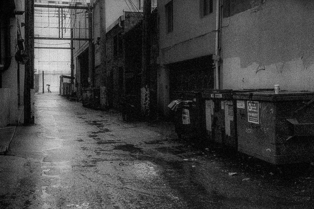
Categories : f/Egor (Leica Blog), Musings, Photo Gear
Tags : Leica 35mm f/1.4 Summilux, Wide Angle Lenses
← Previous Page
Next Page →

CATEGORIES

SEARCH SITE

SUBSCRIBE

Receive new post announcements via Email

LATEST POSTS

Something Pleasant

Tell Us How We Did Today

Book Report

EXORCISM 08

Dredging the Tide Pools

Drift

© 2025 ULTRAsomething
Articles | About | Privacy Policy | Donate | Contact
Manage Cookie Consent
ULTRAsomething uses plugins (which use cookies) to organize and optimize the site. It's kinda how blogs work.
Functional Always active
The technical storage or access is strictly necessary for the legitimate purpose of enabling the use of a specific service explicitly requested by the subscriber or user, or for the sole purpose of carrying out the transmission of a communication over an electronic communications network.
Preferences
The technical storage or access is necessary for the legitimate purpose of storing preferences that are not requested by the subscriber or user.
Statistics
The technical storage or access that is used exclusively for statistical purposes. The technical storage or access that is used exclusively for anonymous statistical purposes. Without a subpoena, voluntary compliance on the part of your Internet Service Provider, or additional records from a third party, information stored or retrieved for this purpose alone cannot usually be used to identify you.
Marketing
The technical storage or access is required to create user profiles to send advertising, or to track the user on a website or across several websites for similar marketing purposes.
Manage options Manage services Manage {vendor_count} vendors Read more about these purposes
Preferences
{title} {title} {title}